Architectural Lettering

0 Commentsby   |  09.09.11  |  Reference

I found a couple of youtube videos about how to write like an architect. For someone who still needs to work on lettering (me), the first one is informative and concise.

The next one is a response to an “angry” e-mail sent to the creator, Doug Patt, of the instructional video. I just though this one was clever.


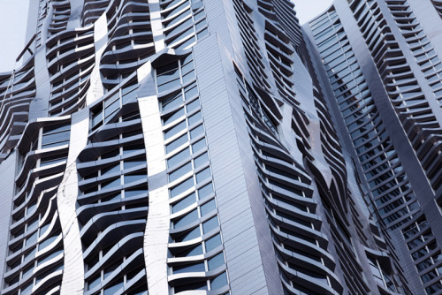
8 Spruce Street | Gehry Partners | New York City

0 Commentsby   |  09.02.11  |  Reference

archiphile:

8 Spruce Street by Frank Gehry (supposedly)
this is one of the few things of his i don’t really hate (another being the DZ Bank in Berlin) and it’s a skyscraper! double surprise. as with DZ Bank, i think it’s the way he works within certain constraints here that i enjoy.

Frank Gehry’s first skyscraper clad (or “draped”) in stainless steel curtain wall panels. Definitely more interesting as you get closer. Notice the use of any flat planes – including window planes – to reduce complexity (and cost) of the curtain wall.

You can read an article here and see a video about the creation, and coordination, of the curtain wall system.

The Making of a Memorial

0 Commentsby   |  09.01.11  |  Architecture, Reference

Below is a link to an article posted on CNN.com about the National September 11 Memorial. It discusses the process, and the problems, inherent with creating such an emotionally-charged monument. Toward the end of the article, mention is given to the Vietnam Veterans Memorial designed by Maya Lin – then a young architecture student at Yale University. I remember one of my architecture professors saying that architecture is only truly created when we design a monument or memorial. Maybe that is due to the significance (social, political, cultural, etc.) of such an artifact and the symbolism – meaning – it holds.

The making of a memorial: Reshaping ground zero – CNN.com.

A Strong Clear Vision is a good documentary about Maya Lin that discusses in some detail the Vietnam Veterans Memorial.

Kinetic Sculpture @ BMW Museum in Munich

0 Commentsby   |  09.01.11  |  Reference, Sculpture

While I am thinking about kinetic sculpture, here is one a student pointed me to a couple of years ago.

Here is a link to Art+Com’s website with more images of the project.

PVC Beach “Animals”

0 Commentsby   |  09.01.11  |  Reference, Sculpture

Interesting piece on wind-powered kinetic sculptures created by Dutch Artist Theo Jansen.

NO CLASS – FRI., APR. 15

0 Commentsby   |  04.15.11  |  Announcements

ART 353,

We will not have class today. I am at home with a sick kid. Keep working on your project – I will check progress on Monday.

Brandon

Soap Label Feedback from Holly + Joy

0 Commentsby   |  03.23.11  |  Reference

Feedback from Holly about Soap Labels/Packaging:

Joy said the class wanted to know why we liked the packaging of the soaps we ordered. Good Fortunes was intially the card that grabbed me. The site had several to choose from not being their logo but loved the style ( online it appeared to be letterpress) I chose the grapefruit bar for the scent ultimately and the rubber band cord looked interesting to also liked the flower style on the card. As for the smaller bar – I liked alot of her website and graphics and wanted to see another of her packaging – picked that one for the citrus graphics mostly and the style looked completely different from the card. The goat milk ( Chivas ) was the logo mostly (goat in circle) and they change the color according to scent. That particlur color wasn’t my favorite but the scent won out. Liked the brown background paper. Both are very polished to me partly the paper of both companies has a shine to it. I don’t think I’m drawn to that finish on the paper? Another soap company I came across was bodygoodiesonline.com – She used a rubberband with her logo on the bar to hold the paper label on – you have to choose a soap to see it on the site. She’s been picked up by whole foods and at the bottom of her home page is a fantastic tub with fun bubbles and blue bird which I thought was delightful her bubbles I think she caries through onto the other packaging. Another thought is the idea of repurposing / recylcing very much appeals to me. Hope that helps.

Feedback from Joy about Soap Labels/Packaging

We both loved the Good Fortune card – the grapefruit, the whole look.  It was maybe a little overboard with information in total, but loved the card.  The small soap seemed overkill to me – but very sleek.  The owner of that company is an artist, graphic design person and it shows.

The Chivas goat bar was very professional and seemed to fit their logo, name and identity reall well – to me.

I’ll bring you another one today which is so underdone.

I like the idea of being able to give it as a gift and having it look good/cute/nice.

Hope that helps.


Colored Pencil Basics

0 Commentsby   |  02.08.11  |  DSGN 248, Reference

Colored pencil can be applied to many surfaces effectively very successfully, including the following:

  • Blue or black line diazo prints (blueprints)
  • Hot or cold-pressed illustration board
  • Architectural or tracing weight papers
  • Textured (heavy tooth) drawing paper (typ. cold-pressed)
  • Marker paper
  • Matboard

It is important to use a soft lead pencil that allows one to lay down the color effortlessly. Many map or art pencils are either too hard or greasy, and will go on completely different from Prismacolor design brand pencils.

One should apply the color lightly at first until they have discovered the intensity and result of their own hand pressure. It may be that the direction of the stroke can also play a part in helping to describe the texture of the surface being drawn (i.e. carpet fiber, tooth, weave, softness, reflectivity, etc.).

Color Matching

With lighter colors finding the closest hue match may be possible. Typically, exceedingly dark colors do not read well in a visual presentation unless highlights are emphasized (rather than the true depth of the selected hue). Color matching can be achieved by layering various colored pencils.

Patterns + Surfaces

Express in reference to the surface’s plane, just as a fabric would “lay” on the surface. In this way, a striped sofa appears as a believable representation of how the fabric looks on the upholstered piece than if the plane direction was not considered.

Contrast

Color contrast may be beneficial in the development of a color scheme in general, but may be especially important in the visual drawing itself to add a feeling of liveliness to even an all white room. Tints of color and accents should be used to achieve contrast. Window treatments are useful elements that can add color contrast.

Highlights + Illumination

These are helpful in the creation of visual interest and provide a sense of depth to the drawing. Use sparingly to maintain a sense of realism.

Outlining + Graphic Texture

These add structural clarity and edge definition. Black ink technical pens and/or fine tip felt tip pen are good tools for this.

Plants

These can add warmth and texture to the drawing. Use shadowing to achieve appropriate volume, and variation in stroke and color for texture.

Accessories

Hang pictures on the walls, add features to the tabletops, combine fabrics and flooring, and consider how lighting (lamps, wall sconces, ceiling fixtures, etc.) may complete the design.

Human Figures

Need to be included for the viewer to interpret both scale and proportion relative to the interior space.