Scholarly and Creative Work Highlights
Because the types of scholarly work I create varies more than most candidates applying for tenure and promotion (as my portfolio includes academic publications, graphic design, and interior design/architecture), in this section I have selected a few feature projects to highlight. Because this type of scholarly work may be unfamiliar to some on the committee, I have provided a detailed description of the work, and the process that underpins the final product. Since the ACU Faculty Handbook states that the portfolio should “summarize the applicant’s achievements, relying on representative, not exhaustive exhibits” (p. 18), I have chosen not to outline the process for every scholarly and creative project in my portfolio and have instead selected a example from each discipline to highlight.
Publication Highlight 1
Culture and Religion (2018)
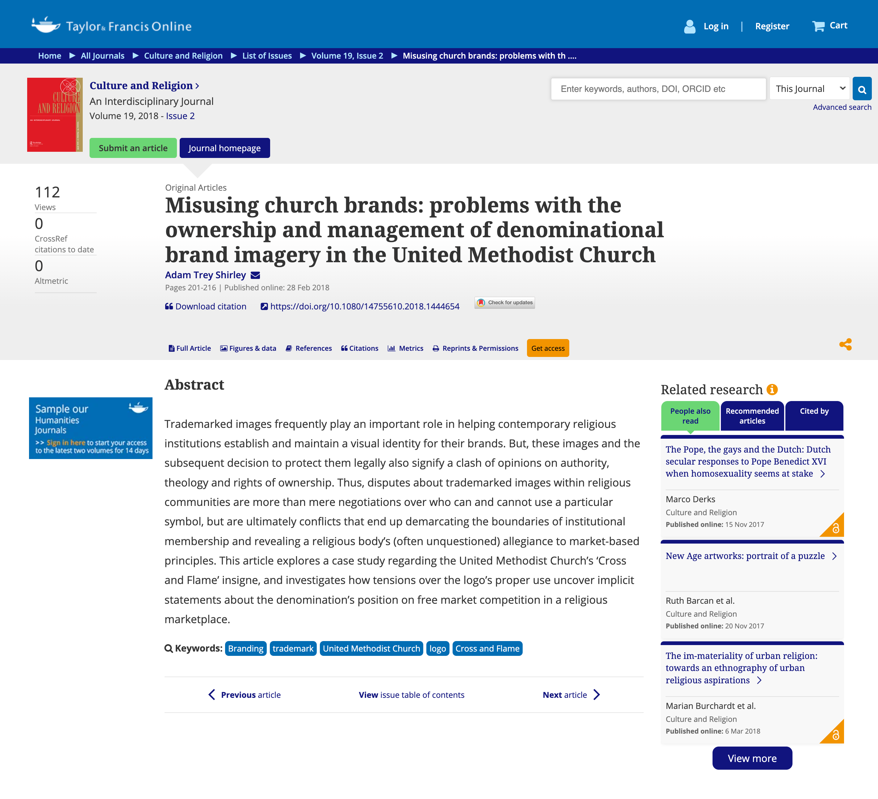
Misusing Church Brands: Problems with the ownership and management of denominational brand imagery in the United Methodist Church
In this article, I get to expand on some of the research I conducted during my dissertation and explore the important role trademarked logos play in helping denominations establish and maintain their brands. As I address this question, I consider how these images and the subsequent decision to protect them legally, creates a context for a clash of opinions on authority, theology, and rights of ownership. By looking at real-life disputes about trademarked images within the United Methodist Church that I was able to collect from a travel grant that allowed me to visit the denomination’s archives, I display how religious logos help inadvertently define the cartography of the institution. Who gets to use the logo (and how they get to use it) is a much more fraught and contentious issue than the average outside observer might realize. This article explores a case study regarding the United Methodist Church’s ‘Cross and Flame’ insigne, and investigates how tensions over the logo’s proper use uncover implicit statements about the denomination’s stance on religious doctrine, political positions, membership delineation, and free market competition in a religious marketplace.
Culture and Religion is a top-ranked interdisciplinary journal in both the Arts and Humanities (Religious Studies) and Social Sciences (Cultural Studies). Published by Taylor and Francis, the journal boasts a Q1 CiteScore Impact Factor (reserved for journals within the top 25% subject category ranking) in the Journal Citation Reports.
Publication Highlight 2
Media and Religion (2016)
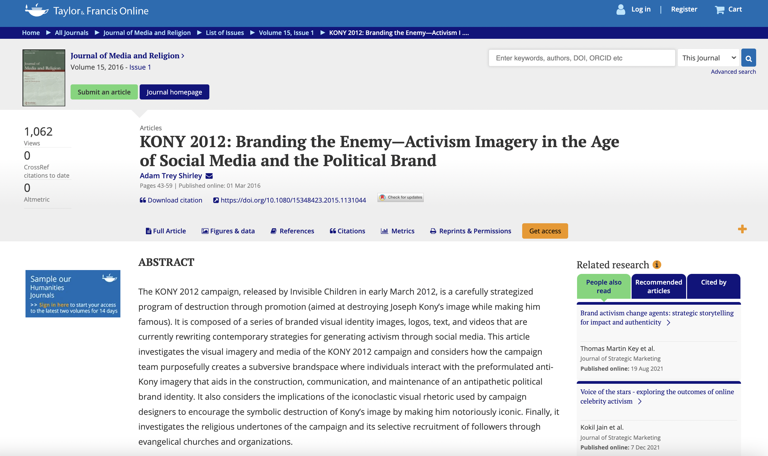
KONY 2012: Branding the Enemy—Activism Imagery in the Age of Social Media and the Political Brand
Graphic Design Highlight
Adams Center Website (2019)
ACU Adams Center
Fee Based: Web Design
Project Description
In 2019, I was contacted by the ACU Adams Center and asked to submit a proposal for redesigning their existing blog as a new website. After preliminary discussions, I submitted the proposal and was selected as the website designer. On a typical website design, there are seven common roles filled by a team. These include: project manager, analyst, information architect, graphic designer, backend developer, frontend developer, and UX designer and quality tester. As a one-person shop, I served all of these roles on this project. Below, I explain my process and what I did in each of these functions. This is also a fair example of my process for all of the seventeen websites I’ve designed since coming to ACU.
1. Project management
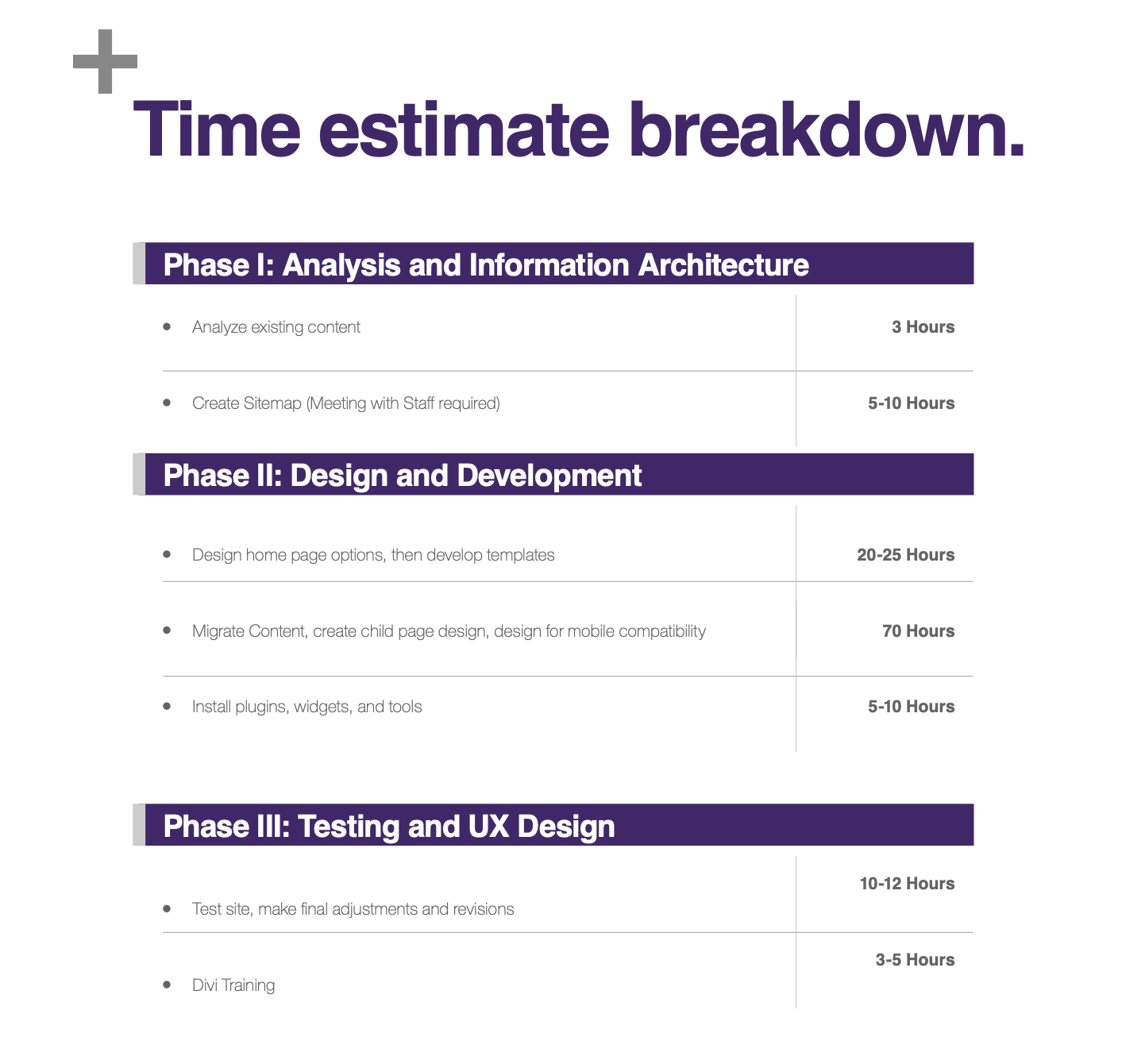
I began this project by meeting with the Adams Center team to discuss the scope of the project, the target audiences, the essential website functions, and to review the existing website to understand in what ways it was and was not successfully serving the needs of the client. I worked on a timeframe for the project and developed a schedule for the redesign, carefully planning for the major overhaul to take place during less disruptive seasons for the client. I also worked with them to determine a budget for the project, including: registration, software, plugins, widgets, and other tools needed for the site. (Below is the estimated time breakdown of the project I submitted in my job proposal).
2. Analysis
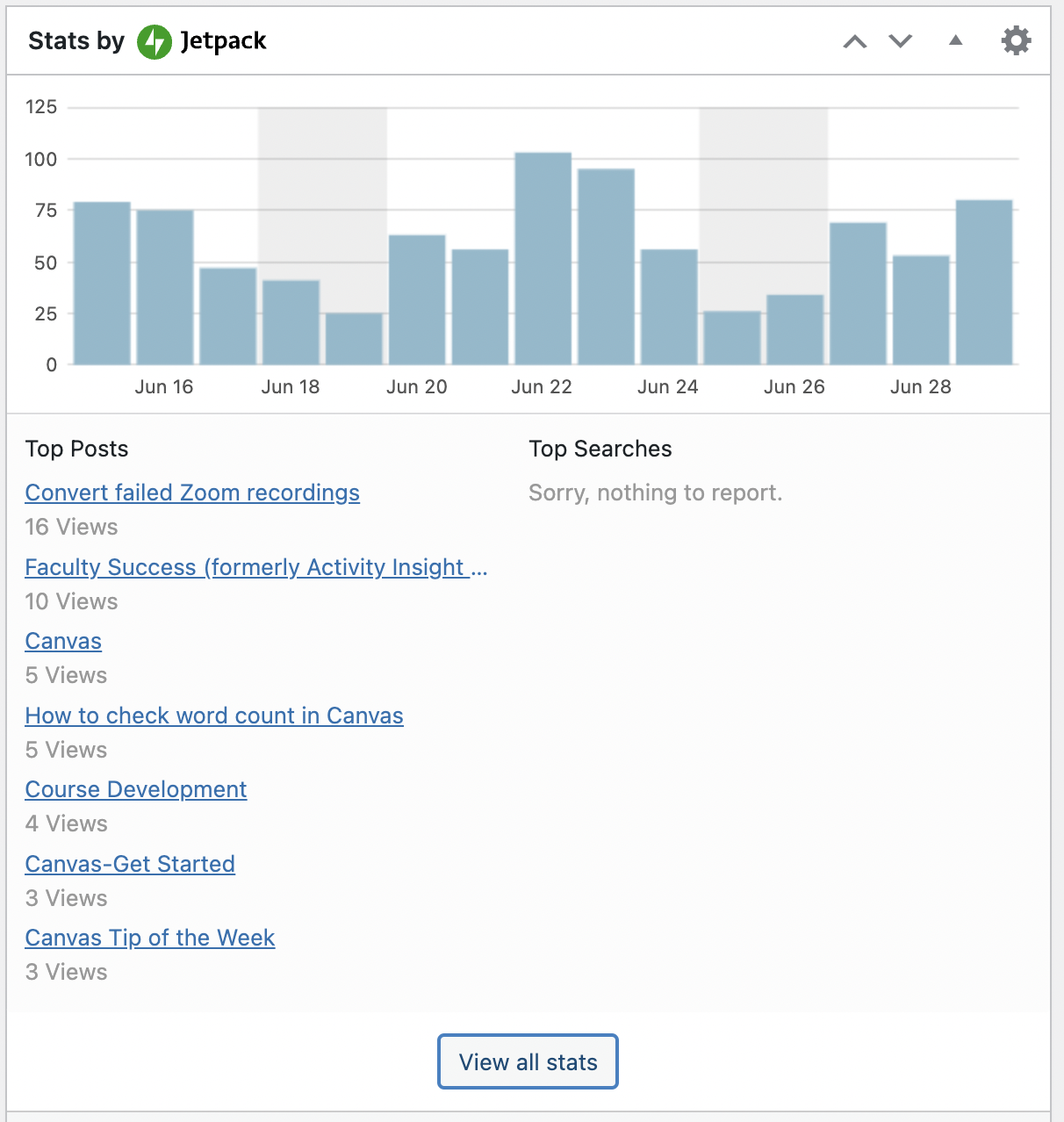
After this, I went through the former website and collected existing analytics as well as new data in order to understand in what ways the site was (and was not) being used. I found that the site was essentially serving one single audience (faculty), though the client also wanted the website to have an outward-facing presence. I began collecting data from faculty to understand what functions were most important to them in the website. Faculty were using the website for three primary purposes: 1) to learn about upcoming activities or to schedule events, 2) to get more information on university tools and resources (such as technology like Turnitin or Canvas), and 3) to receive faculty support or learn about grants and other Adams Center sponsored opportunities. (Below is an example of one of the tools used. This image shows the type of information that was available.)
3. Information Architecture
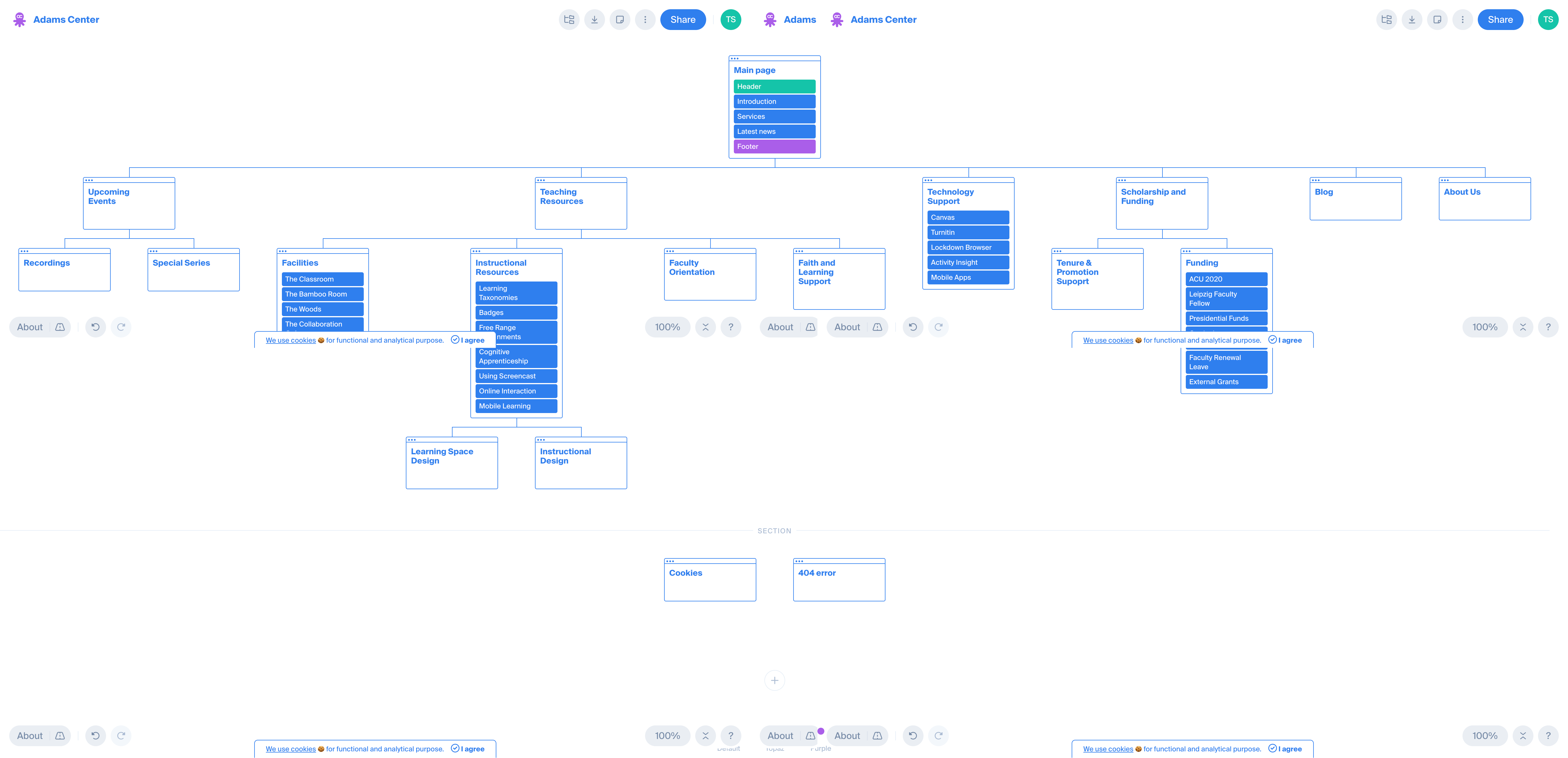
As I analyzed the existing page, I found it to be a mess. Upcoming events were nowhere to be found. The blog had a host of great articles on university resources, but they were not archived or properly indexed. Faculty support information was provided, but it was buried under multiple clicks. Clickthrough rates indicated that people were either coming to the site and not finding what they wanted then immediately leaving, or rummaging around for far too long to find the resources that should have been provided in less than one click. To resolve these issues, I created a sitemap that reflected the hierarchy of information and functions desired by website users.
4. Graphic Design
With the sitemap in hand, I started on an initial set of mockups for the client. I started by researching other websites within the realm of higher education design, one of my own areas of professional expertise. This consisted of familiarizing myself with the visual identity standards for ACU designs, as well as looking at the websites of competitor or sister schools. I collected these designs in a file as reference, adding notes regarding elements I liked or felt would be positive additions to the university site. I worked on thumbnail sketches to draw up a variety of ideas and to figure out the basic layout of the home landing page. Next, I created three different mock ups of the homepage, exploring different primary emphases, moods, color palettes, and typeface selections.
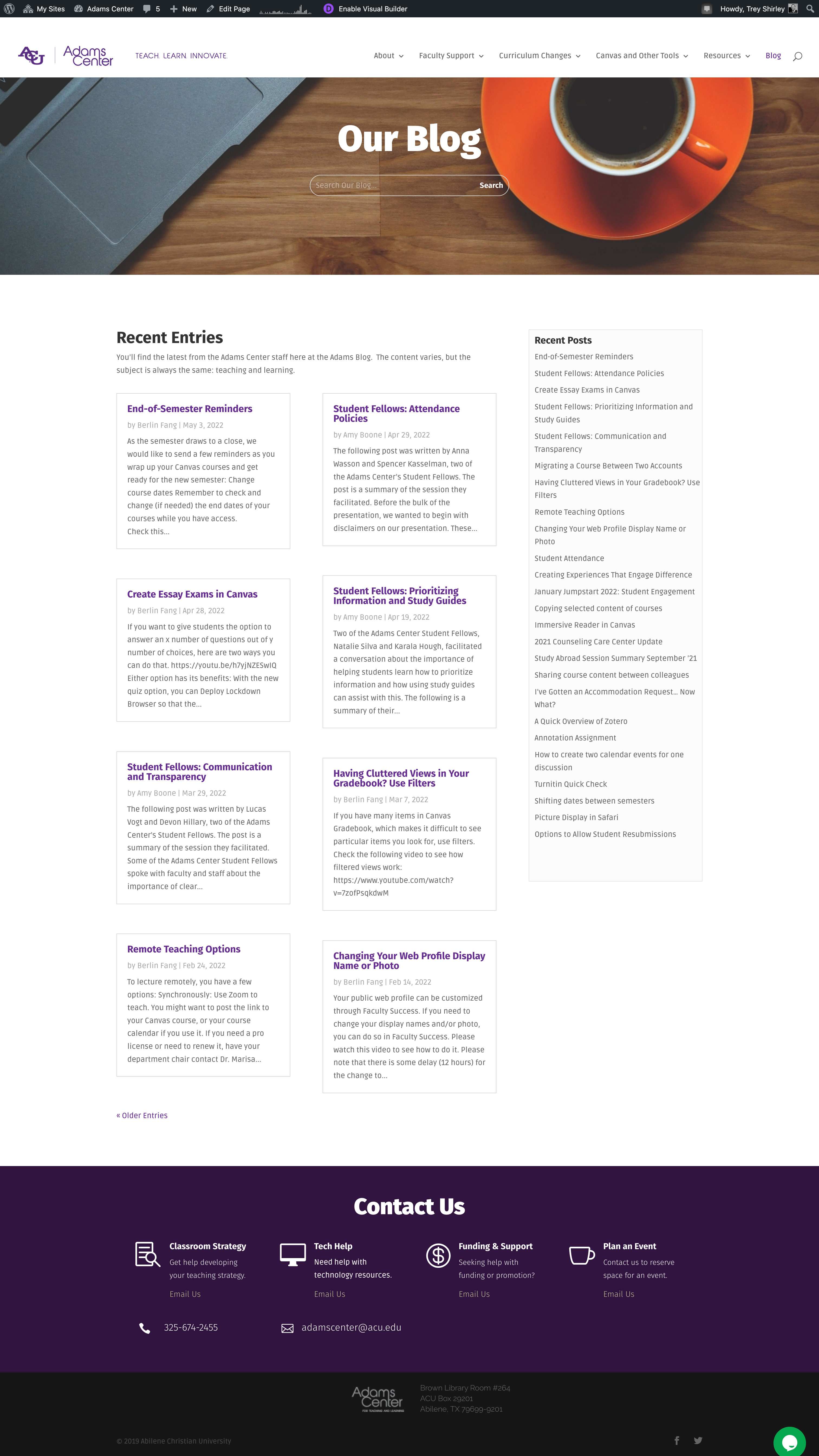
The first version I designed was the most “academic” in character, using collegiate serif typography, official-looking, stately photography, and clear and concise, if not a little lofty, copy. This was the most common type of site found at other institutions. A second version was more austere and “to the point.” It used clear, standard geometric sans serif fonts and very little imagery. Its design was driven primarily by excessively delineated typographic hierarchy. While this no-frills version of the site had less personality (it read more like technical manual), it made up for a lot through its easy navigation and simple, ordered layout. The third version aspired for more personality and charm. It had a fun humanist sans serif typeface that was paired with an overhead perspective stock video of people at a desk working on a project together. Its lighthearted copy (Stop. Collaborate. Listen.) jokingly referenced Vanilla Ice’s 1990 breakout hit “Ice Ice Baby.” In addition to the video and the copy included in the header, the second section had a clean, grid-based content module that clearly included links to faculty support, tools and resources, and had a live calendar that displayed upcoming Adams Center Events. After some debate, the Adams Center team selected the third design as the direction they desired to pursue for their new site while incorporating a few details from the other versions. (See a screenshot of the chosen design below).
5. Backend Development
Even with the homepage style selected, a lot of pieces have to fall into place before I can actually start building the visible aspects of the website. We opted to continue to use WordPress as our website platform since it is supported by the university and we wanted the site to be maintainable by the staff and students workers in the Adams Center without requiring in-depth knowledge of web code or extensive training on site management. Plus, since the previous site had been built in WordPress, this would make the migration over to the new site much easier. I began to build out the back end of the website and migrate the existing pages over. This involved installing plugins needed for specialty features (such as the live calendar and analytics tools), setting up the new website’s information architecture, creating navigation menus and templates, managing design and administrative settings, and debugging issues that came up during the migration. (Below is a brief video scrolling through the backend of the home page in a wireframe view).
6. Frontend Development
From there, I was able to start working on the frontend (visible) areas of the website. With over sixty unique pages that each needed to be designed or modified, this was by far the most time-consuming part of the entire project. I began by creating a style guide based on the homepage design selected by the Adams Center team that determined header, secondary header, body copy, and hyperlink text font standards, website color palettes, image and iconography criteria, grid system and spacing rules, animation style specifications, and more. I spent several months painstakingly modifying every existing page to meet the new design standards and creating new pages to fill gaps where needed. After designing each page, I reviewed and then designed it again to make it mobile device compatible.
7. Testing and UX Design
Finally, I began testing the site. I met with some of the Adams Center employees and had them navigate through the site, giving them tasks and watching how easily or intuitively they were able to accomplish the function. This allowed me to observe in real time their workflow and understand better what was and was not working. During the testing stage, we learned that the “hero” video we were using was not working in Safari browsers and were forced to resort to a static image after hours of failed attempts to fix it. We added a CTA (Call to Action) on the front page because we found that a lot of people were needing to use the site to make reservations. And, we added a chat function so that people could get answers to their questions more quickly. Over the next few months, we progressed with a soft launch of the site (to collect more information from users) and I proceeded to train staff on how to make changes and updates to the site without needing my assistance. In the end, the project included over 170 hours of work.
Conclusion
The new site has now been live and in the hands of the Adams Center staff for four years. If you visit the site today, it is not the same site I created four years ago; but that is the life cycle of a website. Unlike print design, which has a definitive conclusion (the final printed project), web designs are plastic, iterative, and constantly evolving products. This overview is not exhaustive and doesn’t go into every detail, decision, or conversation regarding the website. Nevertheless, I hope that it will serve as a means of showing how much specialized knowledge, effort, skill, and time goes into one single web project, particularly for a single-person web “team.” I spent many hours researching, planning, meeting, designing, and revising this project—not to mention the years of accumulated knowledge and training I did to hone these skills. While I am not able to go into this level of detail with every one of the websites I have designed in the past ten years, I believe that this description will help you better understand why creative projects like this are considered scholarship by my college and department and why each one of these sites should be placed next to any other form of creative, academic, or other form of scholarship at this institution. Each web design is different. Some required more work than this one, like the design for North Texas Escape Rooms, which involved much more backend development with SEO (Search Engine Optimization) and digital marketing strategies. Some required less work, such as the India Today design, which was only for a single landing page. Even so, I am incredibly proud to look back and reflect on each of these significant accomplishments.
Architecture Design Highlight
Abilene Family Practice (2016)
SSW Properties, LLC
Fee Based: Architecture, Interior Design, Landscape Design, Environmental Graphics
About the Project:
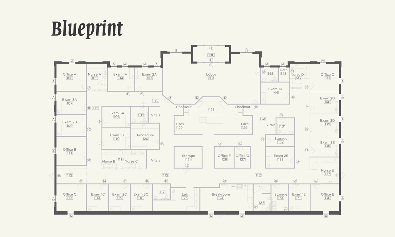
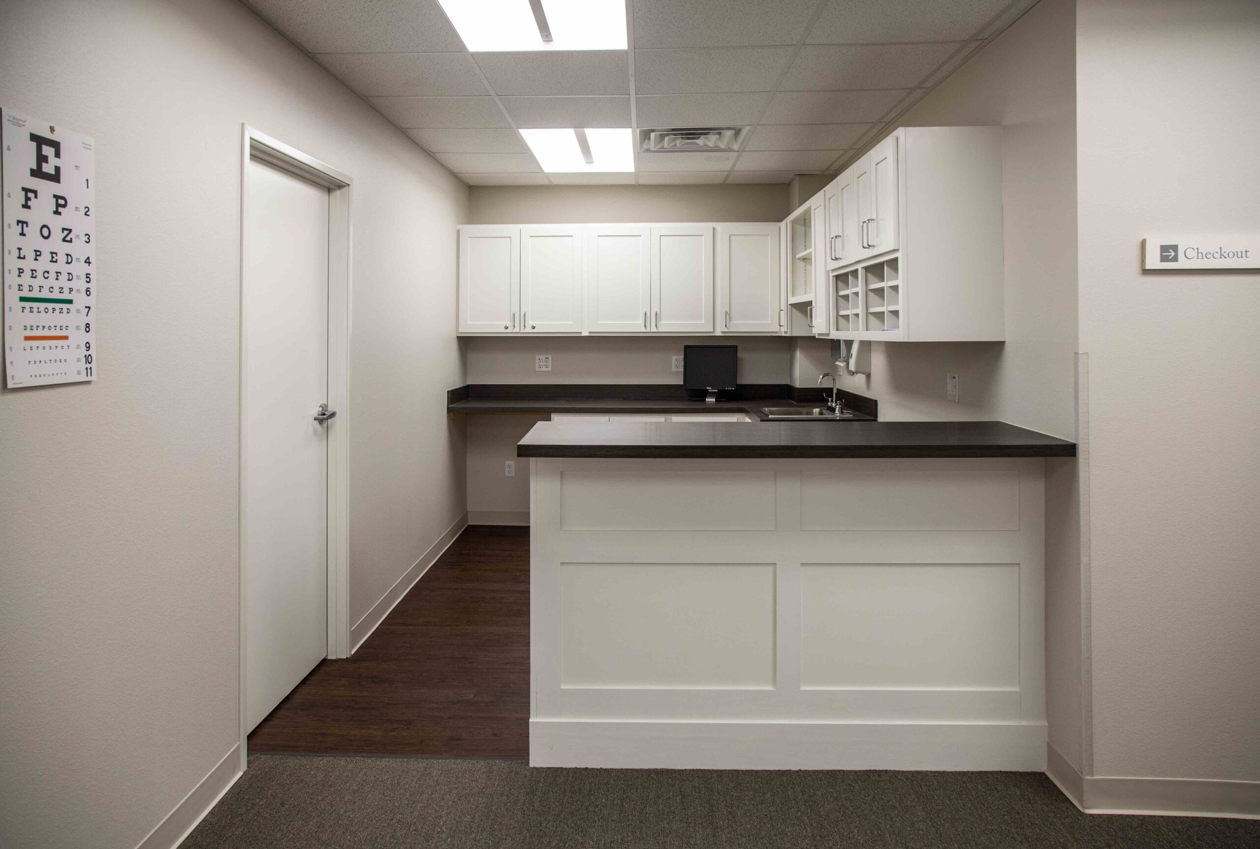
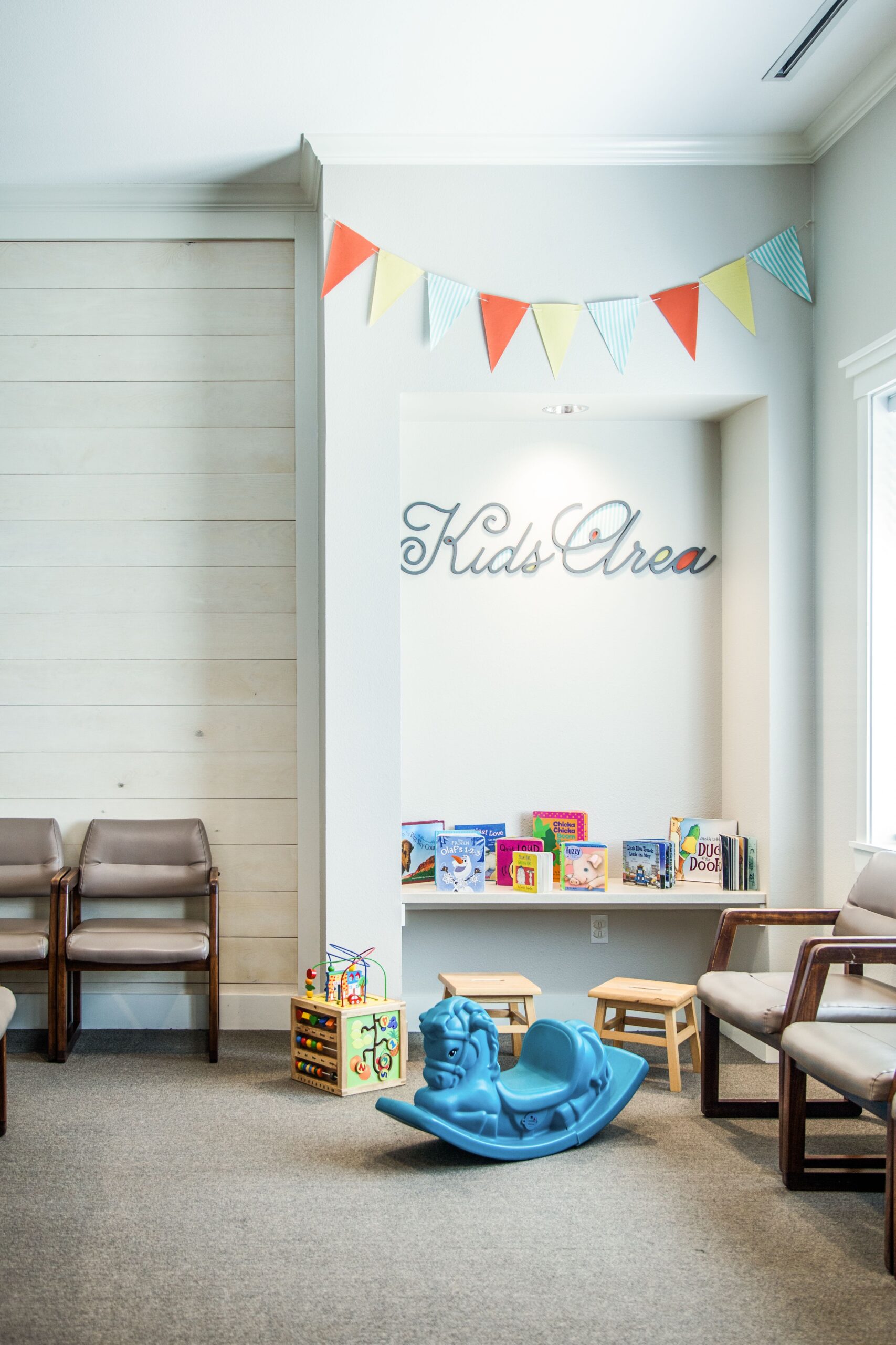
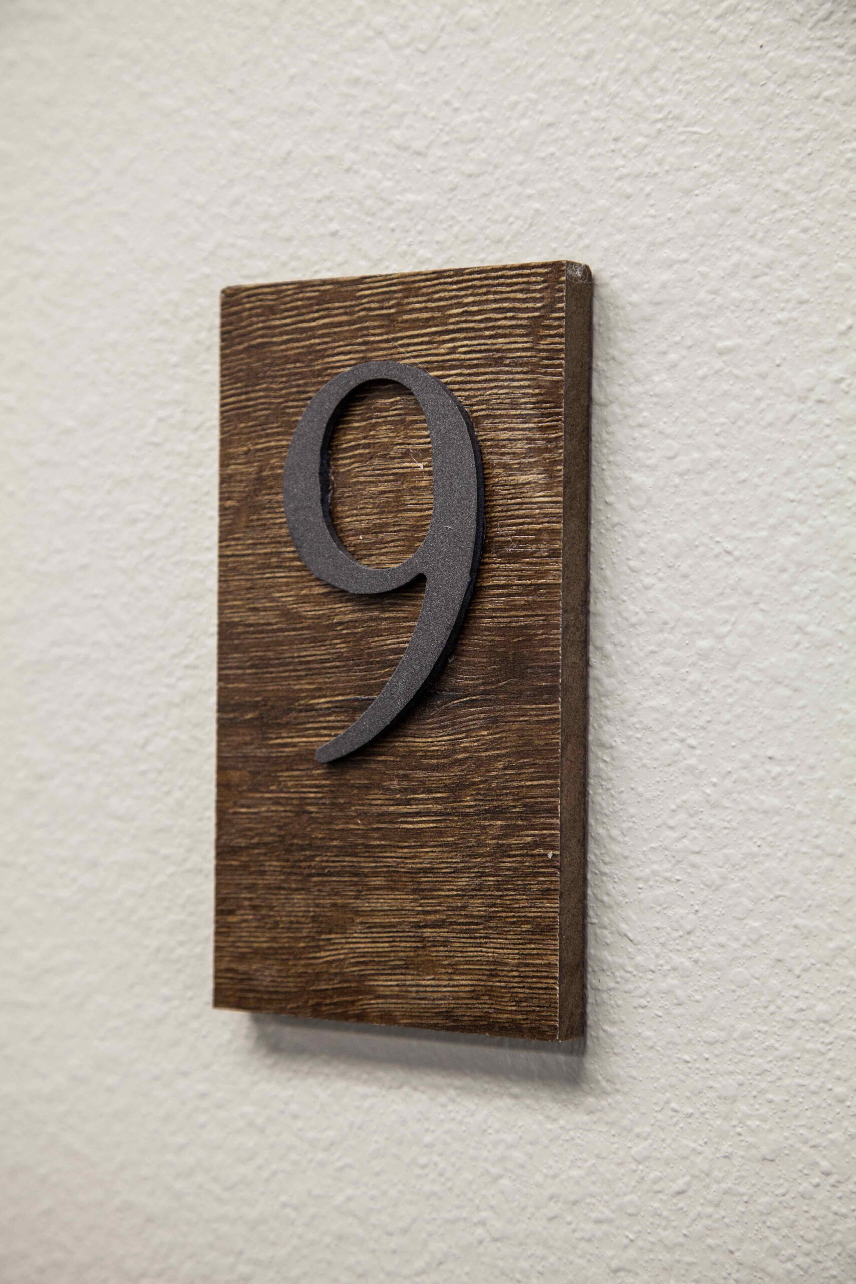
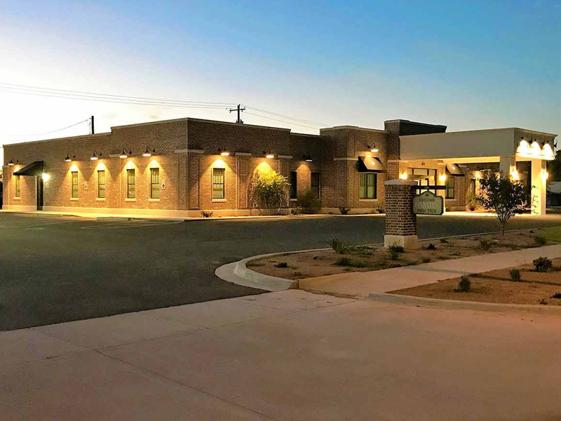
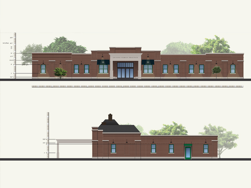
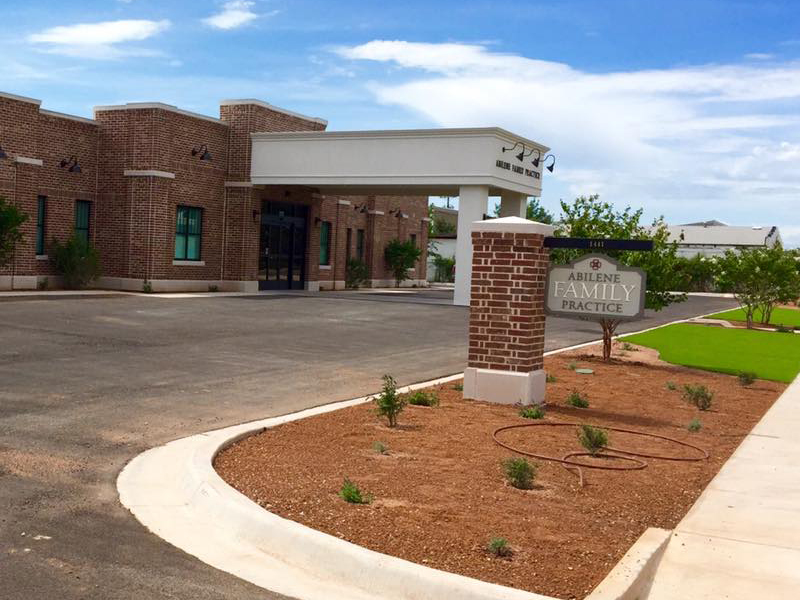
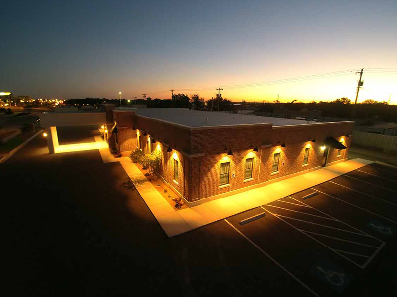
In 2015, I was brought on by SSW Properties, LLC to help them design an 8,024 sf medical office complex for Abilene Family Practice. The final plan was the product of over 1,000 different sketches and revisions, which entailed unique designs for 42 rooms, landscape and parking lot site design for the exterior, and a wide array of environmental graphics including outdoor and street signage, indoor room numbering, brand graphics, a website design, and wayfinding signage. For this project, I oversaw securing funding, identifying the building site, designing the blueprint, drawing up elevations, working with engineers and contractors to ensure work was up to code and met plan specifications, designing interior spaces, deciding on finishes, overseeing the parking lot and landscape design, procuring supplies, coordinating change orders, and finalizing the project to receive a Certificate of Occupancy. Below I walk through my involvement in each of the steps of the construction project.
Conception
This project began through a conversation with the partners of SSW Properties, LLC. My wife is one of the partners and asked me to come to their meeting since I have a background in design and experience in construction. The group of physicians had been renting a building for over twenty years and were ready to build their own medical office building. As one physician stated, “I’ve probably paid for this building twice during my time here renting.” In this conversation, we began to discuss what a new building would entail, what size they wanted, what essential functions they needed, and what they financially could afford. After this meeting, we set up meetings with several architects to discuss the project. Upon receiving the bids and preliminary designs, we realized that none of them were going to provide exactly what the partners wanted while also meeting the budget requirements they could afford. They asked me to draw up plans for a blueprint according to their specific requirements. Upon seeing my plan, they then asked me to draw up elevations. They liked the elevations so much they brought me on to oversee all of the design aspects of the build. Although I am not licensed as an architect or interior designer, I was excited by the opportunity to work in this field of design and work with proper professionals on the aspects of the design that were outside of the scope of my qualifications.
The building needed space for five physicians (five offices and nursing stations, fifteen exam rooms, a procedure room, a waiting area, check-in and check-out stations, a break room, mechanical and cleaning closets, and ample storage for thousands of pounds of paper charts). We calculated their needs at around 8,000 sf for the building with a lot of at least one acre (43,560 sf) for parking.
Design
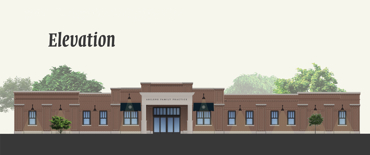
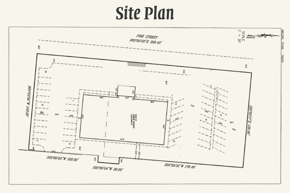
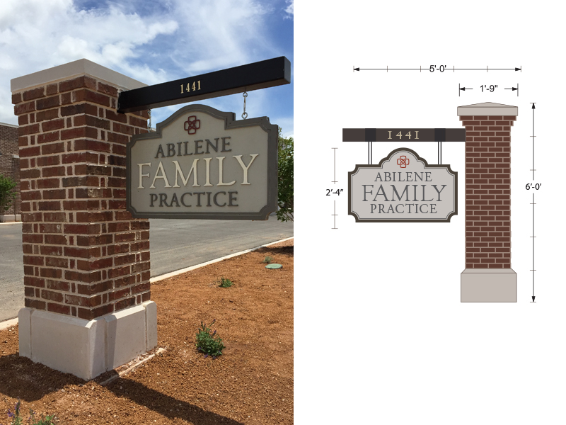
After we had a rough blueprint in hand, the physicians asked me to begin to work on elevation designs. We also set out to find a loan. We met with a number of banks and found one (First Financial Bank), who provided us with the terms we needed for a construction build. We next researched many different site locations. I found and started conversations with the owners of a 1.3 acre plot at 1441 Pine St. We then met with a number of contractors and eventually hired ACI Enterprises, Inc. as our General Contractor for the project.
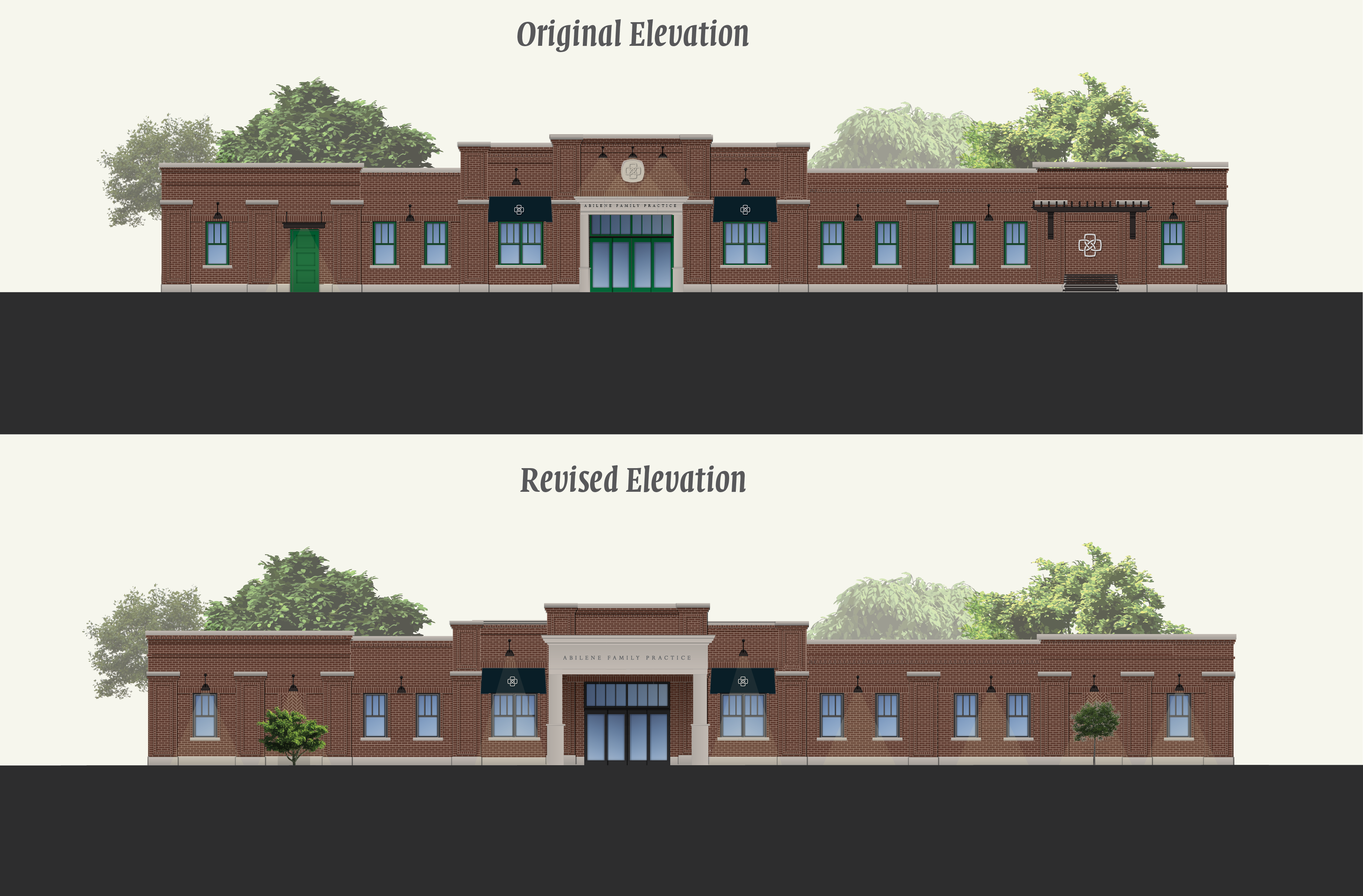
With our site located in the heart of Abilene’s Pine Street Corridor, the doctors wanted their exterior design to connect the aesthetics of the city’s historic downtown with the north-end medical district. After months of research, and literally thousands of sketches, plans, and prototypes, I came to a final solution that combined architectural elements from the Abilene downtown buildings with the major medical complexes on the other end of the corridor. Design details such as intricate brickwork detail, vertical double-mullioned windows, and concrete cornices were drawn from buildings such as the The Grace Museum, The National Center for Children’s Illustrated Literature, and the Alexander Building as well as the Texas Tech University Health Sciences Center and Hendrick Medical Center.
For the first time, the client got to see what their building was going to look like and they loved what they saw.
Preconstruction
With plans in hand, we began to work with our contractor to secure permits, collect bids from subcontractors, procure building supplies, create a work schedule, finalize engineering plans, and ensure that the building met energy and ADA compliance standards.
Because this was a medical office building that would be visited by people from all stages and walks of life, the doctors wanted to ensure that the building was not only compliant with ADA standards, but exceeded standards for patients and employees living with different degrees of physical ability. Bathroom doorways and hallways were widened, grab bars were built into plans, sinks were lowered and made wheelchair accessible (even in employee-only locations), steps were replaced with ramps, and many other small and incremental changes were made so that the building would not merely meet base requirements for compliance, but go above and beyond to welcome other-abled individuals into the space.
During this stage, I also drew out the parking lot site plan and preliminary landscaping design, which were sent out to a civil engineer to be finalized. In the mean time, we worked to begin procuring specialty items and fixtures that were custom built (such as the cabinetry, windows, and awnings) or were on backorder and were going to take a long time to arrive (such as the custom brick and exterior light fixtures).
Construction
We broke ground on September 25, 2015 with a blessing ceremony with the physicians and office staff. By Christmas the foundation was poured and the framing was put up. The next weekend, we had a blessing ceremony for the building and invited employees and their families to come and bathe the space in prayer. Prayers and scriptures were scribed onto the walls and floors, asking for God’s favor in the good work that would be done inside the building.
Other than some very heavy rains that delayed foundation work early on, the process had gone relatively smoothly up until this point. On February 5, I learned of the first major hiccup. The drive through portico I designed was not structurally sound, so the engineer scaled it up to be larger. While in theory, this sounds like a very practical decision, in practice it had the risk of unbalancing the visual weight of the entire front facade of the building. Furiously, I slaved away at the design over the next week, working with the contractor and engineer to find a solution that didn’t upset the entire front face of the building. (To me this was the equivalent of someone just enlarging the nose on a face). Eventually, through some careful rearrangement, we came to a solution that was up to the satisfaction of both me and the client.
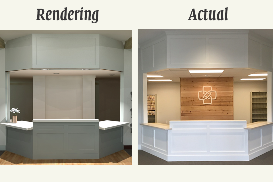
By mid-April we were installing cabinetry and flooring and the project was progressing. I worked dilligently to provide sketches and 3D renderings for the craftsmen working on the project. This was also the season of a thousand decisions, where I was working closely with my clients as well as subcontractors, suppliers, and installers to coordinate colors, fixtures, and finishings (paint colors, flooring selections, wall treatments, lighting, and so on).
By mid-April we were installing cabinetry and flooring and the project was progressing smoothly. It was at this point that we hit our second major hurdle. The project was going to be 15% over budget. While not an insurmountable sum, it exceeded the contingency built into the initial loan. This required procuring a second loan to cover the overage, which was a heavy but unavoidable blow to the client.
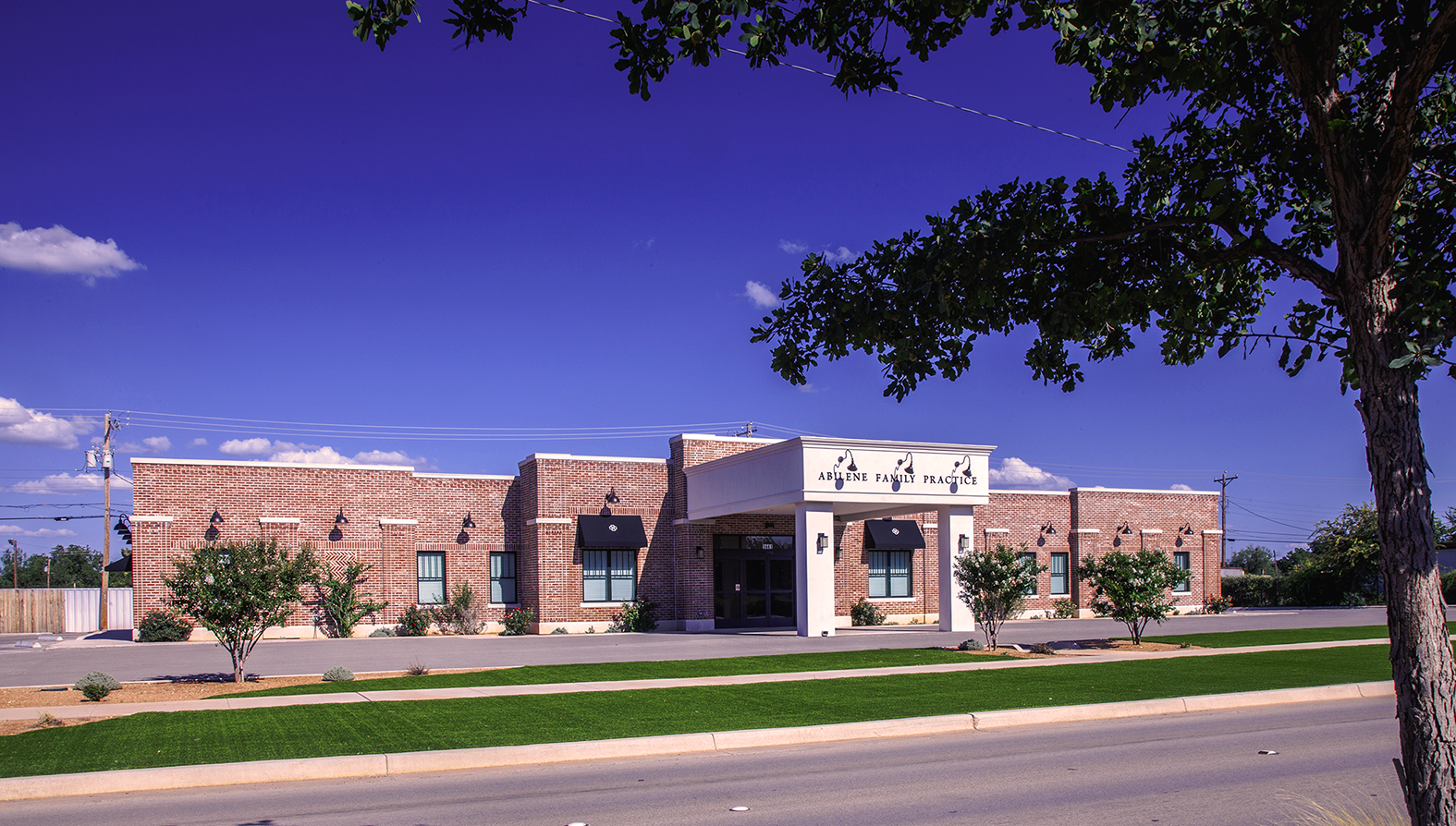
To save money, we had to scrap some of the budget for landscaping and new furniture. However, we were still able to go ahead with our plan to install artificial turf grass as part of my landscaping plan. This came about as part of our water conservation plan and required a vote from the City Council because we were the first commercial building in town to utilize this type of ground cover on such a large scale.
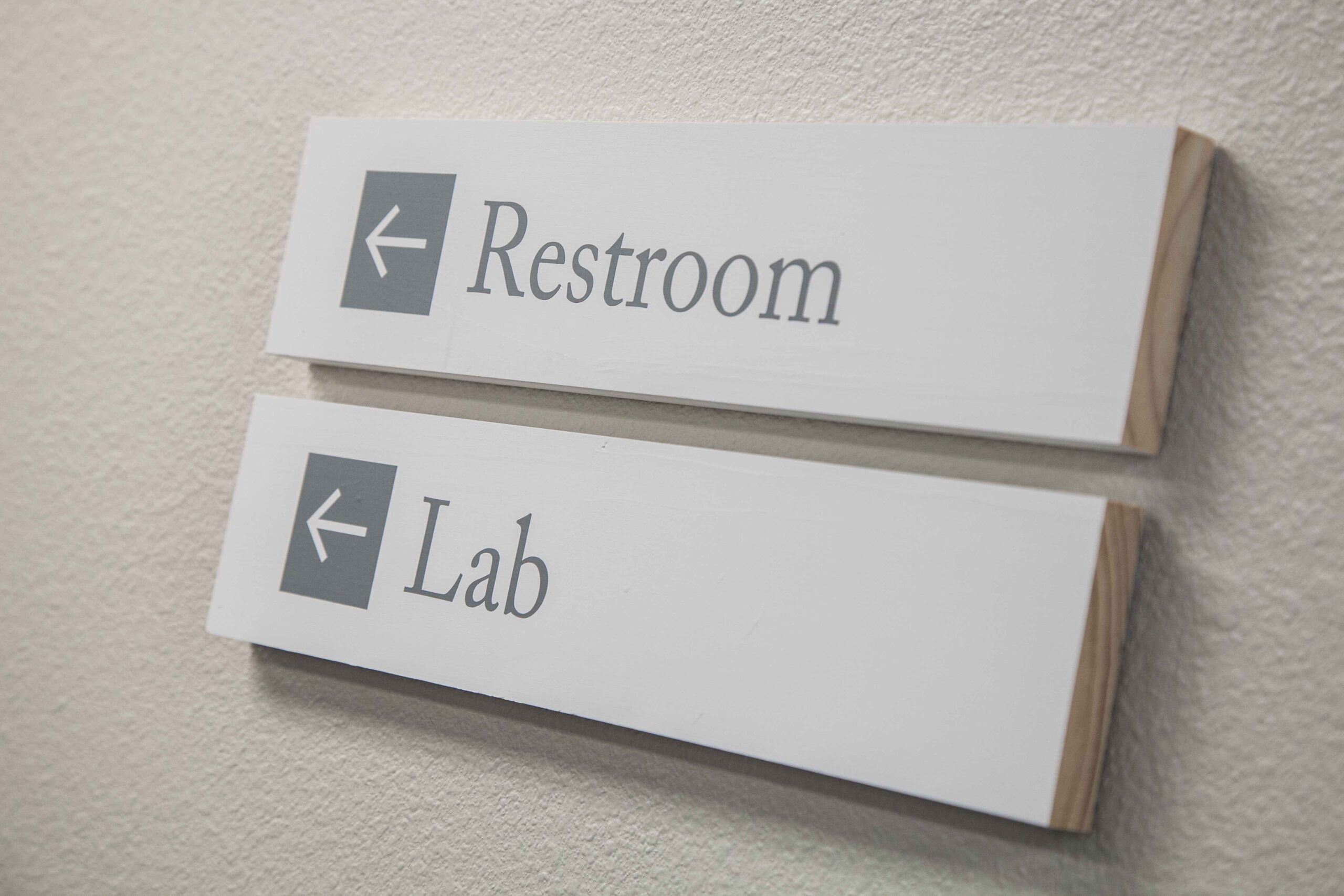
In the mean time, I set to work designing street signs, room placards, digital displays, lobby graphics, and way-finding signage. Because finances were tight, I ended up creating all of these by hand in the ACU Maker Lab. I also was commissioned to design a new logo and website for the practice at this time.
Click on the arrows on the image above to see more photos of the project.
Post-Construction
After construction, the project wasn’t over. We did final walkthroughs with our contractors, scheduled any needed inspections, and created a detailed final punch list. Once all of the items on the punch list were cleared and we received our Certificate of Occupancy, we gave the keys to the physicians. The building was finished on schedule on June 25, 2016 and the doctors moved in that week, opening their doors on the first of July as planned.
Reflection on Significance
The process of designing a new building is complex. There are many untold issues and stories in this brief synopsis that don’t do justice to the thousands of hours that were poured into this project. Nevertheless, this has been one of the most satisfying projects I’ve had the opportunity to work on. Getting to contribute to the Abilene landscape as part of a multi-million dollar construction project, while providing an amazing group of physicians a functional and inviting space to practice their craft has been one of the greatest honors and achievements of my life. This project has been well-received by the Abilene community and has been endorsed by the Development Corporation of Abilene as an exemplary model of excellence in design and strategic development. Likewise, my landscape design was the first major commercial landscape project in Abilene to receive approval to use artificial grass on a new construction and has since become a trendsetter as an environment-friendly lawn solution for its water conservation benefits. Meanwhile, the building itself has been remarkably durable. In the seven years since construction, only minimal repairs have been needed while the functionality of the space has exceeded expectations in accommodating the needs of the physicians. It is humbling, yet incredibly exciting to know that this project will long outlive me or any of my writings or other designs. For all of the effort and time it took to bring it to fruition, the result far exceeds the sacrifice.
Welcome
Summary
Curriculum Vitae
Support Materials
I. Teaching
Reflection on Teaching Effectiveness
University Requirements
Departmental Requirements
II. Scholarship
Reflection on Scholarship
Scholarship Inventory
Scholarship Highlights
III. Service
University Requirements
Departmental Requirements
IV. Collegiality
Reflection on Collegiality
Significant Partnerships and Collaborations

