Kenneth Pybus's Archive

Raygun Rises Again As “C A R S O N”

0 Commentsby   |  01.19.11  |  Typography

Raygun Rises Again As “C A R S O N”

30 Brilliant Typefaces For Corporate Design

0 Commentsby   |  01.05.11  |  Typography

30 Brilliant Typefaces For Corporate Design

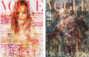
Vogue on Vogue

0 Commentsby   |  12.16.10  |  Magazine covers

From Fall Pub Design student Sandra Amstutz: This is something I thought you might find interesting. All of the covers of this year’s Vogue are superimposed on top of each other and then compared with the Vogue’s of other countries.

COLOR IN MOTION

0 Commentsby   |  11.23.10  |  Color

COLOR IN MOTION

True to type: why letters are a labour of love | Art and design | The Observer

0 Commentsby   |  10.19.10  |  Typography

True to type: why letters are a labour of love | Art and design | The Observer.

Typeface Pairing by Typophile

0 Commentsby   |  10.05.10  |  Typography

Typeface Pairing

Mixing Fonts by Hoefler & Frere-Jones

0 Commentsby   |  10.05.10  |  Typography

Mixing Fonts | Hoefler & Frere-Jones.

Under new federal guidelines all New York City street signs will have to be made lower-case – NYPOST.com

0 Commentsby   |  10.01.10  |  Typography

Under new federal guidelines all New York City street signs will have to be made lower-case – NYPOST.com.

Goudy in Popular Science

0 Commentsby   |  09.30.10  |  History, Typography

This embed won’t work on the iPhone, but it’s a good read:

Pop Science Goudy

The Road to Clarity

0 Commentsby   |  09.28.10  |  Typography

The Road to Clarity

The New York Times reports on a change in highway signage typography in this story from 2007.