The Critical Role of Typography – The Atlantic
It’s not just for Helvetica snobs.
The website for the Communication Design course at Abilene Christian University
The Oxford rule sounds like article of law, but it is more mundane: a thick and thin line that sits side by side, which appears in the earliest printings in history.
Source: How the Oxford Rule Led to Rolling Stone – Print Magazine
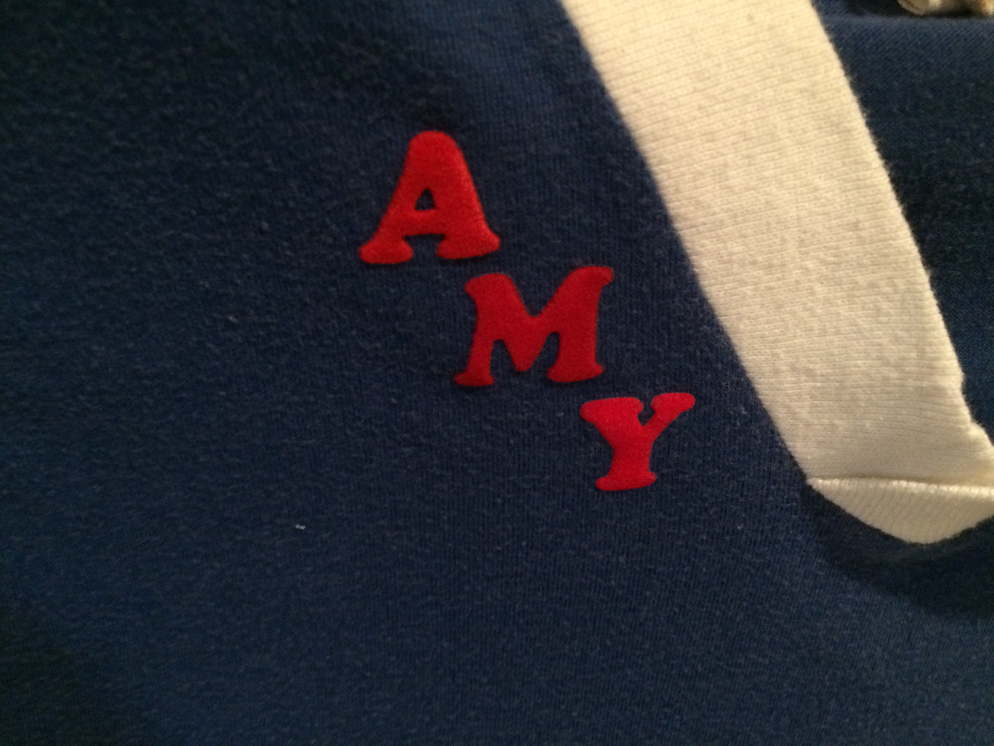
As I note in class, every kid in 1977 had a shirt with their name on it in fuzzy Cooper Black letters. This one belonged to my wife.
Everyone from Topshop to Whistles is offering T-shirts adorned with the goofy typeface – subliminally referencing the 70s, sitcoms and, ahem, easyJet
Source: Just my type: how Cooper Black became 2017’s most fashionable font | Fashion | The Guardian
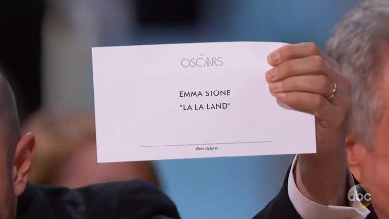
There was a major twist ending and a major snafu at the very end of the 2017 Academy Awards for the category of Best Picture. The wrong…
Protestantism was the first religious movement to take full advantage of the new powers of the press.
The so-called Legibility Wars occurred in the 80s and 90s, defined by stark divisions between young anti-Modernists and established followers of Modernism.
Source: Lost—and Found—in Translation: The Legibility Wars of the ’80s and ’90s – Print Magazine
Once called the ‘eighth wonder of the world’ by Thomas Edison, Linotype typecasting machines revolutionised publishing when they were invented in 1886, and remained the industry standard for nearly a century after. The first commercially successful mechanical typesetter, the Linotype significantly sped up the printing process, allowing for larger and more local daily newspapers. In Farewell, etaoin shrdlu (the latter portion of the title taken from the nonsense words created by running your fingers down the letters of the machine’s first two rows), the former New York Times proofreader David Loeb Weiss bids a loving farewell to the Linotype by chronicling its final day of use at the Times on 1 July 1978. An evenhanded treatment of the unremitting march of technological progress, Weiss’s film about an outmoded craft is stylistically vintage yet also immediate in its investigation of modernity.
Source: The last day of hot metal press before computers come in at The New York Times | Aeon Videos