- Digital Photography
- Previous Workshops
- Academy Group Shots
- Behind the Scenes
- Photography Gruene Fall 2014
- Photography – Gruene, Spring 2013
- Photography – Gruene, Fall 2012
- Photography Gruene, Spring 2012
- Photography – Gruene, Fall 2011
- Photography Gruene, Spring 2011
- Photography – Gruene, Fall 2010
- Lightpainting – Fort Griffin, Spring 2011
- Lightpainting – Marfa, Fall 2012
- Lightpainting – Fort Phantom, Spring 2012
Recent Comments
-
game right
Howdy, I believe your blog could possibly be having web browser …
More » -
JerryAnige
Знаете ли вы? Один из старейших муз…
More » -
Raybowlescarpentryandbuilding.Co.Uk
I am sure this paragraph has touched all the inmternet users, its…
More » -
http://www./
Couple of thoughts.From everything I’ve read – the sh…
More » -
Vina
Very true! Makes a change to see sooemne spell it out like that. …
More » -
Magda
Compré el modelo anterior, el Ford Leño, y fue un fiasco to…
More » -
Maryellen
It’s not consumer choice that closes poor hospitals and sch…
More » -
http://www./
That’s more than sensible! That’s a great post!…
More » -
http://www./
What’s it take to become a sublime expounder of prose like yourse…
More » -
http://www./
Keep up the good piece of work, I read few content on this i…
More »
-
-

Faculty Enrichment
A retreat led by the AT&T Learning Studio, building skills and confidence in digital creation.


Ginna Sadler
10:55 pm, 04.12.11
I am drawn to the last one with the star and gable. The gable seems to be pointing up, up, and away.
Donald Philip Simpson
7:53 am, 04.13.11
I like that one as well. Nicely done!
Kyle Dickson
8:20 am, 04.13.11
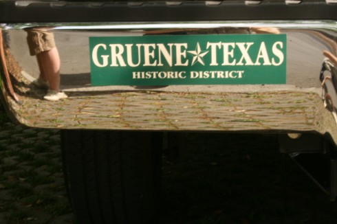
The bumper sticker is great setting the others in context but I love the way you see a skewed picture of the world in the chrome.
Nil
8:22 am, 04.13.11
I agree, I see the arrow pointing up. But I also think the first one has some interesting elements: reflection, bumper sticker.
Tracy Shilcutt
2:30 pm, 04.14.11
I like the framing on all of these Tina.