Andy Munoz's Archive

Final Reflection

0 Commentsby   |  05.12.11  |  Reflection (P5)

This project was a little overwhelming to me at the beginning. With all of the other projects and things i had on my plate at the end of this semester it was really hard to start this project. I enjoy designing websites and in the end i always hoped i had put more time and effort into them So in this project i decided to do that. The work with the groups always helps to get me excited and ready to start the project. Seeing everyone work together and coming up with ideas is really inspiring and helpful. As far as the process goes im the first to say that i am not very good at sketching out ideas and wireframes. But knocking out some of this in a group really does help me to get the ball rolling. I felt like i didnt have many technical mistakes. Sure there are plenty of them in my project but compared to other previous projects i was much careful and payed more attention to detail in this project, which took me to an end piece that i was fairly proud of, more proud then any other piece. I felt like i could have spent more time on the websites layout and branding. Although i like where it is headed, i feel like this is just one stop on the way to the final piece. As far as improvements go, using columns and grid structure in this project really helped me out when it came down to the clean look i was going for. I think there are a few places where i broke the columns and mixed and matched but it was all on the same grid. The process in this final was definitely improved because we did it as a group. I enjoyed working on the wireframes in class way more then on my own. In class i can see the website and how it would be used and explored. On my own i am just making squares and boxes. Which could be improved a lot.

Task List

0 Commentsby   |  05.02.11  |  Task List (P5)

The food banks will:

Go to the homepage.

Log in

Complete inventory list

Categorize and enter quantities of food.

Add an event

Update contact info and food bank info.

Put out requests for items.

Volunteers/Needy will:

Go to homepage.

See full list of food banks and status of inventory for food banks.

Click on the indicidual banks to see detailed lists of inventory.

Find locations of banks on google maps.

See events and opportunities to help out or be helped.

Search function to find events and nearby pantries.

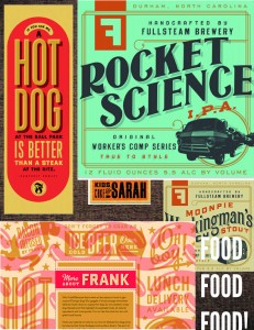
Mood Board

0 Commentsby   |  05.02.11  |  Mood Boards (P5)

0 Commentsby   |  04.15.11  |  Task List (P4)

User will:

1. Sign into their created account.

2. Search for beaches to surf at:

-Best beach breaks.

– Top rated beaches

– Most popular beaches. (Where friends are)

3. Be able to accumulate followers/friends.

4. Update surf report at the beach they are at so others can see how the surf is.

5. Comment and rate:

-Beaches and breaks.

– Other users comments/updates.

– Other users.

6. Create and invite other users to events at specific beaches.

– Update event according to how the surf is. (Easily change from one beach to another)

– Users “attending” the event will get notifications based on the location of the admin.

7. View map of the coast to see where the most popular and highest rated beaches are.

8. See a live feed of friends/followers updates and ratings.

9. Upload and view videos/photos.

– Rate videos and photos.

-Comment videos and photos.

10. Write and read reviews on certain beaches.

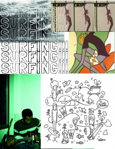
Surfing Mood Board

0 Commentsby   |  04.15.11  |  Mood Boards (P4)

Blog Reflection

0 Commentsby   |  03.25.11  |  Reflection (P3)

This project was hard to wrap my head around at first. I knew that we were doing a blog but it was hard for me to understand what all we were going to be tackling in this assignment. It was fun looking through all the wordpress themes and blogs that I usually surf on the web, and looking at them as inspiration and taking little elements out of each blog to incorporate in my own design was a lot of fun. I think the strengths I have in this design are more hidden then the weaknesses. It’s not that i believe that I have more weaknesses then strengths but that my weaknesses are a lot more apparent and noticeable. First of all, i really need to redesign my “recently added posts” segment in the single post page. It looks amature and unfinished. I thought that the typeface I used for the post titles was also a weakness that I had. it looked good to me at first, but after working with it for a while I decided that i wanted to change it. It doesnt match the rest of the design as far as cohesiveness goes. Another weakness that I see on my design is the post a comment part. To me it looks unfinished and lacking in detail. I need to figure out a way how I can treat multiple comments and comments on comments.

As far as strengths go, I feel that, besides one typeface, it is all very cohesive. The whole design flows from page to page and it is really easy to understand. It is a very simple design and a photography based site. I was very pleased with the way that i treated and handled the photos i chose as they represented the post. I don’t think i need to learn anything in order to make my design better, the only thing that I can do to truly improve in this design is just to spend more time on it. There are a lot of things that i wasnt happy with in the end that i can improve with just more time.

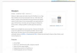
Theme Inspiration

0 Commentsby   |  03.07.11  |  Announcements, Inspiration (P3)

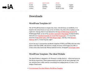
Information Architects

ULF Pettersson

Graph Paper Press

User Scenarios

0 Commentsby   |  02.14.11  |  User Scenarios (P2)

Eric, 18, San Diego, CA

Eric is a highs school student in  San Diego, CA. Recently he has become a vegetarian just to see what it would be like. All of his friends are not and they have all made plans to go to a restaurant in downtown for prom. Eric is torn because he does not want to miss out on this awesome time but also does not want to push aside his beliefs of being a vegetarian. So Eric gets on the website in order to see what meals will be available that are completely vegetarian and what meals can be made vegetarian.

Sean, 23, Arlington, TX

Sean is a college student in Arlington, TX. Sean’s girlfriend lives in CA and is flying out to Dallas to visit Sean. Sean is picking up his girlfriend Laura in the Dallas Airport and wants to stay in Dallas for a night and find a nice restaurant to eat at that has online reservation and also gluten free meals as Laura can not have meals that contain gluten. He gets on the web and needs to find a restaurant whose website contains all this information.

Andy’s Tutorials

0 Commentsby   |  02.14.11  |  Tutorial Links

Andy Reflection

0 Commentsby   |  02.09.11  |  Reflection (P1)

HThis project was a really tough one for me to wrap my head around. From going to designing packages and posters all last year to an interactive interface with buttons and links was really hard to get started on. I feel like the biggest weakness that i had during this project was conceptual. It took me some time just to get my direction and get rolling on my design. To be honest i had looked at the AIGA website so much that it was more complicated to create a new design than it should’ve been. The treatment of all the text and how to organize it was so hard for me. I had trouble straying away from the original AIGA design because thats all I had been looking at for the past few weeks. Unlike designing poster where there is literally hundreds of pieces of inspiration out there, looking for inspiration for web design seemed to be a lot harder for me. It took me over 2 weeks of mixing and matching and trial and error to finally get my direction down and get rolling on my design.

As far as my stance on the technical issues, photoshop is a very tedious program to use. I don’t mind designing in it but when it comes to dealing with shapes and different treatments of type, it became very frustrating. I could’ve designed in illustrator and moved it over to photoshop but I think that doing the whole project in photoshop will help me become more familiar with it like i am illustrator. And thats what im striving for.

I already know that there are areas that i need to improve on. One are that i was very unhappy with was the way that i treated the text in the articles. I feel like the text is too cluttered and that i couldve spent a lot more time focusing on that. Overall i feel like it was a good project as far as my knowledge of web design goes. I learned a lot and really am looking forward to do it again.