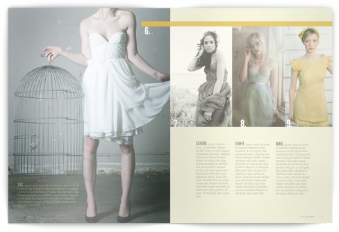
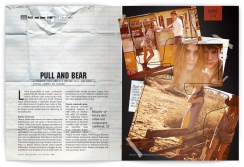
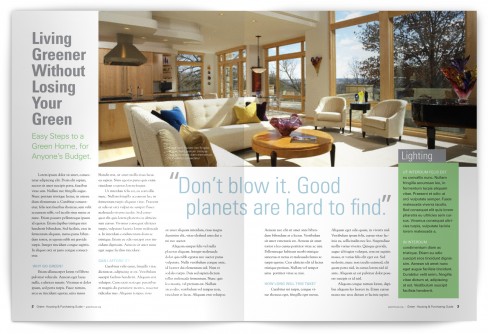
This is some student work from my Digital Graphic Techniques course taught over Maymester. This project focused on grid structure and typographic hierarchy in the context of multi-page layouts. You have to give it to these students, this is the first project of their second graphic design course. Enjoy it… and please leave a comment or two.


Thanks for posting them, Mike. I find these designs very refined and beautifully executed, especially knowing that a maymester class puts more pressure due to its short time. Congrats to those students!!
Thanks for commenting! You have broken the silence of this blog. Hopefully you have started a trend ;-)
I’m pretty impressed. The evolution of the work since I left has significantly improved! Good job Mike and Nil. Give yourselves a pat on the back.
Nice work guys. It’s always refreshing to see student projects.
Great work, digging the presentation of the spreads as well.
It’s amazing what a little photoshop trickery will do to a PDF.
these pieces are amazing! way to go fellow ACU students. I’m proud.
Great publications – very clean and crisp. How did you get the bend in the magazine and the shadow? Are those printed and photographed?
It’s all Photoshop trickery. The pages are square, there is no bend… well, I guess there is a bend in the shadow. That’s what gives the illusion of a bend in the paper. The rest is just some strategic dodging and burning. The original is a PDF opened in Photoshop.