Zack Giuliani's Archive

Zack G Project 3 Reflection

0 Commentsby   |  03.23.12  |  Reflection (P3)

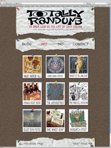
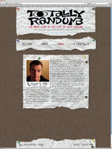
I think this project was one of the most difficult ones yet, mostly because it was so open ended. The name of the website, the target audience, the subject matter and the look were completely open ended, and that was very difficult for me to find a starting point for. As per usual I procrastinated way too long on this project as well, so I didn’t get any constructive feedback about my direction, which definitely hurts the learning process. I also noticed that I used the grid structure to format the site, and I used it for all my tool bars and headers and footers and such, but didn’t rely on it much at all when formatting the text. Another problem I face (which I put myself into) was my direction. I’ve seen soooo many boring blogs out there that just have information on the screen in a very boring way and they don’t hold my attention, so of course I decided to try something I haven’t seen as much of, and went with the bulletin board approach. My initial idea was to create an extremely user friendly site, in which the user could practically drag and drop whatever posts they wanted, wherever they wanted, almost like rearranging magnets on a fridge, or placing sticky notes in whatever order they wanted to. The other challenge I faced was executing this idea in an artistic, fresh looking manner. Like I said, I get so tired of all the blogs out there that look like a businessman with Microsoft Excel made them, so I wanted mine to have a kind of fresh, young looking feel to it. It was later that I actually decided to use my own art works and stories for the pages, mostly because I couldn’t think of a better client to create for, hence the name “Totally Randumb”. That is exhibit A of my lack of creativity. To wrap things up, I liked this project because it made me solve a lot of things for myself instead of just being told who to create for, but it was that same open-endedness and my lack of a creative idea that hindered me from creating something better.

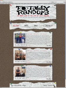
Zack G Project 3 Final Comps

0 Commentsby   |  03.23.12  |  Final Comps (P3)

Zack G – Restaurant Reflection

0 Commentsby   |  02.29.12  |  Reflection (P2)

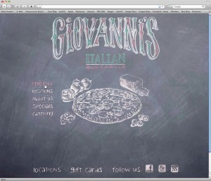
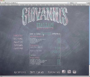
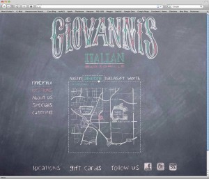
After completing this project, its actually kind of fun to look back on it, because it was so open ended, and I think each student had an opportunity to show their own personality. It probably won’t be very often that an entry level graphic designer will get to completely develop their own web site however they want it. Usually we will be coached to create something the client is looking for specifically, and because of this, there is not as much of the artist’s identity in the site (or project). One thing I definitely struggled with in the beginning was the use of a background picture, and foreground pictures, and how to successfully merge the two. Every time I’d use an image of food or something, it would just look cheesy. Another setback I faced was not developing my final idea earlier. I liked the direction I ended up on, but I just wish I could have arrived there much earlier, so I could have had more time to evolve the over all design, and spend more time working on negative spaces, and hierarchy issues, and even color issues. I kinda shot myself in the foot by waiting as long as I did, but overall I am not too ashamed of my final project. Butt again, I do think this was a fun project and I definitely enjoyed the freedom to explore your own theme, and choose your own target audience.

Zack G – Giovanni’s Restaurant

0 Commentsby   |  02.29.12  |  Final Comps (P2)


Zack G Project 2 Progress

0 Commentsby   |  02.22.12  |  Progress (P2)

Zack G User Scenarios

0 Commentsby   |  02.13.12  |  User Scenarios (P2)

Name: Jim

Age: 68

Location: Abilene

Occupation: Retired

Jim is a retired carpenter, who lives alone. Jim doesnt have a car to drive aroud town, but likes to eat out at restaurants, so he must rely on restaurants being close to bus stops, or within walking distance of his house. Jim saw a commercial for this restaurant and wanted to check it out on the website to see if there was one close to him.


Name: Martha

Age: 32

Location: Ft Worth

Occupation: Single Mother/Banker/Commissioned Sales

Martha is a single mother of 3, and works two jobs. Between her two jobs and and taking the kids to and from school and their extra curricular activities, she doesnt have aas much time to cook as she would like, and is forced pick up food from restaurants to feed her family. Martha checks out this website to see the affordability of this particular restaurant, if they have carry out, delivery, or catering options, and if they describe the quantity and nutrion facts of the food.

Zack G – Restaurant Inspiration

0 Commentsby   |  02.08.12  |  Inspiration (P2)

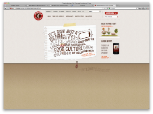
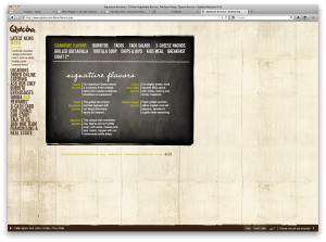
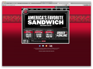
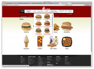
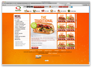
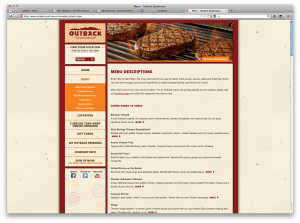
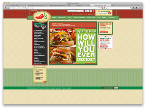
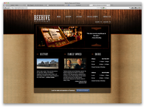
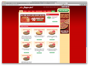
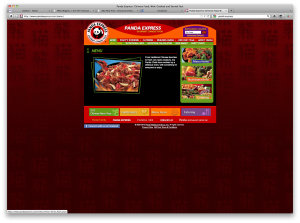
Here is kind of a hodgepodge of websites… multiple directions.

Zack Giuliani – Reflection

0 Commentsby   |  02.03.12  |  Reflection (P1)

This entire process has been a fun challenge for me. I’ve never tried to design a website interface, and I don’t use photoshop all that often, and those are both things that I want and need to change. I think my biggest downfall in this project was that I got started a bit late, and spent too much time dealing with the technical aspects and the wireframing, and didn’t develop a successful visual language in my final piece. The only elements I really have are the translucent grey backgrounds and the heavy blue title bar and tool bar buttons, which don’t really have anything to do with eachother… On top of that, I have trouble working in photoshop, therefore do all my working in illustrator and have to transfer everything to photoshop, and get to deal with any translation errors.

There are some areas in my piece that I feel like are more successful than others. I do like the translucent grey background boxes, even though I said earlier that they don’t really tie into the visual language with the blue banner up top. I don’t want to brag and say they are amazing, because they aren’t but they do look like something you would actually see on a real website, which to me is achieving the desired outcome.

I don’t want to say this project has grown my skills from classes in semesters past (it has) but this whole class is going to improve my vision as an artist. Not to say that I am going to walk out of this class as an amazing web designer, but it is opening up my horizons, expanding my skill set, and if nothing else, at least I can be more discerning and have a more critical eye when browsing the web.

A few things I need to learn to improve are 1.) GETTING STARTED EARLY…. I always get a late start on my projects and have to rush to finish them instead of taking time to refine them. 2.) Creating stronger visual languages in my pieces… Already been said, but I need to work on creating new concepts that flow and are appealing to the eye. 3.) creating successful type languages and hierarchys… I think my over all hierarchy in my piece did its job, but it could have been done in a more visually appealing way… I’ve never been too great when it comes to font choices… 4.) I need to become more fluent in photoshop…