Archive for ‘Project 3’

Project 3 Reflection

0 Commentsby   |  04.01.12  |  Reflection (P3)

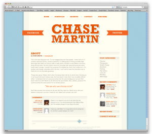
I enjoyed this project however I did have some confusion of all the details we needed to add to the blog site. The first time I started my homepage I didn’t realize that it normally has recent blogs on the homepage that can look similar to the blog page. The first comp I made looked more like an ‘about page’ rather than a homepage for a blog. I think I improved on my blog actually looking more like a webpage but with crafty visual elements. I think I improved on the feel of a website but I think I need to improve on my website designs to look more professional.

I don’t think I struggled with more with technical mistakes for this project than the last projects. I figured out to bring in the webpage jpg into Photoshop and using that at the correct size as my webpage. I also was able to use grids better since the webpage was the right size. I think the technical complications I had was possibly spacing but I tried to space out the best as possible but it’s not perfect.

I think one of the struggles I have is making my websites look more professional. I think I presented a lot of visual elements into my blog pages and similar blue colors that looks somewhat intermediate work. I think I need more color themes and possibly less visual elements to make the page look more professional like it belongs on a website.  I think with my webpages would look better with another color and not all the blue colors.

I think a strength in this project is that it looks visually pleasing like a blog should look like and the layout of the webpages fit well. I think a strength was having all the elements on the pages that were needed on a blog. It was too bad I missed the critique but I feel like a critique would help out improving my page to look more professional.

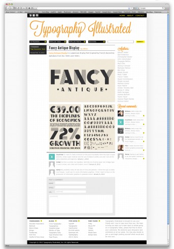
Typography Illustrated

0 Commentsby   |  03.27.12  |  Reflection (P3)

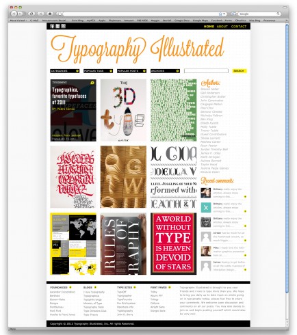
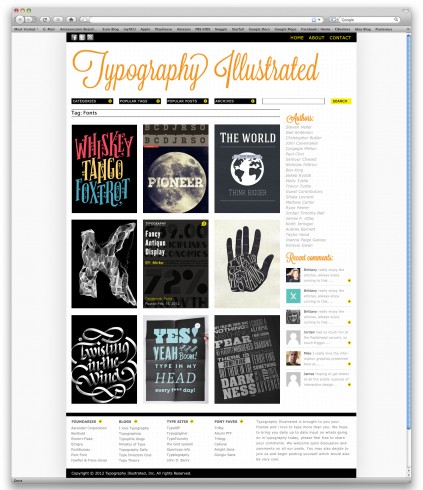
I really enjoyed this project. Blogs are one of the most commonly used formats on the web and i use them constantly, the decision to create a typography blog was an obvious one to me. Its something that I am most familiar with viewing but this project has definetly changed my perspective on their functionality and how delicate the hierarchy and layout of a blog can be. Overall I think my idea was much stronger with this project and the process work helped enormously in formulating that idea. For this project specifically I decided to focus more on my preliminary drawings, which I am increasingly learning more and more that the process is vital to producing a good quality website. On this project I still struggled with finessing the fine details that really made the hierarchy work. Although i feel my design solution was functional and pleasing to look at, I think next time I will approach the initial concept and try to find as many diverse and dynamic solutions as possible. I believe my websites have been lacking a sense of originality and i hope to change that in the future. As far as techinical difficulties it is still takes me quite some time to do work on photoshop and im hoping i can add some more three dimensionality to my work which i feel it is lacking. Overall i really enjoyed this assignment and i find interactive design to be quite a challenge, but also something i would like to continue to improve on. I find that my work tends to use a strick adherance to the grid, while sometime this can be very positive, but i really want to push back the grid. Use it without it dominating the design which is definitely something that can increase the quality of the design.

Typography Illustrated

0 Commentsby   |  03.27.12  |  Final Comps (P3)

Personal Blog Design

0 Commentsby   |  03.25.12  |  Final Comps (P3)

Project 3 Reflection

0 Commentsby   |  03.24.12  |  Project 3

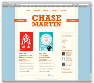
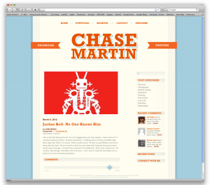
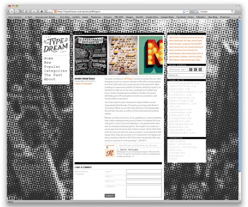
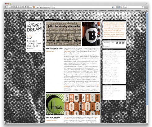
During this project, my main idea was to do something that I hadn’t in the past two. I wanted to incorporate a retro feel and a strict grid system to my already existing hand-lettering. I think I accomplished this, but might have missed out on some other opportunities.

As far as strengths, I think my look and feel really came together nicely. I like the aesthetic it bring and its uniqueness. I also liked how my hand-lettering played into the retro feel of the design. You mostly don’t see the two genres mixing that much (that is, 90s computer graphics and distressed, classical lettering). I also really liked the idea of only having one accent color, the rest being in black and white. I think this complimented the typography and retro feel very nicely.
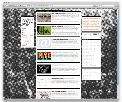
I didn’t get that much critique on this project so I am not completely sure what all the weaknesses are, so bear with me. I think there might be some odd hierarchy in parts of my design. This can maybe be seen in the top of the middle section of the categories page. Along with the categories, Mallory helped me work out some spacing in each categories box, but it may still be a bit tight. I wanted it to be a bit stuffy, but obviously not too much. I also think one of my weaknesses also could have been that I didn’t experiment with many other directions. I had an idea, and ran with it! Hopefully it worked.
Technically I was much more satisfied with this project than the past two which hopefully means I’m getting better at the whole photoshop web design stuff. At first, I would have an idea and it would take me forever to execute it. This time I felt more confident and able.

In general overview though, this was my favorite project. I mostly don’t like extremely open-ended projects, but this one came out good in my opinion. I liked being able to create a specific idea and then execute it. I say this meaning, I liked building from the bottom up. No redesign, not model or preconceived plans, just creating something new and unique. It was definitely a learning experience and hopefully a portfolio piece!

Final Comps

0 Commentsby   |  03.24.12  |  Final Comps (P3)


Post

Home page

Categories

Reflection Número Tres

0 Commentsby   |  03.23.12  |  Reflection (P3)

At the beginning of this assignment I felt like I had no idea what was going on. It was frustrating for my domain name to fail to work for the first few classes and I felt so behind the entire time. I could have had the mindset that I won’t catch up, but I didn’t allow myself to think that way and kept truckin’. That being my motivational story, I’ll  move on.

I can see improvement on my treatment of hierarchy and am feeling more confident in that. I feel that, that leaves more room to focus on other details, which was exciting. I realized that the other details was more hierarchy that I hadn’t addressed in previous posts. I hope that I utilized space more successfully. I did see some areas on my archival page that I should have worked on further. I still need to produce more sketches and add more content to my wireframe. I forget how important this preliminary work is and that could really hurt me at some point. I felt like I could have done better with the headers, but it allowed me to play with a new element. I don’t regret going with that element, but it’s definitely something I want to improve upon. I would also work on my elements such as icons. I think that I’ve improved on them, but I want to continue to find more solutions. I think that I can always improve on type treatment, but I branched out some more on this project. I hope my eye for typography continues to sharpen.

My fragments have improved x10. I think I may have put too much thought into them, but it really helped me visualize what the whole blog could look like. I found that incredibly helpful. I think my website looked more finished than in the previous projects. I suppose that means I keep improving, which is quite encouraging. I hope nothing slows me down for this next project, like a milkshake spill or new technology to me, but life happens. It’s been interesting to see how things turn out. I enjoyed creating these pages; I can definitely see myself making so many more different layouts.

P3 reflection

0 Commentsby   |  03.23.12  |  Project 3

I feel good about this project – technically and conceptually.

I spent more time sketching for this project, and I can tell that it helped. My project felt more cohesive from the beginning and I didn’t have to spend as much time making all the details match up. I also have a couple other blog themes ready to mock up for my portfolio.

I’m getting really comfortable in Photoshop and I really enjoy working in it. I think the elements I create are starting to look less clunky. Also, I’ve started to notice details on websites I visit. Once I notice these things I am getting better at figuring out how to make them.

While working on this project and lately at the Optimist, I noticed that I am becoming more sensitive to hierarchy. I used to have to make myself think about managing levels of hierarchy, but recently I have noticed that I have a couple of levels defined right off the bat. While I was working on the first project in this class, I noticed how bad I was at setting leading. I’ve made an effort to improve that, and I think it’s getting better.

I haven’t figured out another specific area of design to focus on, but I think it helps to find one area to keep in the front of my mind while I design so I can make it more intuitive.

Project 3: A Reflection

0 Commentsby   |  03.23.12  |  Reflection (P3)

With this project, as with all the projects beforehand, my biggest problems stemmed from using Photoshop. The medium is still difficult for me to design with, and though I can definitely see myself improving, I still would not say that I am entirely proficient. That said, I have started to love the nuances of designing in Photoshop, as opposed to Illustrator or inDesign. Photoshop allows me to be extremely detail oriented, and I can easily lose hours adjusting opacity, changing colors, adding shadows, ect.

With this project, one of my initial design problems was using too much reversed-out text. I went into this assignment with a dark color scheme in mind, and started with all my body copy white-on-dark, not realizing the eye strain that much reversed out type could create. My biggest issue after that was using a lighter background color on my dark themed site. I tried a number of variants, and ended up matching the color of my white(er) heading text. I was afraid that the sudden large area of white on dark would draw too much attention, but once it was matched up with images and copy, it all evened out fairly nicely.

Another issue I had was finding a balance between text and images, especially on my main page. I wanted the main page to catch the eye, as it’s the first thing a viewer would see, and really determines whether they view the site or not. My initial design was primarily text, as I imagined a blog had to look. I was stuck on blog themes stemming from Blogspot that were text heavy and image light. After reviewing my inspiration and broadening my mind on what a blog can actually entail, I allowed a lot more images into my site, helping the overall look and feel tremendously. I even went so far as to hide most of the body copy on the first page, only revealing it over a mouse hover-over.

Perhaps my biggest concern with this assignment, and with all the assignments before it, is how difficult it was for me to initially approach the project; and I know exactly why that is: sketches, fragments and wireframes. I always see the huge importance of those pieces after the fact, and then approach the following project the same way, tackling the main project on it’s own, only after I have a single idea in my head. It’s bad design, and leads to a lack of creativity, and I need to stop it. So I will!

Project 3 Reflection

0 Commentsby   |  03.23.12  |  Reflection (P3)

Project 3 was different from the previous projects in that I felt like we moved at a much quicker pace. One way that I can tell that I have improved since the previous projects is that I was able to come up with ideas for visual language faster, and I also spent considerably less time staring at the screen trying to come up with an implementation of an idea (especially on the six visual fragments). I also feel like that my hierarchy, while it still certainly has room for improvement, came a bit more naturally to me this time – and with some help, I feel like I was able to create an easy to understand arrangement of complex hierarchy.

One struggle that I still felt on this project was color choice. Insight that I got in class critiques on Wednesday helped me to find a little bit more defined direction (as far as background pallet, link color, header image color, tag cloud color, etc) but up until that point all I knew was that something was off about the color – I just wasn’t sure how to fix it.  A somewhat more conceptual struggle that I faced, surprisingly, was how to present the archive page. I spent a lot of time thinking about and sketching out complex headers for the archive page (images, layout changes, etc). I ended up settling on a very simple label for the archive page, simply because that is what most of the “inspiration” professional blogs had done.

Technically, I felt much more confident in Photoshop starting off this project. For the first time, I was brave enough to try somewhat more complex textures and shading – although this may have led me to overemphasize certain visual languages. I also, throughout the project, had to refrain myself from adding too many different visual language options. I also feel like that I got a bit too excited about these new ideas that I tried, and ended up leaving some of the remaining visual language options a bit overemphasized. As we looked at our work this morning after turning it in and looking at the work from the rest of the class, I could already pick out several places that seemed over exaggerated (lines, custom shading on certain elements, etc). So while I am excited to branch out and try new things in Photoshop, I need to work not to let this distract me from using tastefully balanced visual language.