Archive for ‘Project 2’
Reflections Project 2
Overall there was an enormous improvement from the first project to this one. My treatment of elements progressed as well. After going through the Photoshop tutorial about creating buttons, I felt more confident in experimenting with my own. I definitely feel that I have a long ways to go–there’s always more to learn. I’m learning to enjoy Photoshop more; I love learning new shortcuts. Trying to perform one task can take forever, like finding the layer you need to work with, but now I can just command + click and there it is!
As far as technical mistakes go I realized that I failed to follow the grid structure as much as I should have. I think it would have definitely created a stronger since of unity between the pages. I struggled with varying the pages; I tried not to venture too far from the overall layout look and feel. I need to continue to learn more and improve my use of hierarchy. It’s frustrating because I’ve worked with it time after time, but I still make senseless mistakes. I need to be producing more sketches, but I feel like I’m getting there!
Conceptually, the beginning process was not what I ended up with, which is just fine. I feel that I still struggle with communicating what my vision for how things should work. That’s always a challenge though. So hopefully I will be able to better depict my site map for the next project and it will not be a stumbling block.
I was glad to have more freedom in this project, it could have been daunting, but I feel that I found a subject I was passionate enough about to keep it concise. I think a strength is that I really strive to listen and take critiques seriously, if something needs to be changed I am willing to at least try it, if not completely go with the suggestion. It was a wise decision for my menu page as well as a text box on the home page of my site. I thoroughly enjoyed this project and wanted to keep making pages!
Project 2 Reflection
During this project one of my main technical weaknesses was in color choice and type size – although it was very helpful that at every critique people were able to help me refine my choices. I tend to default to using too many colors that are too strong, while also using text that is too big/close in size that dilutes the hierarchy. I also am still lagging behind in technical photoshop skills. While I did try to branch out and integrate textures, they came from a “guess and check” method as I still am very new to the process.
Conceptually, I feel that I may have put too much content on my site, simply because I felt that if I did not have enough text the site would feel empty. This then diluted my attention when it came to time to add details that could have really improved the overall design. Looking at some of the other projects in this class, some of my favorites had relatively little text and simple layouts, but you could tell that there was more attention to small details and subtle visual languages.
The input that I received through the course of this project has helped me become better at avoiding awkward negative space and using subtle visual language. My first rough comp of the home page featured strong gradients, strong textures, and text boxes that weren’t aligned horizontally. Each time I worked on this project, I made it a point to look at all of my visual language options and tone down anything that seemed distracting to me – by the end of the project, they were much more subtle and effective.
From the previous project, I feel like I have started to become more open minded in regards to picking a unique design/layout. While my design was still fairly traditional, I forced myself to think of alternative options in several cases (such as the breakfast,lunch,dinner etc at the top of the menu page) that I ended up liking more than my original idea. I also feel like I was able to put my own personality into the design a bit more than the previous project – part of this may be due to the fact that we designed from scratch this time, but I also feel like I am becoming somewhat more comfortable coming up with my own unique design directions.
reflection
So we just completed project 2 and I can say I am fairly pleased with the outcome. I feel like it could have been better with a few small adjustments, but overall I was happy with the look and feel. I will say how much faster and easier this project was in comparison with the last one. Perhaps it was the amount of time given, but I would like to think it is due to becoming more familiar with building a website and the program.
I made one major technical mistake in the beginning that slowed down my progress and probably haltered me from fulfilling the true potential of this project- I used a screen shot of the grid lines rather than taking the time to make them. Somewhere along the line I realized I couldn’t really see the blue lines and I was more just going off my own eye. After spending time completing two different directions was when I noticed the downfall of this. I realized how off center and unaligned everything was. So being 45% done (I’d say after getting the homepage done, the other two pages flow and take significantly less time), I had to almost start completely over. I went back in and put in the grid and realigned what I had. Through this though, I realized how off some type and photos were so I ended up pretty much having to redo all of it.
I also will admit I procrastinated on working on the 3rd page until the last minute and you can tell. I didn’t spend a lot of time on it at all and in some ways it feels incomplete to me. I didn’t refer back to my sketches and I think thats where I messed up. As I had already taken the time to sketch out my plans on how the site navigated and would work, I already had the hard part worked out.
I do think I was able to handle hierarchy and negative space a little better than in the last project. Whether that be because we could choose the info put into this one, I don’t know. I think I still need to work on clear hierarchy and placement.
FINAL REFLECTION
Creating websites is hard work. Or at least using Photoshop is. I have never been as mentally and physically drained as I have after I’ve spent time working on websites in Photoshop. I know why this is: I’m still learning. But the learning process is grueling. The results however, are fun and rewarding, and I’m excited to eventually know Photoshop like the back of my hand. Speaking of results, I was fairly happy with my final comps for this project. I wanted the design, layout and color scheme to look just as appetizing as the food itself, and I feel like a reached a good spot with that. The browns and yellows echo the colors of the burgers, while the blues bring in the ‘beach vibe’ that I was trying to capture (along with some help from the photos). My font choice (a nice, soft slab sans-serif called ‘Cubano’) provided a great ‘beach-y’ feel while also being fun and playful, perfect for a burger hut. I also kept the corners of all boxes round, to match the type-choice as well as keep an overall aesthetic or soft, round, and delicious.
Whenever I found restaurant websites that I liked, they always had one thing in common: they were very simple. When I go to a website looking for food, there are only really two things I care about: what kind of food do you have, and how can I get that food. Everything else is really just filler or the Restaurant tooting it’s own horn (who really cares about the ‘about me’ page?). I wanted to capture that simplicity in my own website, but I also wanted to provide an additional reason for the website to exist. My answer was to have the website serve doubly as a menu for the restaurant, but also a blog/photo log of the local San Diego surfer scene. This gave importance to the rest of the website, as well as made the website that much more interesting (burgers AND surf?? Yes please.)
I also really focused on keeping my website on a grid structure, especially on the menu page, which really helped me keep the site simple and organized with really little to no worrying about what will fit and what wouldn’t. Because I was coming up with all the information on the site, it was especially easy to fill in blank spots, as well as take out info when I needed too.
Vavino’s Reflection!
Well, this whole web design thing is getting easier. Easier, but I still have a long way to go.
Project 2 surprisingly brought up new challenges that I wasn’t expecting. I figured that it would be easier doing a restaurant website, but since we were starting from scratch, my opinion quickly changed. Starting from scratch meant, coming up with EVERYTHING – and I’m obviously no restaurant connoisseur.
Other than coming up with the information for the website, another issue that I had trouble dealing with is all the levels of hierarchy. More specifically, making sure the menu flowed and the overall look of the website. Having Links, with more links, and even more links was interesting to make sure that the levels of importance was properly displayed; however, after trail and error, I think that it is now working.
One thing that I really like about my website is how I used organic “slices” for the transparent background behind the text while still staying true to the grid structure. Yet again, making sure using the organic shapes while still staying true to the grid structure was difficult, but I think since it is successful, it brings something new to the element of web design (in the sense of combining organic with structure).
I know that I still have a long way to go with web design, but I’m pleased with the restaurant design I did for Vavino’s. I feel like it encompasses the modern pizza bistro and bar feel, while still not looking like every other pizza website. I need to work on type size and hierarchy more to where it becomes natural for me to choose the right type size because while although by the end of the project, things start coming together, I’d like for it to start moving towards that direction faster.
I think with this project I took our first assignment and fixed many of the problems that I had. But also, I remade some of the same mistakes just in different ways. This really helped me learn what I have trouble with and what I need to improve on. Some of these mistakes were not paying enough attention to conceptual detail and not putting enough content into the page. I am mostly very good at adding lots of detail or information and being able to portray it well.
Conceptually I had many great ideas, but on the comps you cannot see movement or action so it was kind of hard for people to tell. This one thing could really hurt my design if this scenario was a real client meeting. Therefore, I definitely need to fully think out how every small part of my website works. The auto scrolling effect was a good idea, but I needed arrows in there so people could jump to the next section without having to scroll up. I also think since it was a grungy bbq restaurant I could get away with not super neat typography, but I have definitely done better in my time and should put more focus and thought into what I love most about my design.
I believe we have all made leaps and bounds from our last assignment, but I think for our next project I need to realize what hurt me in this project and remember that for every aspect of the site. I know I needed to put more detail and pay attention to user interaction, but I made a few small mistakes and people noticed them in critique. That obviously means I didnt do what I sought out to do. I think with this in mind, my next project will be much better.
Reflection
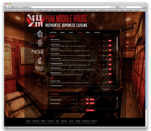
This project was easier but at the same time challenging from the last website for different reasons. It was easier and more enjoyable because I got to choose something that fit my style and personality. It made designing the website more enjoyable but so much more difficult because we had no content to begin with, it was all from our imagination. The hardest part for me was not the homepage, but designing the menu. I went back later and came up with a better way to organize all of the information, but originally it was hard to figure out a way to make it readable and organized with good hierarchy, but still fit the feel of the rest of the layout, which is fun and playful. I wanted to fit everything into a rectangle so that you did not have to scroll down the page, but that was challenging because of the amount of information needed for a website for such a small space. Organization and hierarchy was the most difficult thing to figure out on the two pages other than the homepage. I have gotten much better at making sure everything is the correct size and making it fit to the grid properly. The menu page was challenging for my design because I had to figure out how to put it on the image I had on my homepage and make it readable and useable. I didn’t want to change the layout of my page because it was in the rectangle and if I got rid of the image behind it or moved the navigation bar, then it would not feel like the same website. Coming up with the menu items for the wireframe was challenging because I dont own a restaurant and this was all made up and it took some time, but was kind of fun at the same time. I think I need to go back and rework my two lower pages to make them feel finished and more complete, to match my home page better. This project I found was more enjoyable than the Imprint magazine one, but also more challenging.
Reflection – Zach Wulf
This project was very challenging for me, mainly because on the heavy emphasis on illustration and artistic capability. As an experiment with designing an unconventional but creative website I don’t think I excelled, but I believe I improved from the last project in a few areas that needed work.
My biggest regret conceptually was not giving my shop a distinctive brand or identity; I really wish I would have drawn a handmade type for the business name instead of just using a prefab font. After seeing much of the illustrative work of others, it really would have strengthened my pages to add some kind of subtle personal touch consistently throughout the site.
Another big conceptual hurdle I have trouble overcoming is breaking the ‘barrier’ between a website and an intentionally designed piece. There is something intrinsically different when a user visits a site and doesn’t feel like they’re on a website, and I want to achieve that level of quality in my work. I am still operating within the rules of traditional web programming, and it is admittedly a hard habit to break.
On a technical level, I believe I am getting a better feel for using the grid structure on the web. Deciding which elements of a site are allowed to hang off of the main body, how subheadings and elements should behave within the grid and the placement of images are all things I think I’ve improved on from the last project by a little. It was a bit easier not having to deal with as much raw content for this site, but that made dealing with negative space much more of a challenge. Learning how to handle awkwardness on the homepage of a site with not a lot of content is a real challenge for me, and I have a lot of room for improvement in that area.
I’m also not sure if I’m getting the hang of color. In the small group critiques my group members all unanimously agreed to stick with the color scheme I used for the final, but after playing around for several hours I’m still not crazy about it.
With this project I had two goals:
1) Don’t make the user have to dig for important information and
2) Make the user hungry
In this regard I’m pretty pleased with what I made, but as stated before the site really needed that little extra something to make it a personal site for a ‘mom and pop’ type shop.

