Alan Hilligoss's Archive

Interview Findings

0 Commentsby   |  03.30.12  |  Interview Summaries (P4)

My interview findings were pretty interesting. First of all, they showed 8/10 responses that people tend to go to a theme park approximately once per year. People’s best experiences at the park tended to either be centered around the group of people they were with, a ride that they rode, or short line lengths at the park, while worst experiences involved riding super scary/painful rides, waiting in line for a long time, or super crowded park visits. Those that had used a fastpass to get in front in the line fell at 5/10. Everyone said that they would be willing to take a smart device (iPhone, iPod Touch, Android) to the park if the park offered rewarding services. Some pointed out, however, that this would be contingient on the park offering good free WiFi, while others pointed out that they would not feel comfortable bringing an iPad/Tablet to the park for fear of losing it, not being able to put it in a pocket, etc.

I also asked people what information that they would like to know about a ride/attraction before walking to it. Almost everyone mentioned that they would like to know the wait time. Others wanted to see reviews from park visitors, information/stats on the ride, and ratings in terms of how scary the ride is, how intense the ride is, and health warnings for the ride. Lines tended to be deemed important for deciding which rides to ride, especially for ones that may not be the “extreme” rides that are the most popular at each park.

Most people were excited to hear about the prospect of my App as described, and said they would love to use something like it. When I asked for suggestions for additional features, I got quite a few interesting suggestions. Some suggested having the ability to look at the park in an augmented reality interface to see overlays of information. Others suggested having ratings from the park visitors, others suggested having the ability to look at line lengths, menus, and food prices for eateries in the park. Another suggested having a list of showtimes for various other attractions.

Project 4 Interview Preparation

0 Commentsby   |  03.28.12  |  Interview Prep (P4)

  1. How often do you go to theme parks?
  2. What is your favorite theme park? Why?
  3. What is your best memory/experience from a theme park?
  4. What is your worst memory/experience from a theme park?
  5. Have you ever used a “fastpass”? Why or why not?
  6. If you could know any info on a ride/attraction before walking to it, what would it be?
  7. How important is line length in helping you pick rides and attractions?
  8. How important is line length in shaping your overall experience at the theme park?
  9. Do you carry a smartphone or mobile device when you go to theme parks? Why/why not?
  10. How do you feel about a mobile app that would allow users to view line length and ride status, and place ride reservations from anywhere in the park – and what ideas do you have to expand/improve this app?

Project 4 Ideas

0 Commentsby   |  03.26.12  |  Ideation (P4)

  1. Food Specials Database: An app for iPhone / iPad that shows limited time specials, daily specials, and hourly specials at restaurants and eateries within a certain mile range (using GPS location). Users could display the information in calendar form, hourly schedule form, or in a map form. It would allow users to filter by price range, restaurant genre, location, and more.
  2. Mobile “App” Generator: A website that allows users to quickly create a mobile site for their blog. Users would enter the RSS feed, choose images and colors, and select other options (such as community photos, location info, etc) and could then send that link to their readers.
  3. Shared To-Do Lists App: An app for mobile devices that would allow people to share a to-do list / shopping list. The lists could be broken down into categories, color coded, and given descriptions with instructions, priorities, map locations, photos. This would be designed so that families, roommates, or even co-workers could remotely share to-do lists and keep track of what tasks have been accomplished.
  4. Grocery Store Map: An in store map for mobile devices that would allow users to import their shopping list, and would then provide the most efficient route through the store while highlighting special deals that would balance quality and price for the best overall shopping experience possible.
  5. Theme Park Line App: An app for mobile devices that would show current line lengths at various attractions/eateries at theme parks, including time estimations, ride status (normal, down, double capacity, etc). The app could also integrate any fastpass functionality so that users would not have to carry around an additional device – they could place reservations from their phone and see a queue with directions on how to get to their next scheduled ride – and even decide whether or not to purchase fastpass directly from their phone without having to go into a specific location at the park.

Project 3 Reflection

0 Commentsby   |  03.23.12  |  Reflection (P3)

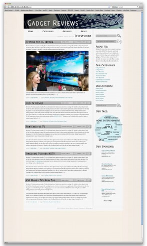
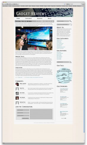
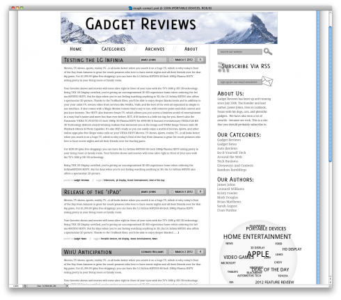
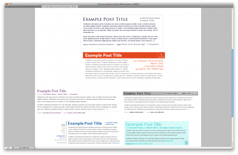
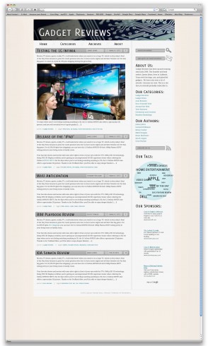
Project 3 was different from the previous projects in that I felt like we moved at a much quicker pace. One way that I can tell that I have improved since the previous projects is that I was able to come up with ideas for visual language faster, and I also spent considerably less time staring at the screen trying to come up with an implementation of an idea (especially on the six visual fragments). I also feel like that my hierarchy, while it still certainly has room for improvement, came a bit more naturally to me this time – and with some help, I feel like I was able to create an easy to understand arrangement of complex hierarchy.

One struggle that I still felt on this project was color choice. Insight that I got in class critiques on Wednesday helped me to find a little bit more defined direction (as far as background pallet, link color, header image color, tag cloud color, etc) but up until that point all I knew was that something was off about the color – I just wasn’t sure how to fix it.  A somewhat more conceptual struggle that I faced, surprisingly, was how to present the archive page. I spent a lot of time thinking about and sketching out complex headers for the archive page (images, layout changes, etc). I ended up settling on a very simple label for the archive page, simply because that is what most of the “inspiration” professional blogs had done.

Technically, I felt much more confident in Photoshop starting off this project. For the first time, I was brave enough to try somewhat more complex textures and shading – although this may have led me to overemphasize certain visual languages. I also, throughout the project, had to refrain myself from adding too many different visual language options. I also feel like that I got a bit too excited about these new ideas that I tried, and ended up leaving some of the remaining visual language options a bit overemphasized. As we looked at our work this morning after turning it in and looking at the work from the rest of the class, I could already pick out several places that seemed over exaggerated (lines, custom shading on certain elements, etc). So while I am excited to branch out and try new things in Photoshop, I need to work not to let this distract me from using tastefully balanced visual language.

Project 3 Final Comps

0 Commentsby   |  03.23.12  |  Final Comps (P3)

Project 3 Progress

0 Commentsby   |  03.19.12  |  Progress (P3)

Rough Comp #1

Fragments

Three Visual Fragments

0 Commentsby   |  03.07.12  |  Progress (P3)

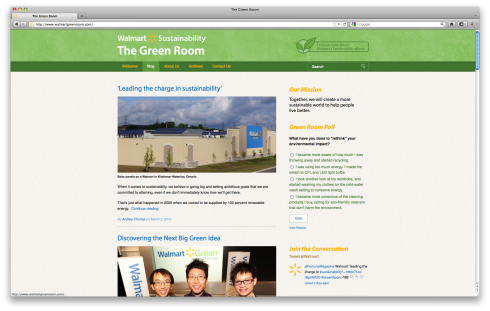
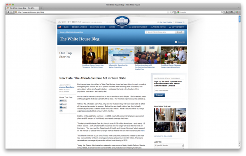
Blog Screenshots

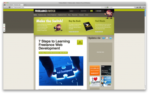
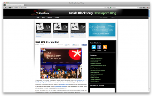
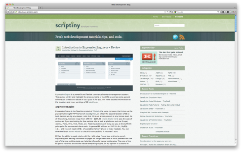
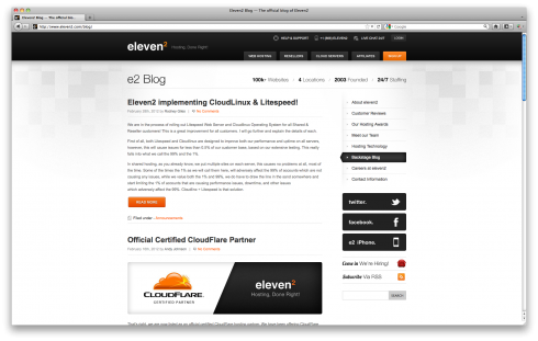
0 Commentsby   |  03.02.12  |  Inspiration (P3)

Project 2 Reflection

0 Commentsby   |  02.29.12  |  Reflection (P2)

During this project one of my main technical weaknesses was in color choice and type size – although it was very helpful that at every critique people were able to help me refine my choices. I tend to default to using too many colors that are too strong, while also using text that is too big/close in size that dilutes the hierarchy. I also am still lagging behind in technical photoshop skills. While I did try to branch out and integrate textures, they came from a “guess and check” method as I still am very new to the process.

Conceptually, I feel that I may have put too much content on my site, simply because I felt that if I did not have enough text the site would feel empty. This then diluted my attention when it came to time to add details that could have really improved the overall design. Looking at some of the other projects in this class, some of my favorites had relatively little text and simple layouts, but you could tell that there was more attention to small details and subtle visual languages.

The input that I received through the course of this project has helped me become better at avoiding awkward negative space and using subtle visual language. My first rough comp of the home page featured strong gradients, strong textures, and text boxes that weren’t aligned horizontally. Each time I worked on this project, I made it a point to look at all of my visual language options and tone down anything that seemed distracting to me – by the end of the project, they were much more subtle and effective.

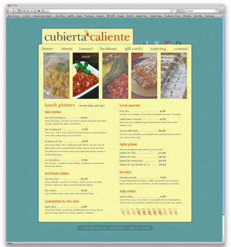
From the previous project, I feel like I have started to become more open minded in regards to picking a unique design/layout. While my design was still fairly traditional, I forced myself to think of alternative options in several cases (such as the breakfast,lunch,dinner etc at the top of the menu page) that I ended up liking more than my original idea. I also feel like I was able to put my own personality into the design a bit more than the previous project – part of this may be due to the fact that we designed from scratch this time, but I also feel like I am becoming somewhat more comfortable coming up with my own unique design directions.

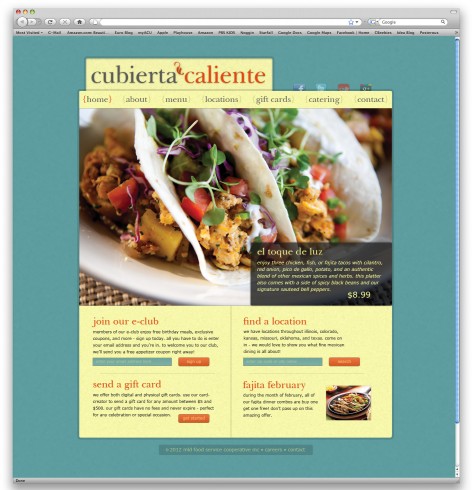
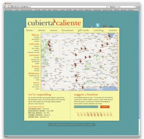
Project 2 Final Comps

0 Commentsby   |  02.29.12  |  Final Comps (P2)