Evan Marks's Archive

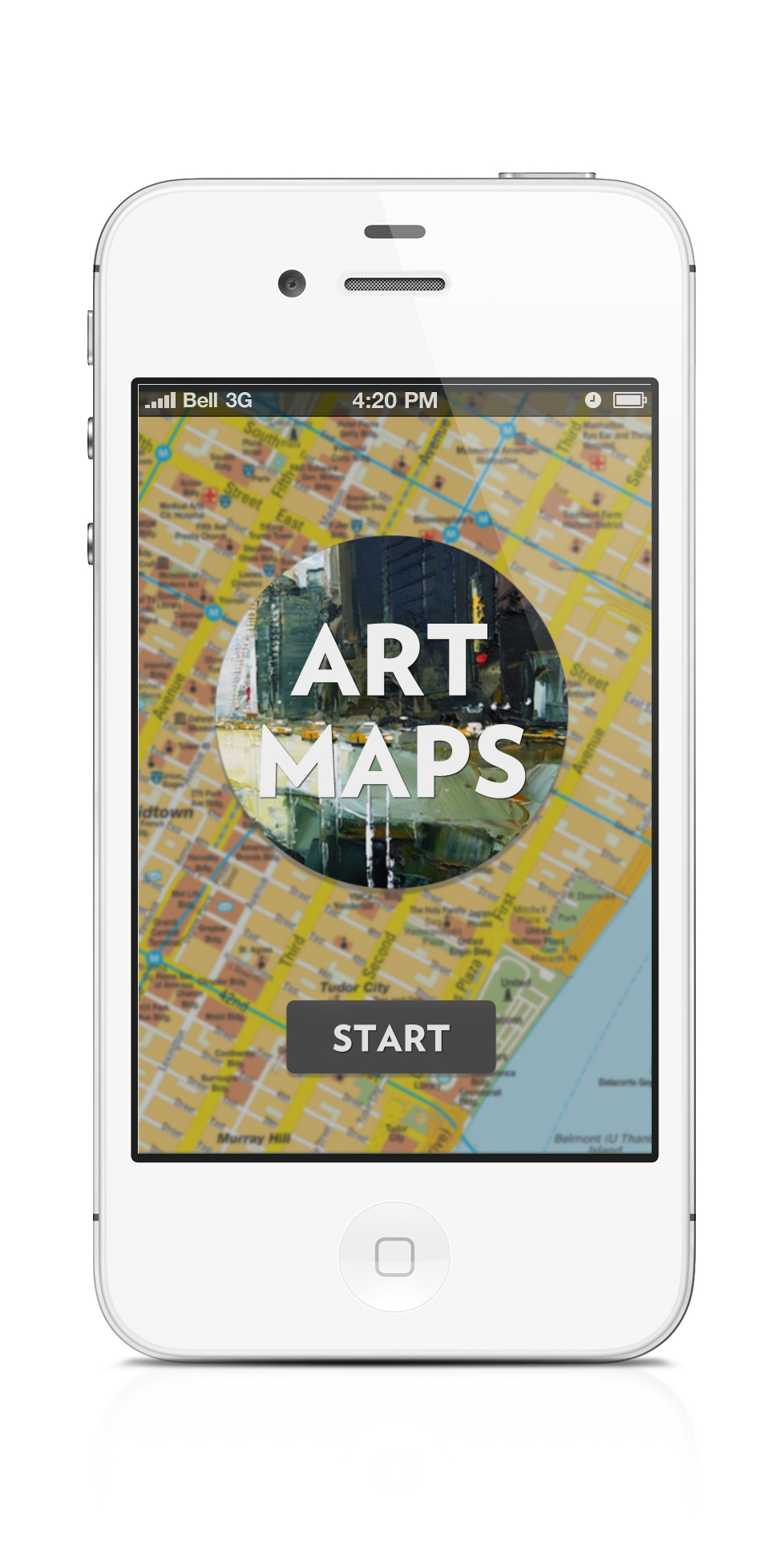
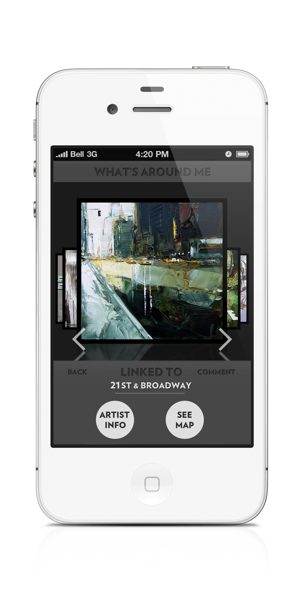
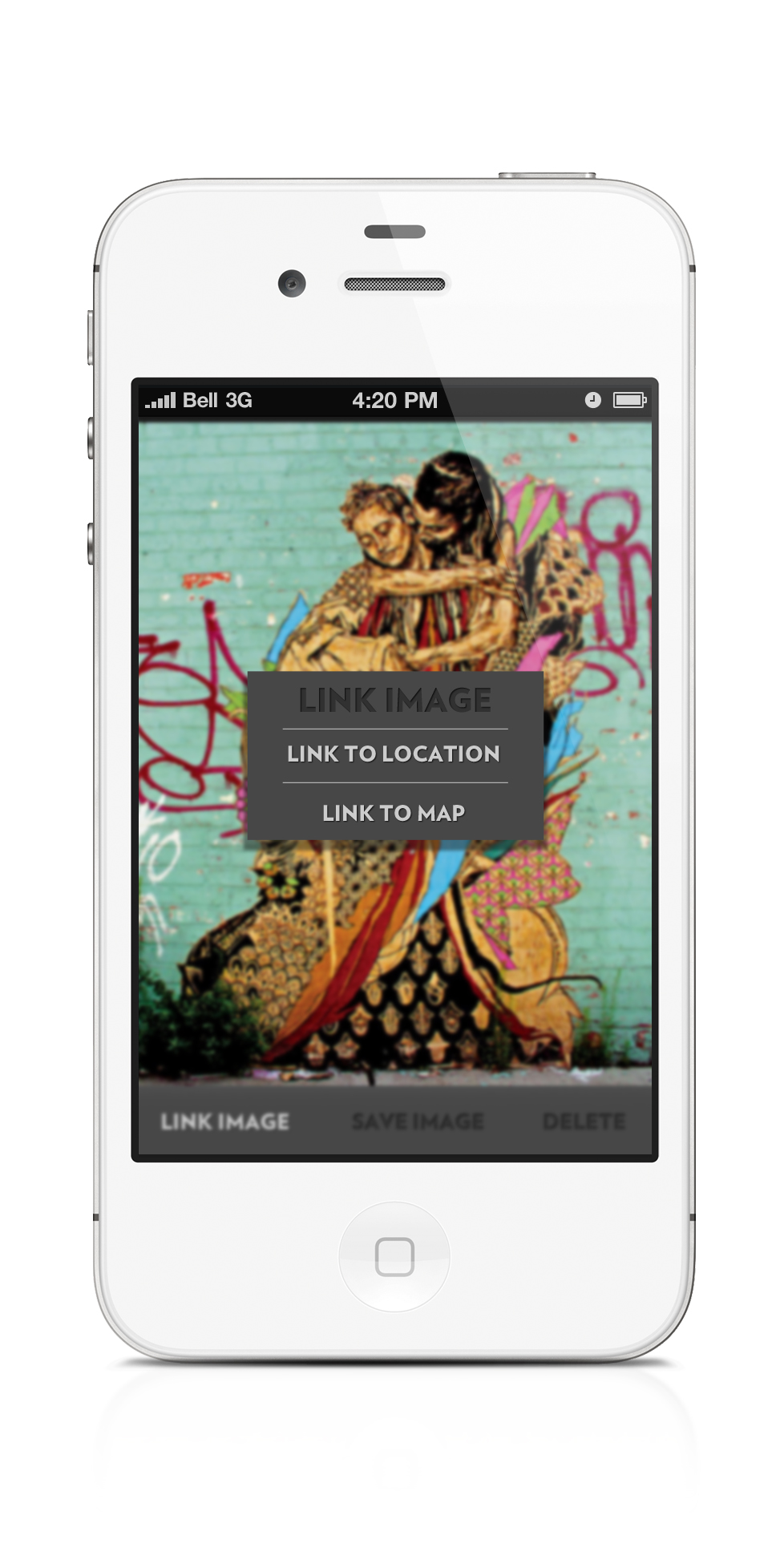
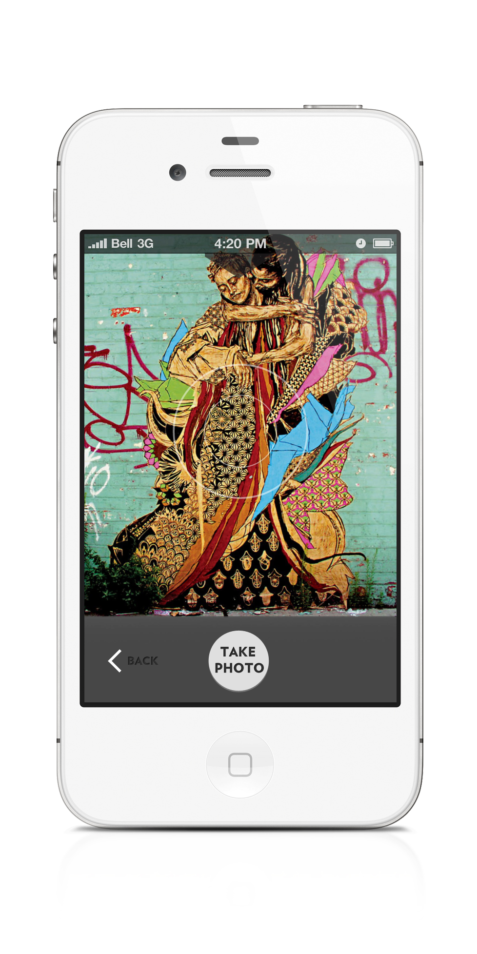
Reflection – Evan Marks

0 Commentsby   |  05.09.12  |  Reflection (P5)

This project was one of my most successful for the semester. I had all the elements ready (for the iphone mockups), I felt more than capable in Photoshop, and I had my wireframes to guide me. It all played our really fantastically. Photoshop is still a pain, but I feel like I can work with it now, without fear of causing some catastrophic mistake, or spend hours designing in the wrong DPI. It’s become a lot more usable, and it’s great.

Technical Mistakes: My biggest flaw with Photoshop right now is that I’m disorganized. Much like my actual desk at home, my PSD files hold layers and layers of untold content, none of it organized or named. Any attempts I make at cleaning it up only lead to frustration and anguish, and I quickly give up and let the disorganization take over. And honestly, as nice as it looks to have named, color-coded, and alphabetically organized folders and sub-folders, it doesn’t really hamper my work. One day I will learn.

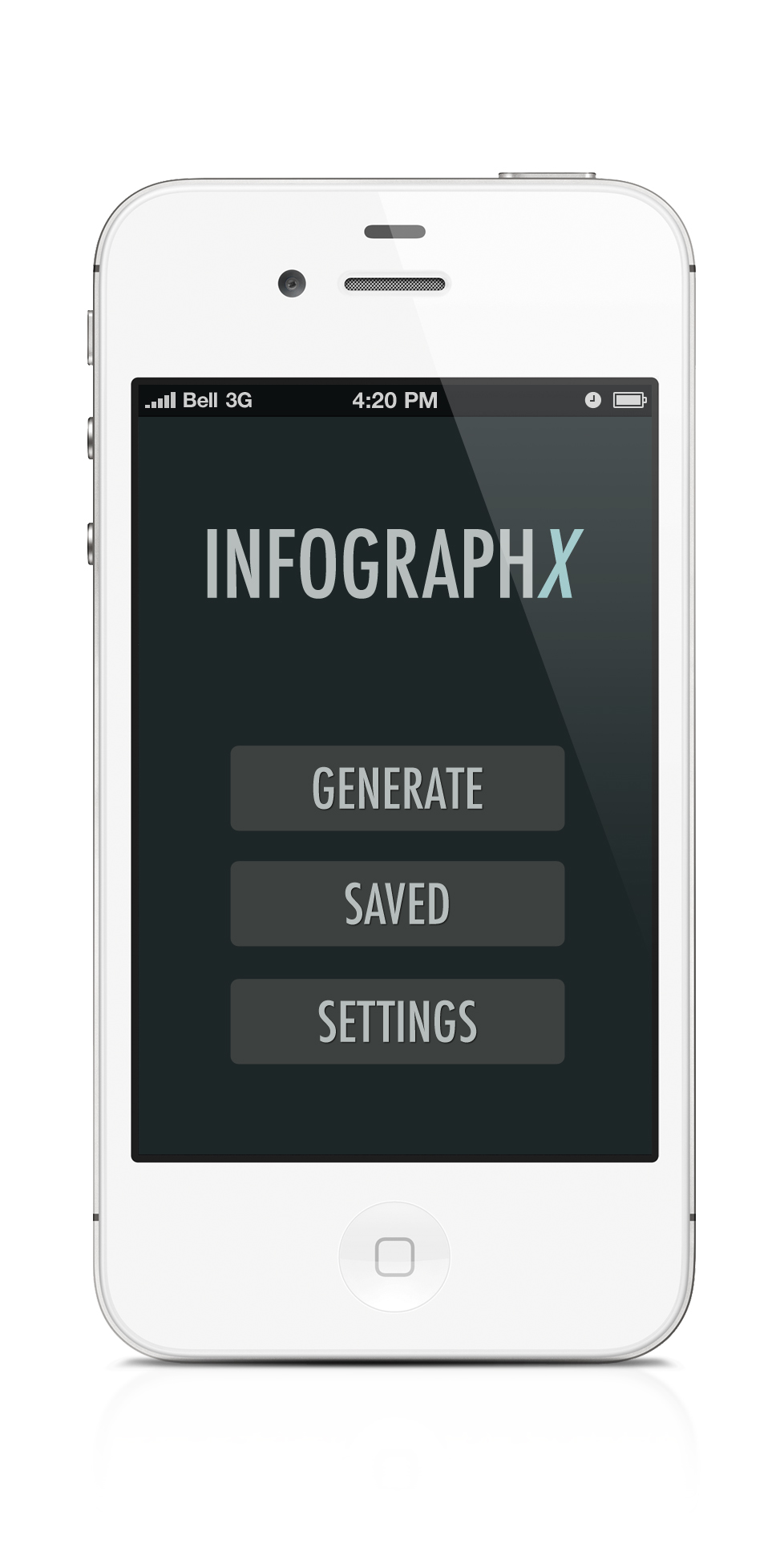
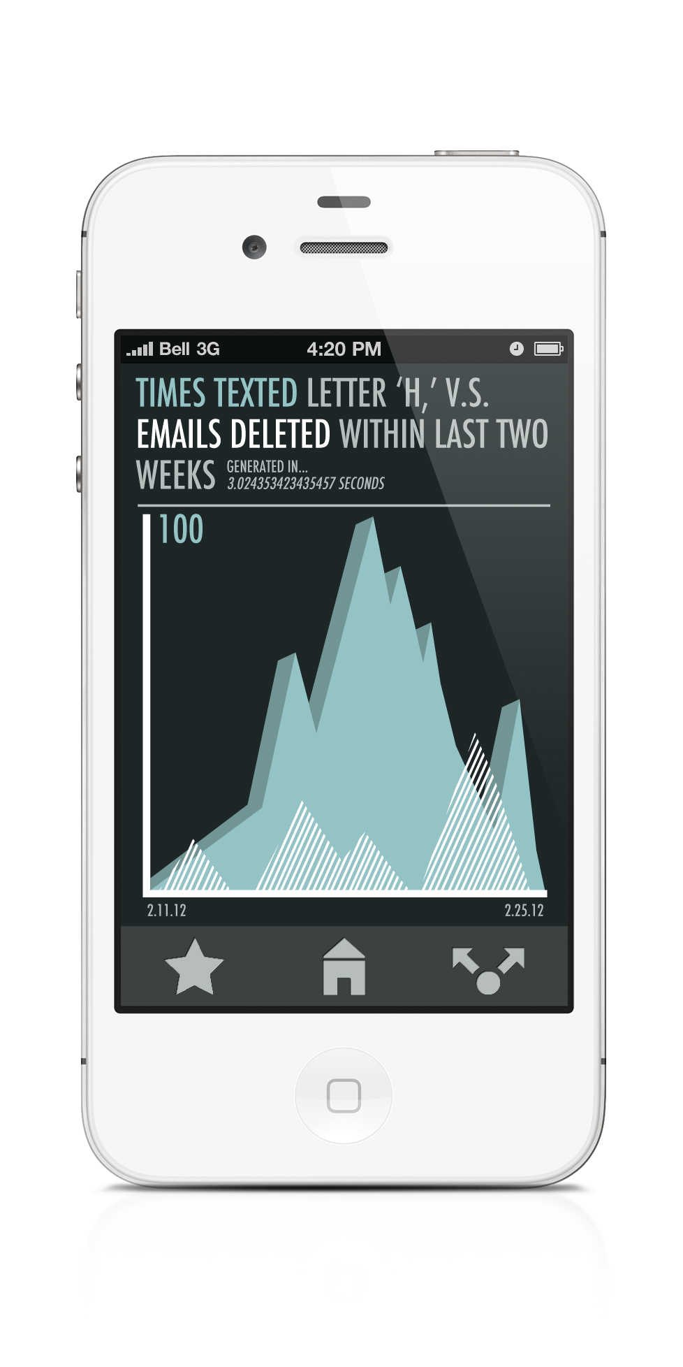
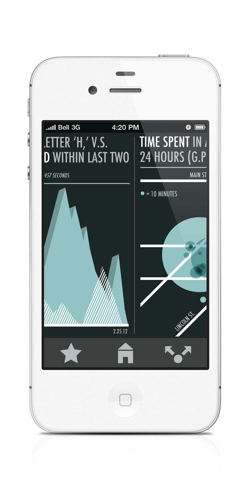
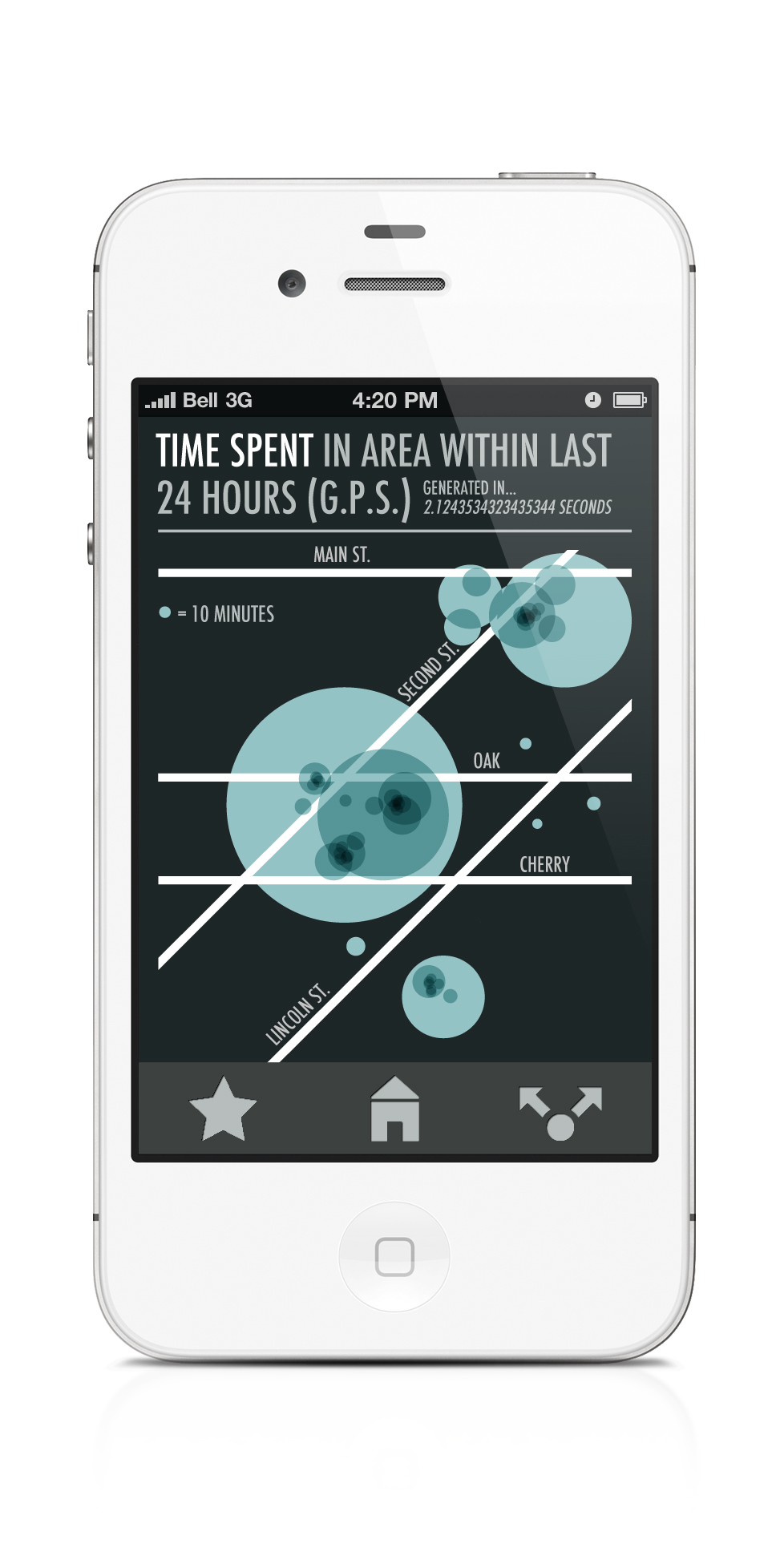
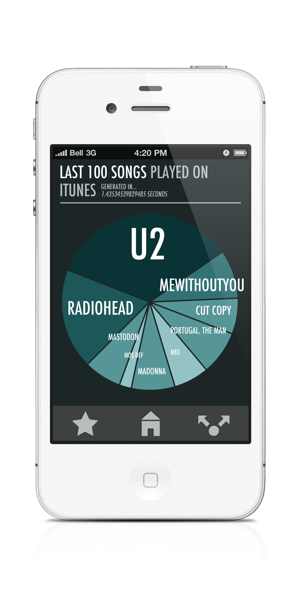
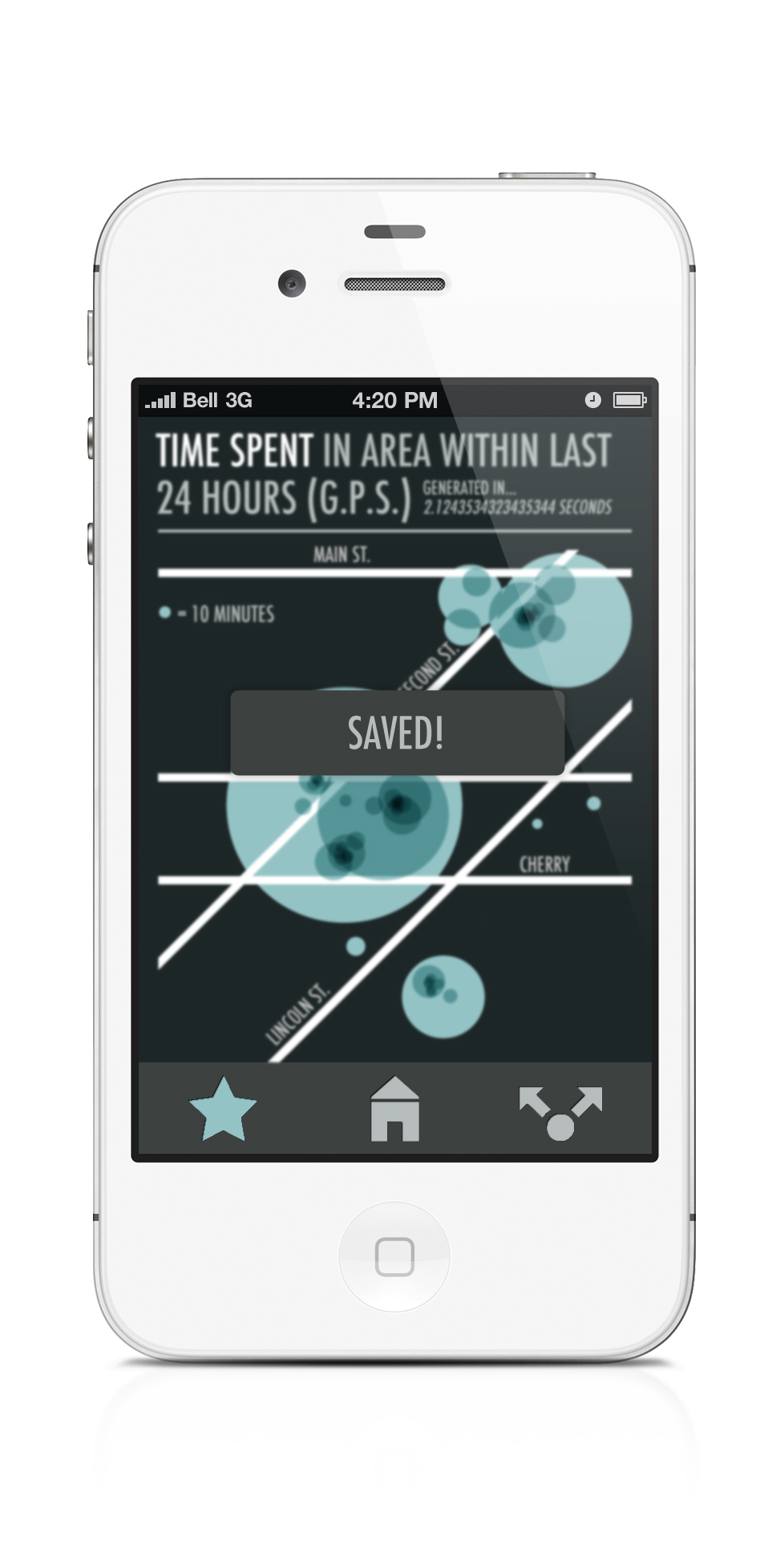
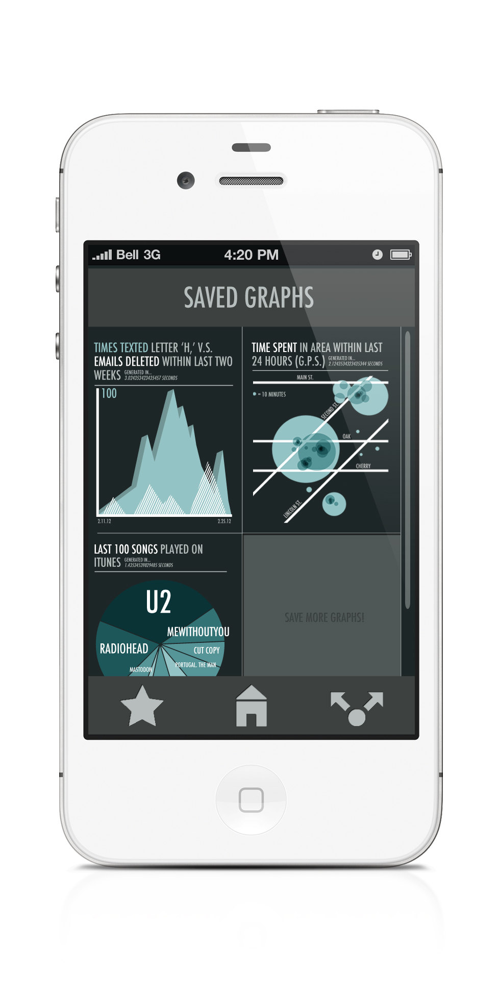
I had a different approach when it came to this App (InfographX). From the start, I was intrigued by the possibility for randomness, for the benefits that come from a complete lack of user input (or I guess unknown user input, since the graphs tracks everything the user does). Being able to pick and choose topics or turn specific graphs into posters is nice, and for some apps it would be a necessity, but for InfographX, I felt like the most rewarding experience was that of total randomness.

This was a really fun project, and I really enjoyed designing for it. This App and the previous one will (hopefully) both be really good and unique portfolio pieces for the future. Thanks Mike!

INFOGRAPH X

0 Commentsby   |  05.09.12  |  Final Comps (P5)

My websites!

0 Commentsby   |  05.03.12  |  Tutorial Links

Uphero:

http://evandoesart.uphero.com/index.html

Webfiles:

https://webfiles.acu.edu/users/edm10a/web/website1/index.html

Here are the best names for this App.

0 Commentsby   |  04.26.12  |  App Names (P5)

1) InfographX

2) Infographer

3) Data-tracker

4) Frequency

5) Isotyper

Tasky task list.

0 Commentsby   |  04.25.12  |  Task and/or Functionality List (P5)

1. App could show a random infographic of your info as your background/lock screen.

2. The App’s initial set-up (or at least the settings menu) could have a series of checkboxes asking what and how you want the app to gather info. For example, say you want the app to collect a lot of data based on location, but less data based on other tasks.

3. All screens/infographics could be easily shared as images on twitter/facebook with easy access posting buttons.

4. Because of the time needed for the phone to gather info, the user should be able to input previous data so that they don’t have to wait a significant amount of time for finished infographics.

5. Other things the app could check within the phone : Internet usage, website visits, amount of ‘logins,’ number of times (random letter) is typed, number of times (random word) is typed, number of times phone unlocked, ect…

My appinions on project 4

0 Commentsby   |  04.20.12  |  Reflection (P4)

Designing for the smaller screen of the iPhone was both a challenge and a relief. It took less time and effort for my good ideas to come to fruition, but coming to those good ideas was a unique and sometimes confusing challenge. There was, however, something very familiar about designing an App, as if I was creating it to suit my own needs. I knew how I would navigate the interface, what I would expect from the functionality, and so on. You could argue that this experience should be the same for designing websites, but the mere fact that you navigate and control an App with your hands and fingers makes it much more interactive and intuitive, or at least demands that you make it so.

With all that said, it’s easy for my to forget certain conventions that all apps should keep. I wasn’t sure if I should use Apple’s back buttons, or select keys, or a whole slew of other icons that seem to appear on everything. Making my app, I strayed from using pre-made icons and buttons, hoping to give my app it’s own look, and not that of Apples. However now I wonder if that was just hurting my user’s experience, and fighting too much with convention. Looking over my app now, I see that even though I used my own buttons and my own back button, Apple’s design still managed to creep into my own, probably subconsciously. I guess this one is a fight that’s not worth fighting.

Another of my less abstract issues was that of contiguity between my pages. I had a ‘look’ that I wanted each page to adhere to, but I didn’t really have a ‘look’ that I wanted my entire app to adhere to. I think my final design makes sense because of app conventions (a map denotes a map page, a button is meant to be pushed, ect.) but apart from that falls a little short. This is seen clearly with the titles of my pages. When I was designing my app, I wasn’t thinking I wanted every page to be titled with a header. I figured the usage of that page would be clear enough to denote it’s meaning. However, once I put a header on one page (my ‘Find Around Me’ page) I realized that it was odd that the other pages didn’t follow that convention. There was a slight disconnect between my pages. This can be easily solved, I hope, my unifying my page layout, instead of varying it.

Apparently this was a very appealing assignment, that I would definitely appoint as one of my least appalling projects. Though at first I was apprehensive, I was able to approach it and ultimately find approval with my apparatus. Apple.

Art Maps!

0 Commentsby   |  04.18.12  |  Final Comps (P4)


Interview Prep Questions YEEEEEEEAAAAAAH!

0 Commentsby   |  03.28.12  |  Interview Prep (P4)

  1. Do you seek out local art/artists? Why or why not?
  2. Do you use image-based social media, such as Pinterest? Why or why not?
  3. Do you regularly take photos of nature/buildings/places? Do you share those photos?
  4. As an artist, do you create art based your local area?
  5. As an artist, how do you share your artwork with others?
  6. As an artist, would you want to share your work with a community of artists?


Ideatizeationism

0 Commentsby   |  03.26.12  |  Ideation (P4)

1. Disc Golf Course Finder – Find all the holes, keep score, keep stats from past games, mark were you lose discs, ect…

2. Animal Shelter Finder – Profiles of all the Animals available with pictures/stats/facts, ect. This might exist in some form, I would want to make it somewhat unique, perhaps more suitable to a niche of people (such as catering to a single animal, such as a Pug Finder?)

3. Artists Map – Utilizes google maps to link environments/buildings/places with paintings/drawings/photos of those places by local artists. Example: Hiking somewhere, you see an awesome mountain, you check your app to see if any local artists have posted art of that mountain. Also an interesting way to share work with local artists. Could emphasize ‘plein air’ artists.

4. Shiny Shants (Shants = Short Pants) – Take a picture of a pair of pants, and the app magically shows you what those pants would look like as SHANTS! Features include a length adjuster, and more!

5. EatyourFace! – An app linked to a nearby bakery. You send a picture of your face to bakery, and they will deliver you a cake with a picture of your face on it!

Project 3: A Reflection

0 Commentsby   |  03.23.12  |  Reflection (P3)

With this project, as with all the projects beforehand, my biggest problems stemmed from using Photoshop. The medium is still difficult for me to design with, and though I can definitely see myself improving, I still would not say that I am entirely proficient. That said, I have started to love the nuances of designing in Photoshop, as opposed to Illustrator or inDesign. Photoshop allows me to be extremely detail oriented, and I can easily lose hours adjusting opacity, changing colors, adding shadows, ect.

With this project, one of my initial design problems was using too much reversed-out text. I went into this assignment with a dark color scheme in mind, and started with all my body copy white-on-dark, not realizing the eye strain that much reversed out type could create. My biggest issue after that was using a lighter background color on my dark themed site. I tried a number of variants, and ended up matching the color of my white(er) heading text. I was afraid that the sudden large area of white on dark would draw too much attention, but once it was matched up with images and copy, it all evened out fairly nicely.

Another issue I had was finding a balance between text and images, especially on my main page. I wanted the main page to catch the eye, as it’s the first thing a viewer would see, and really determines whether they view the site or not. My initial design was primarily text, as I imagined a blog had to look. I was stuck on blog themes stemming from Blogspot that were text heavy and image light. After reviewing my inspiration and broadening my mind on what a blog can actually entail, I allowed a lot more images into my site, helping the overall look and feel tremendously. I even went so far as to hide most of the body copy on the first page, only revealing it over a mouse hover-over.

Perhaps my biggest concern with this assignment, and with all the assignments before it, is how difficult it was for me to initially approach the project; and I know exactly why that is: sketches, fragments and wireframes. I always see the huge importance of those pieces after the fact, and then approach the following project the same way, tackling the main project on it’s own, only after I have a single idea in my head. It’s bad design, and leads to a lack of creativity, and I need to stop it. So I will!