Samantha Hawthorne's Archive

Reflection

0 Commentsby   |  05.09.12  |  Reflection (P5)

This project was the most challenging conceptually and for functionality because we really worked hard as a group coming up with what exactly the app was supposed to be. It was a good learning experience to take an idea that was not necessarily or entirely your own and collaborate to come up with the final solution. It was very exhausting  to think you had a solution and then end up having to completely change it again because someone brought up a different viewpoint. This to me feels like what it will  be like working for a real design company, where you have a client with a need or idea, and you have to work together to come up with the solution, where in classes we generally get to make up whatever we want, with only basic guidelines.This made the project more of a struggle because it was not initially a concept that I was excited to do or really had a vision to do, but after exhaustively talking about all the options and directions it made me re-evaluate what I had originally thought of doing, and ended up with a better end product.

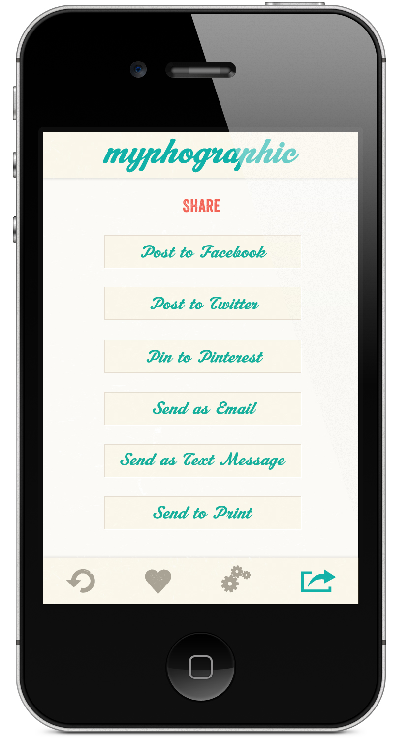
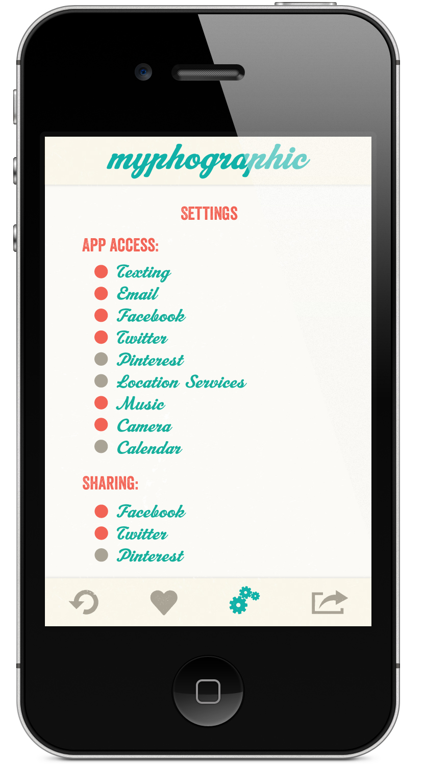
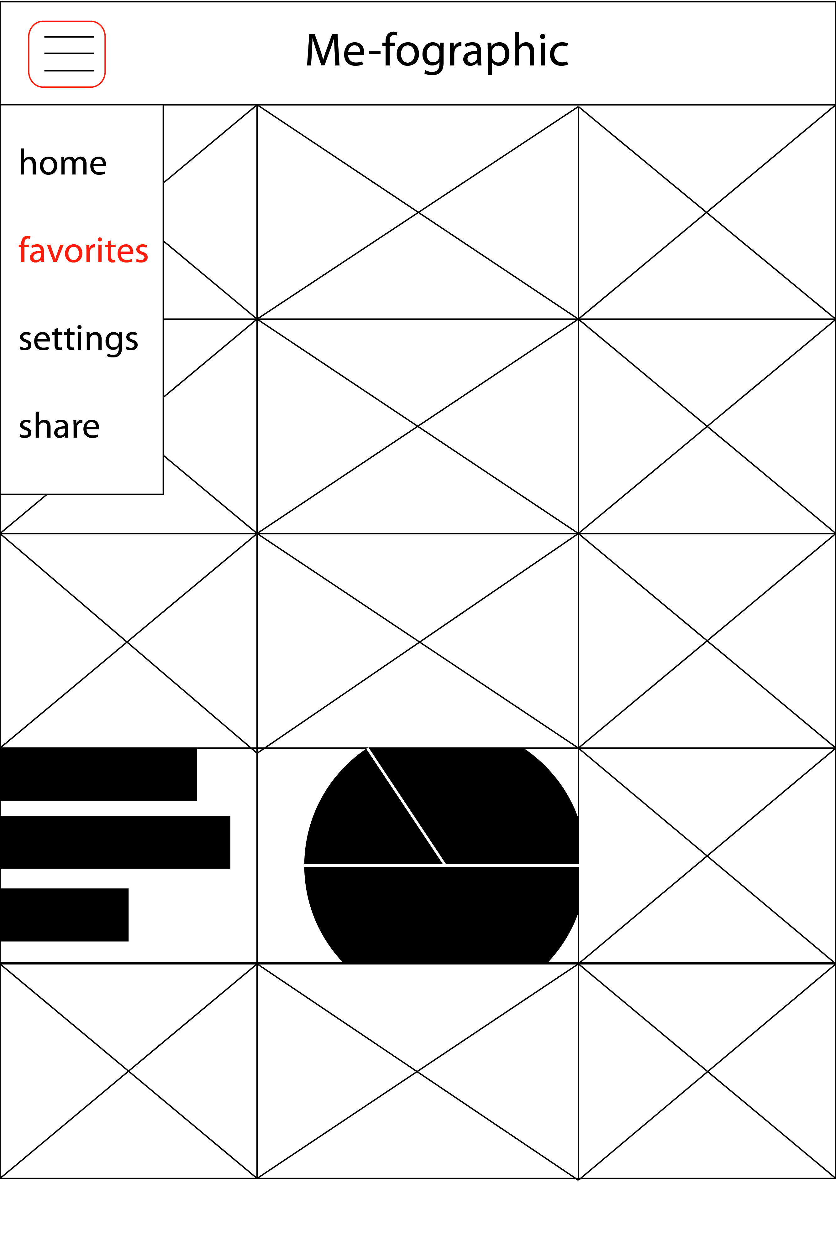
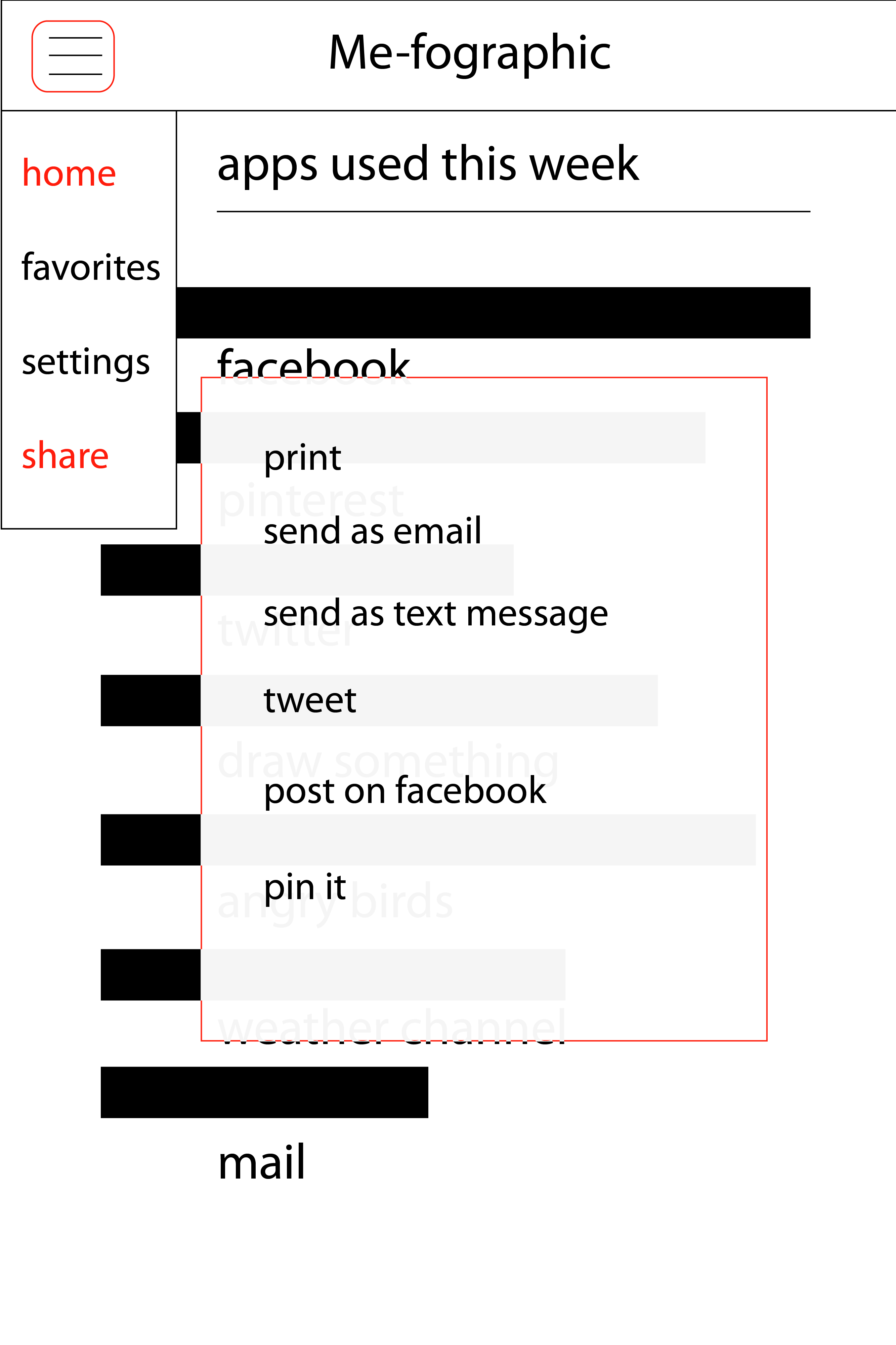
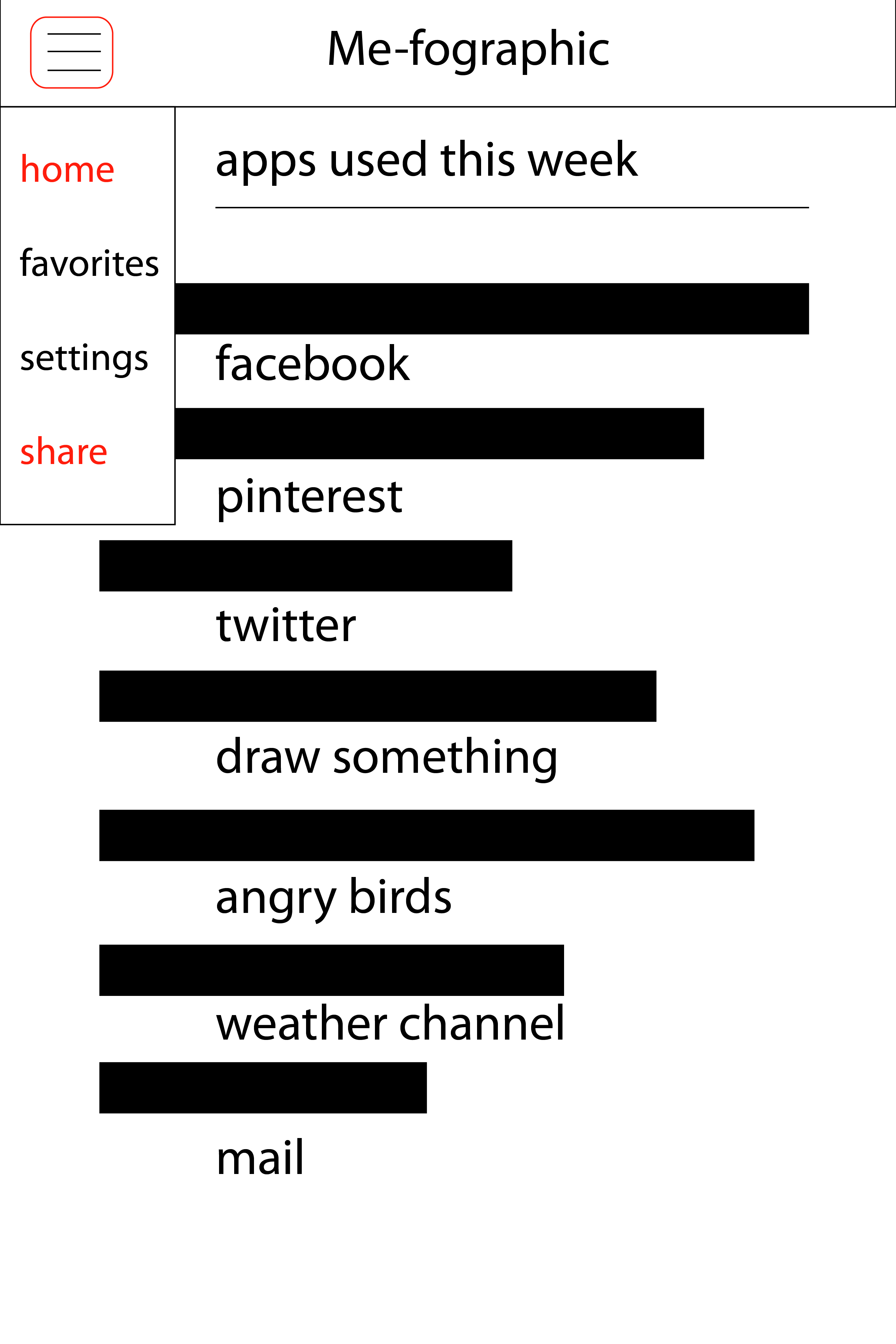
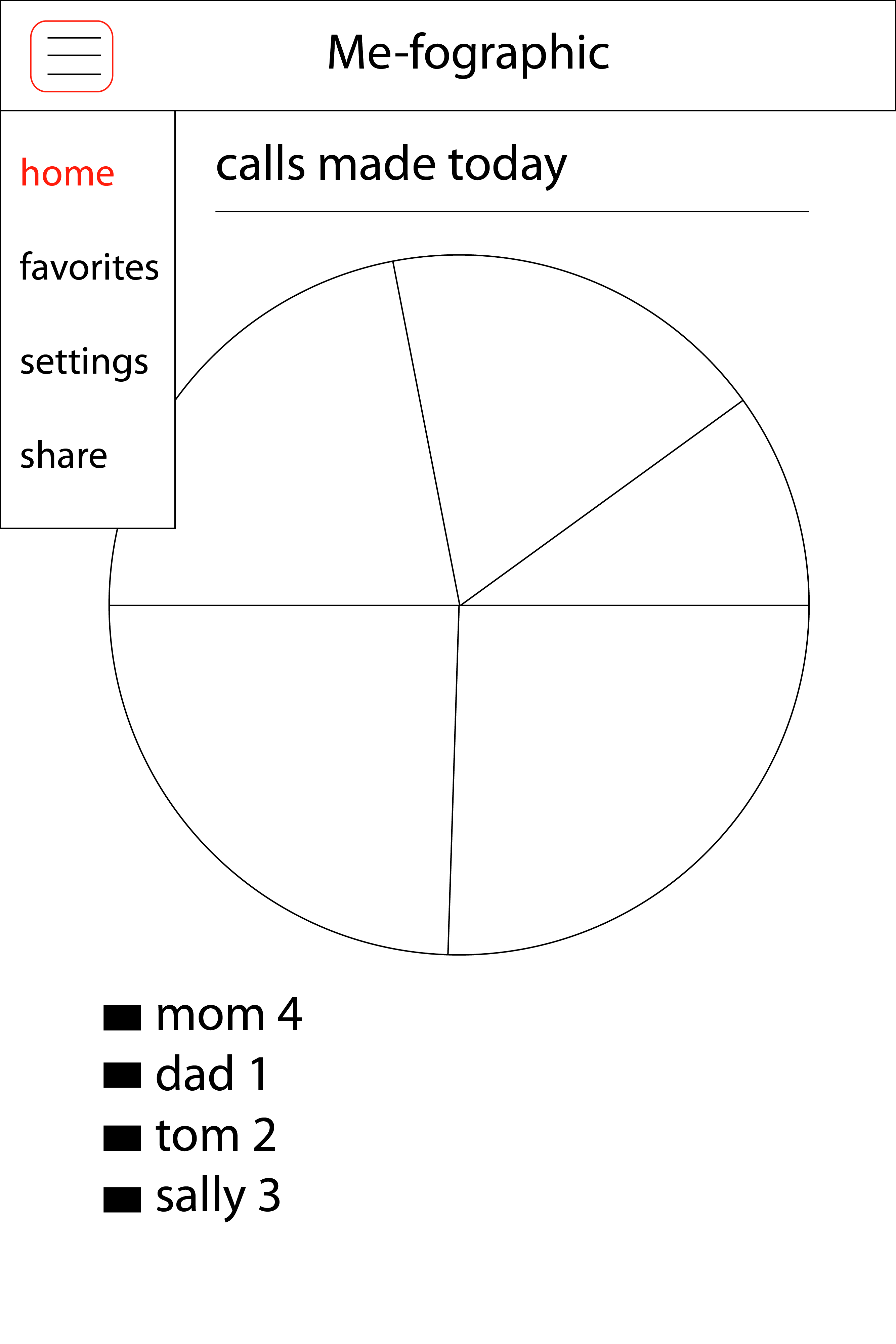
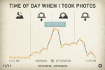
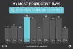
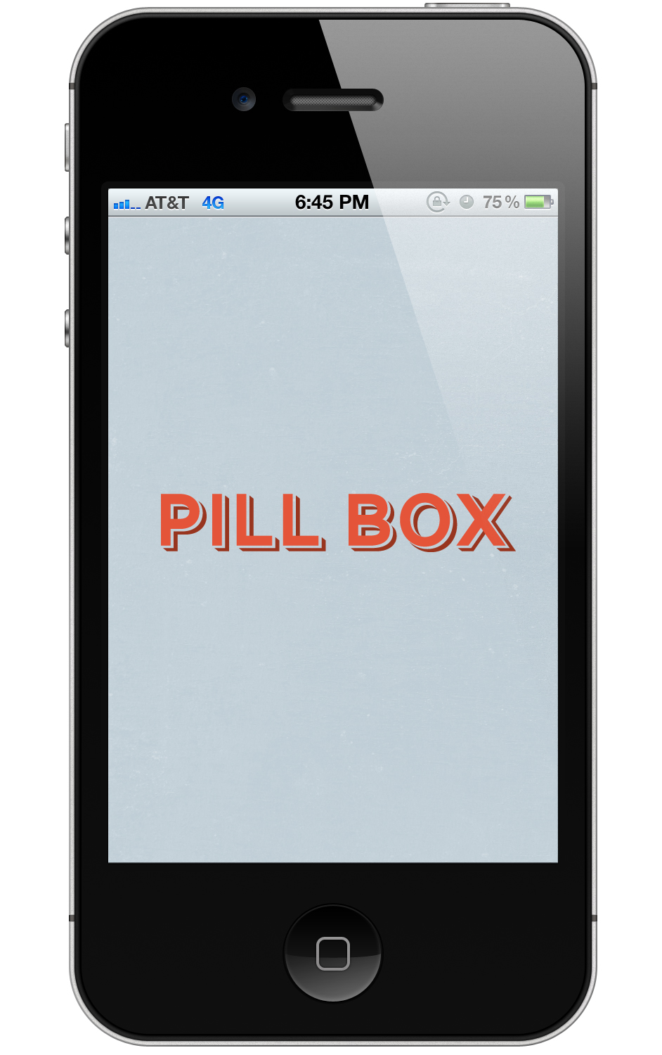
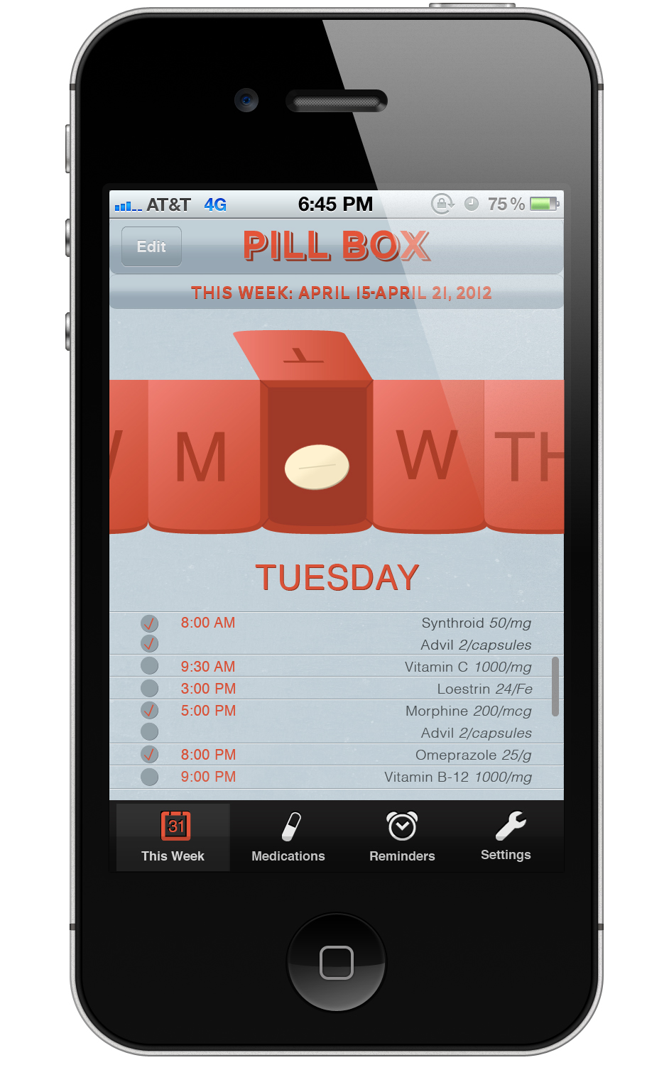
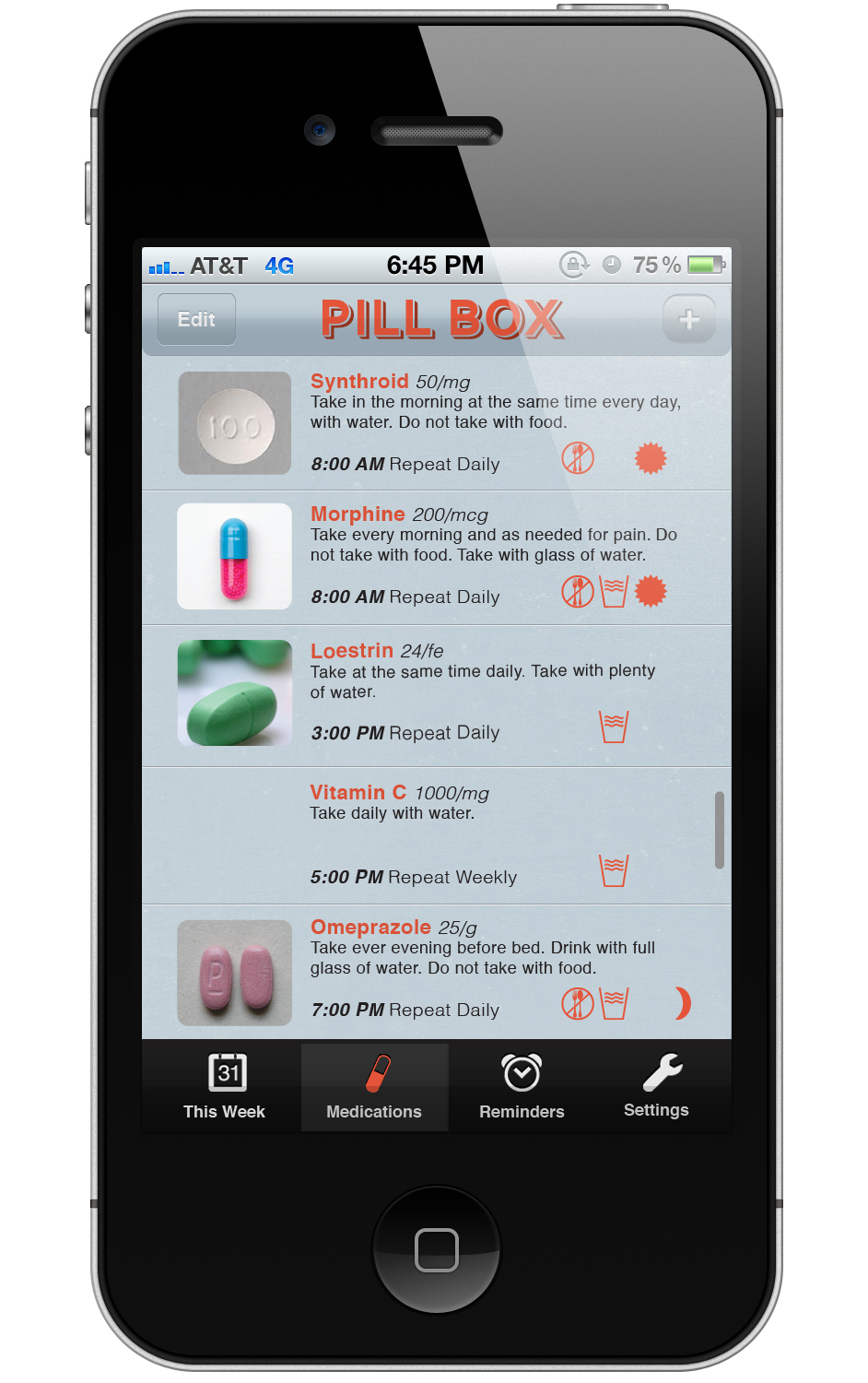
Doing the last app I deffinitley learned how to design for the iphone and on this one I broke away from the traditional iphone look and feel just a little bit to make it more playful and fun. I think that this app could have gone so in depth that I tried really hard to scale it back so that it was not too heavy on the mechanics of the app, for instance only having 4 menu options total, and very limited setting options. It just does one thing basically and that makes it where the graphs can speak for themselves and be much more interesting, and let the app interface just guide you through the process.

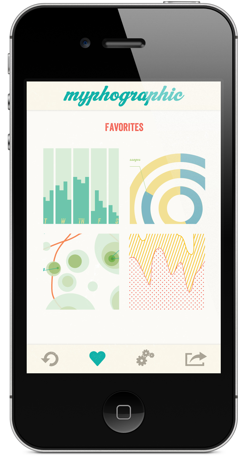
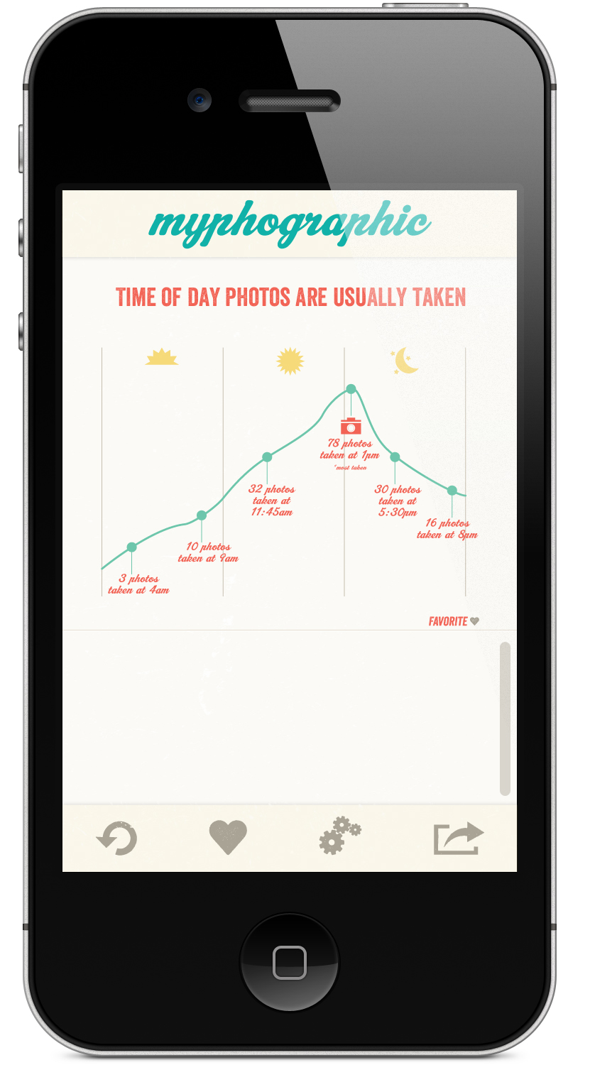
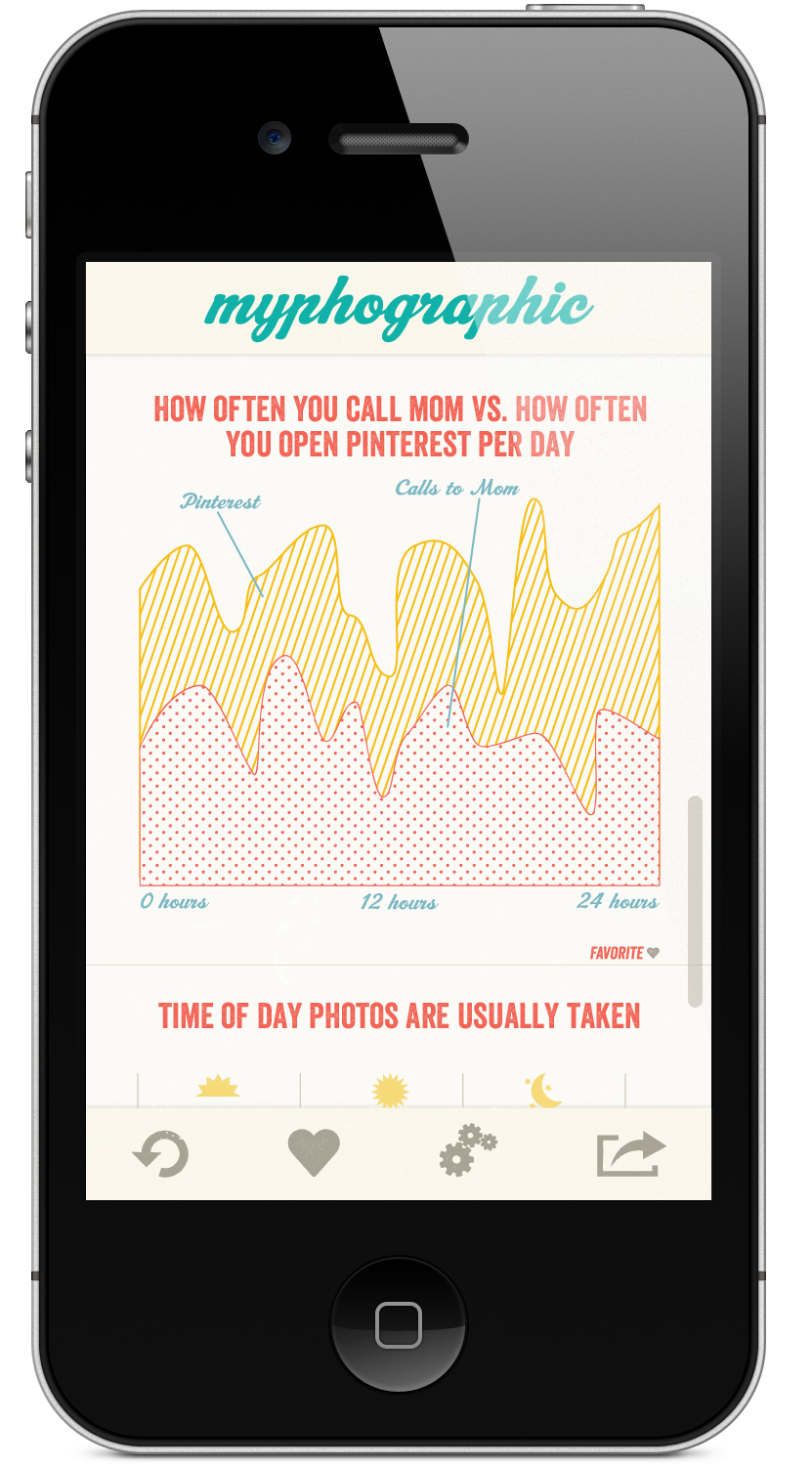
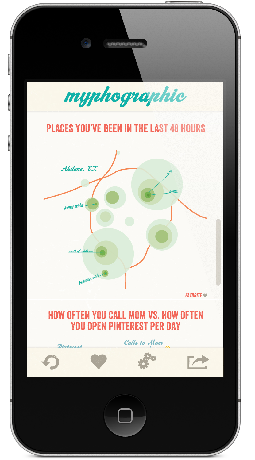
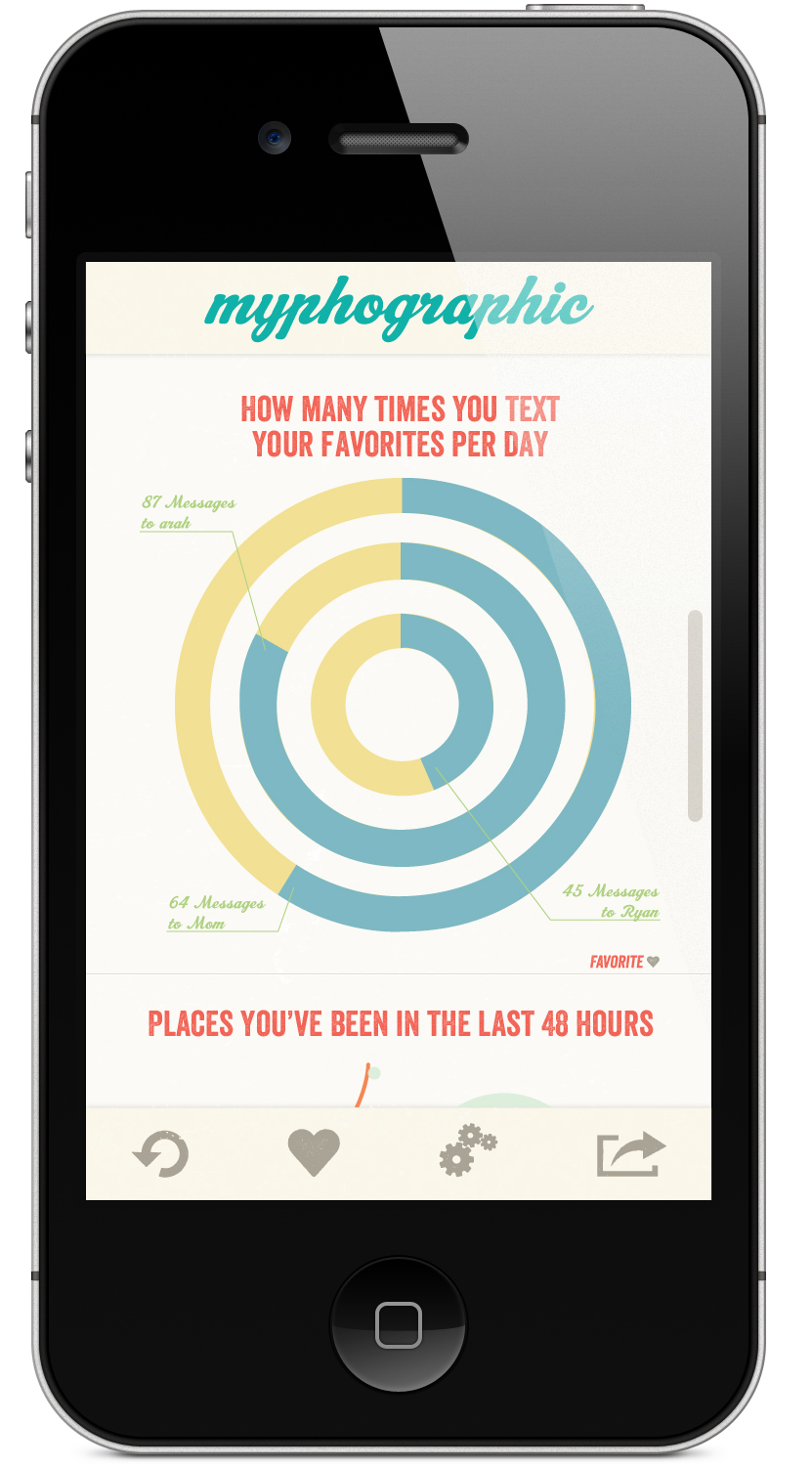
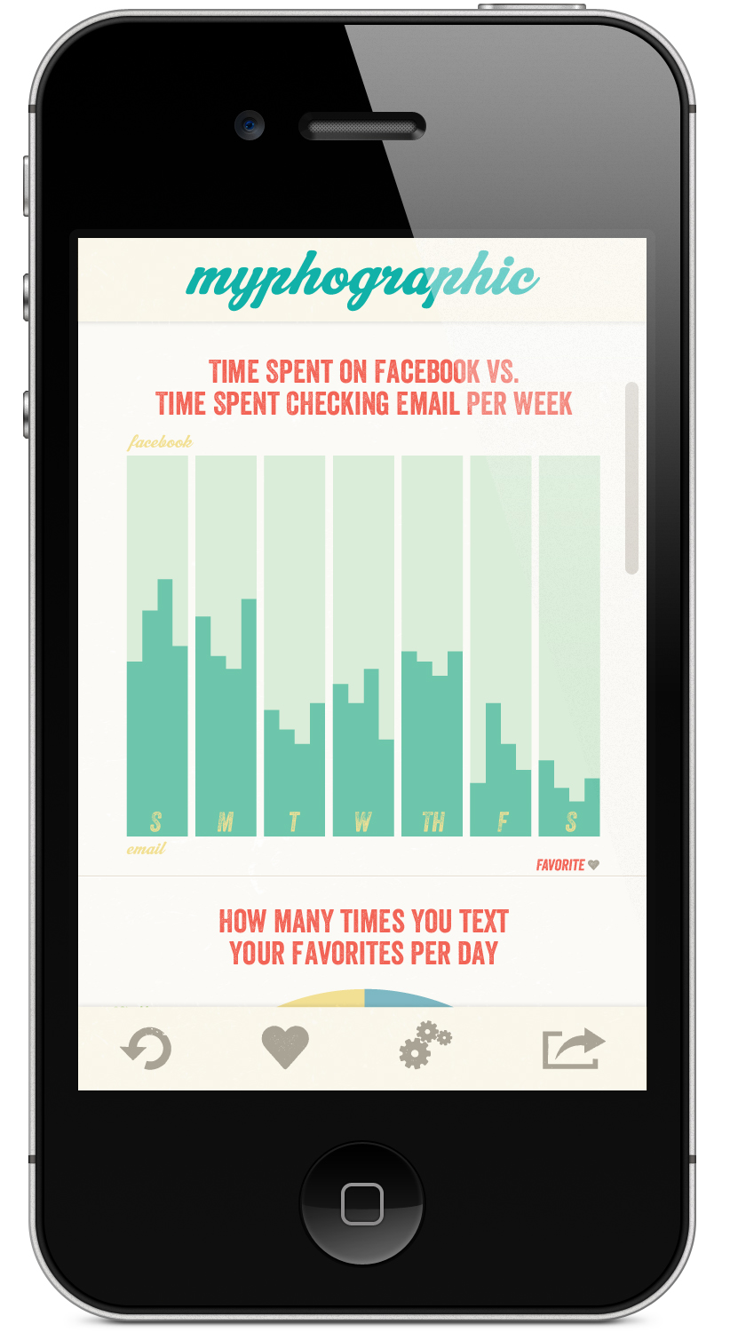
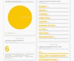
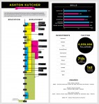
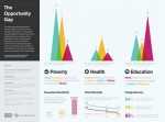
The biggest challenge for this project was tackling the infographics themselves. I realized before I could design the app, you really had to come up with the graphs and make them  really well, and then from there use the look and feel to work through how you actually use the graphs in the app. This project turned out better than I thought it would and I am pretty happy with the end result.

Final!

0 Commentsby   |  05.09.12  |  Final Comps (P5)

My Websites

0 Commentsby   |  05.06.12  |  Tutorial Links

http://samanthahawthorne.comze.com/wordpress/

https://webfiles.acu.edu/users/skh08b/web/

my portfolio: samanthahawthorne.com

wireframes

0 Commentsby   |  05.02.12  |  Wireframes (P5)

Inspiration

0 Commentsby   |  04.30.12  |  Inspiration (P5)

Click here this infographic is interactive!


App Names

0 Commentsby   |  04.26.12  |  App Names (P5)

Infotastic

Me-fographic

factastic graphics

graph-o-self

factable me

lifeographic

tasks&functionality

0 Commentsby   |  04.26.12  |  Task and/or Functionality List (P5)

1. This app will collect data from your phone, through applications including texting, weather, facebook, phone calls, etc. It will also take data about phone usage totals.

2. It will then make an infographic- in the form of a simple graph, and it can compare and contrast some of this data, or it can just state facts about you from this data

3. It will list all of your graphs like a feed, and there will be a refresh button. In your settings you can change the frequency of how often and how many it generates

4. You can search for certain graphs by searching by keyname or looking through the categories(it automatically categorizes these graphs)

5. You have the ability to tell it what applications you want or dont want to draw data from

6. You can click on the graph to expand it to full screen, and from there you can share through social media, email, text, or print this infographic. While in the full screen mode you can also like or dislike, and it will weed out ones you dont like and help it generate graphs that better suit you in the future. You can access your likes from the main menu bar

Iphone App Reflection

0 Commentsby   |  04.20.12  |  Reflection (P4)

This project was a complete new level of interactive design. It was more challenging than just a webpage because you have to worry about the user interface and interactions in more detail. You only have a small screen and you have to use multiple screens to show the task, where on the web you have much more room. You also have to pay attention to tiny details, because this screen is so sharp and right in your face, any mistake will show. It has to be clean and simple, but complex in a way that makes your user feel at ease and comfortable.

I am not sure that I completely achieved this in my design. I think I improved on working through the wireframe process and the backbone for the app, but designing was challenging. I had ideas and wanted to convey them but it was difficult to get everything in there without feeling messy or uncomfortable. On the web there is a grid you can use to make it feel structured, but with this you have an empty rectangle and you have to make your own guidelines for spacing and putting in information randomly was challenging to make it fit in a structure. I think on my pages the main elements are done really well, like the header bar and the icon bar at the bottom, but figuring out a way to make the content work was difficult. I worked for a long time on them and I feel like they still dont feel quite right, or like I would not want to use this app until some things are re-organized or moved around. Sizing was completely different and somewhat of a challenge as well, changing over from the huge web screen to the tiny iphone screen. I think I want to re-work my first two pages because they feel too crammed, and then my last few pages dont feel believable, or real. I am not sure how to do that other than look at more apps to solve this problem.

Overall I am glad we did a mobile app because it helped me learn a new way of designing and it will be a good thing to say that I can do. I think that, like our first webpage, our first app will not be quite perfect because we are trying to learn something new, but considering it worked out pretty well.

Final

0 Commentsby   |  04.20.12  |  Final Comps (P4)

Final, almost

0 Commentsby   |  04.18.12  |  Final Comps (P4), Progress (P4)