Jordan Bell's Archive

User Scenarios

1 Commentby   |  04.01.12  |  User Scenarios (P4)

Jace

Age: 16
Occupation: High schooler
-Avid iPhone app user, socially awkward, dork. 

Jace has a friend that told him to download this new cool type app called {app name}. Jace doesnt nessissarily care a lot about font, typefaces, hand lettering or whatever; but he does use Instagram quite a bit. He thought since his friends were using it, it might actually be fun too. His friend thought he might enjoy being able to take pictures of cool lettering, pinning them where he saw them, and then figuring out what font it was. He may like the app or he may only use it a few times.


Lauren

Age: 26
Occupation: Hotel Manager
-Loves art in general, cool, very girly.

Lauren loves getting on Pintrest, Instagram, and her favorite art blogs to find and link things she finds cute or fun. She has recently understood typography and how some artist draw or make type. She thinks this is fun and cool and so she has a “typography” pin board on Pintrest. She was looking for apps in the Apple App Store for anything to do with type and stumbled across {app name}. She quickly downloaded and started taking pictures of cool fonts/hand lettering that was all around her.

Type app interview prep

0 Commentsby   |  03.30.12  |  Interview Prep (P4)

Since there already was a Type ID app I decided to take my app in a new direction. I want it to still be able to take a photo of typography and tell the user close to the typeface or the style. Also in the app a user would be able to pin on a map where he/she took a picture of it at and say the name of the font or family on his pin as well. This can give the app the ability to be ran just by the user. Kind of like Instagram and What the Font combined in one app.

Through my interviews I realized that more than just type lovers would use the app. I feel like It could become a competition or just a fun way to show what type styles you like. Most people said they would like to see the app and would be interested on how it can ID the font. But also, people really liked the idea of the social aspect that is similar to instagram. I think it would be a fun app, but also a way to learn more about the nerdy type world.

App Ideas

0 Commentsby   |  03.26.12  |  Ideation (P4)

1. Font ID app. Camera app that allows use to take a picture of some type and the app will give you the font or closets matches.

2. Handlettering ID. Same as above, but only with hand lettering. So you could take a picture of hand painted signage and the app would give you fonts suggestions closets to it.

3. Pill ID app. Take a picture of a pill or a pill case and the app will show you which medicine type and kind it is.

4. Sunglass Celebrity ID – Take a picture of your sunglasses and the app will tell you which celebrities wear those sunglasses.

5. Find your coffee! – An app that lets you input the name and brand of your coffee and it will show you which part of the world its from.

Project 3 Reflection

0 Commentsby   |  03.24.12  |  Project 3

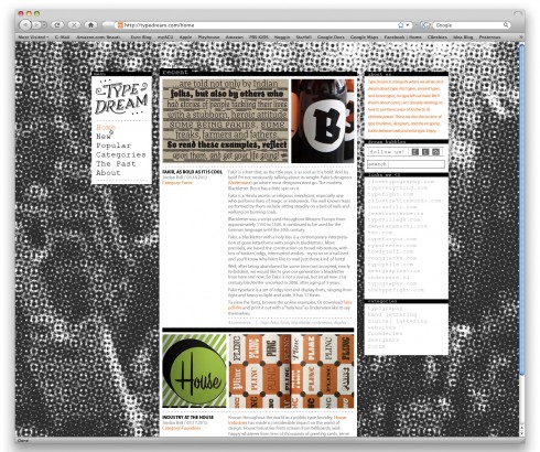
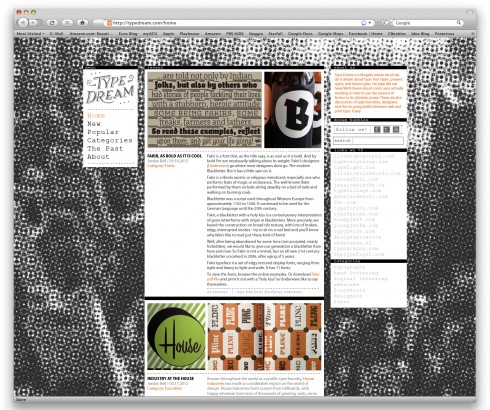
During this project, my main idea was to do something that I hadn’t in the past two. I wanted to incorporate a retro feel and a strict grid system to my already existing hand-lettering. I think I accomplished this, but might have missed out on some other opportunities.

As far as strengths, I think my look and feel really came together nicely. I like the aesthetic it bring and its uniqueness. I also liked how my hand-lettering played into the retro feel of the design. You mostly don’t see the two genres mixing that much (that is, 90s computer graphics and distressed, classical lettering). I also really liked the idea of only having one accent color, the rest being in black and white. I think this complimented the typography and retro feel very nicely.
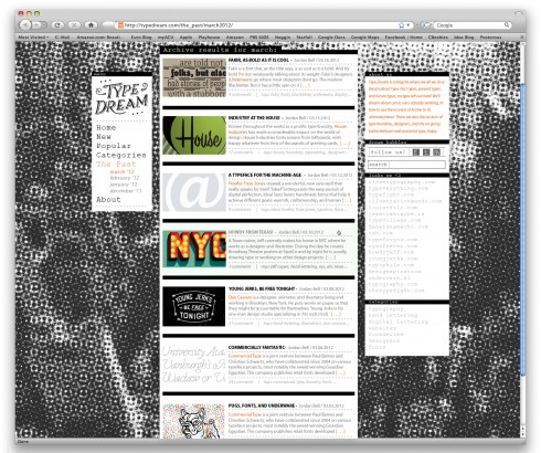
I didn’t get that much critique on this project so I am not completely sure what all the weaknesses are, so bear with me. I think there might be some odd hierarchy in parts of my design. This can maybe be seen in the top of the middle section of the categories page. Along with the categories, Mallory helped me work out some spacing in each categories box, but it may still be a bit tight. I wanted it to be a bit stuffy, but obviously not too much. I also think one of my weaknesses also could have been that I didn’t experiment with many other directions. I had an idea, and ran with it! Hopefully it worked.
Technically I was much more satisfied with this project than the past two which hopefully means I’m getting better at the whole photoshop web design stuff. At first, I would have an idea and it would take me forever to execute it. This time I felt more confident and able.

In general overview though, this was my favorite project. I mostly don’t like extremely open-ended projects, but this one came out good in my opinion. I liked being able to create a specific idea and then execute it. I say this meaning, I liked building from the bottom up. No redesign, not model or preconceived plans, just creating something new and unique. It was definitely a learning experience and hopefully a portfolio piece!

Final Comps

0 Commentsby   |  03.24.12  |  Final Comps (P3)


Post

Home page

Categories

Progress

0 Commentsby   |  03.19.12  |  Progress (P3)

Inspiration

0 Commentsby   |  03.09.12  |  Inspiration (P3)

Fragments

0 Commentsby   |  03.07.12  |  Progress (P3)

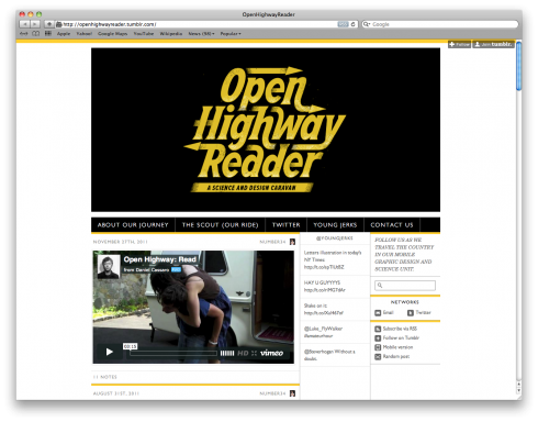
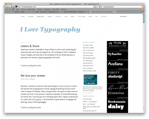
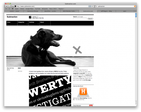
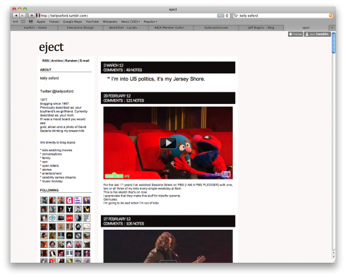
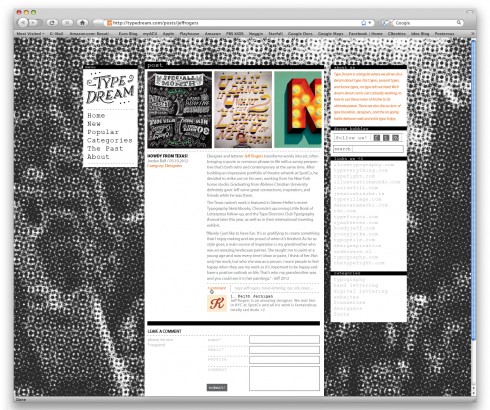
Blog Inspiration

0 Commentsby   |  03.02.12  |  Inspiration (P3)

0 Commentsby   |  02.29.12  |  Reflection (P2)

I think with this project I took our first assignment and fixed many of the problems that I had. But also, I remade some of the same mistakes just in different ways. This really helped me learn what I have trouble with and what I need to improve on. Some of these mistakes were not paying enough attention to conceptual detail and not putting enough content into the page. I am mostly very good at adding lots of detail or information and being able to portray it well.
Conceptually I had many great ideas, but on the comps you cannot see movement or action so it was kind of hard for people to tell.      This one thing could really hurt my design if this scenario was a real client meeting. Therefore, I definitely need to fully think out how every small part of my website works. The auto scrolling effect was a good idea, but I needed arrows in there so people could jump to the next section without having to scroll up. I also think since it was a grungy bbq restaurant I could get away with not super neat typography, but I have definitely done better in my time and should put more focus and thought into what I love most about my design.
I believe we have all made leaps and bounds from our last assignment, but I think for our next project I need to realize what hurt me in this project and remember that for every aspect of the site. I know I needed to put more detail and pay attention to user interaction, but I made a few small mistakes and people noticed them in critique. That obviously means I didnt do what I sought out to do. I think with this in mind, my next project will be much better.

Jordan Bell's Comment Archive

  1. Jordan Bell on User Scenarios
    8:16 pm, 04.01.12

    If that hipster chick is supposed to be a metaphor for me frick you! nice scenarios though