Mallory Ming's Archive

Last Reflection :(

0 Commentsby   |  05.09.12  |  Reflection (P5)

The last project for interactive design is complete, the air is light, and yet the atmosphere is still tense. Welcome to finals week.

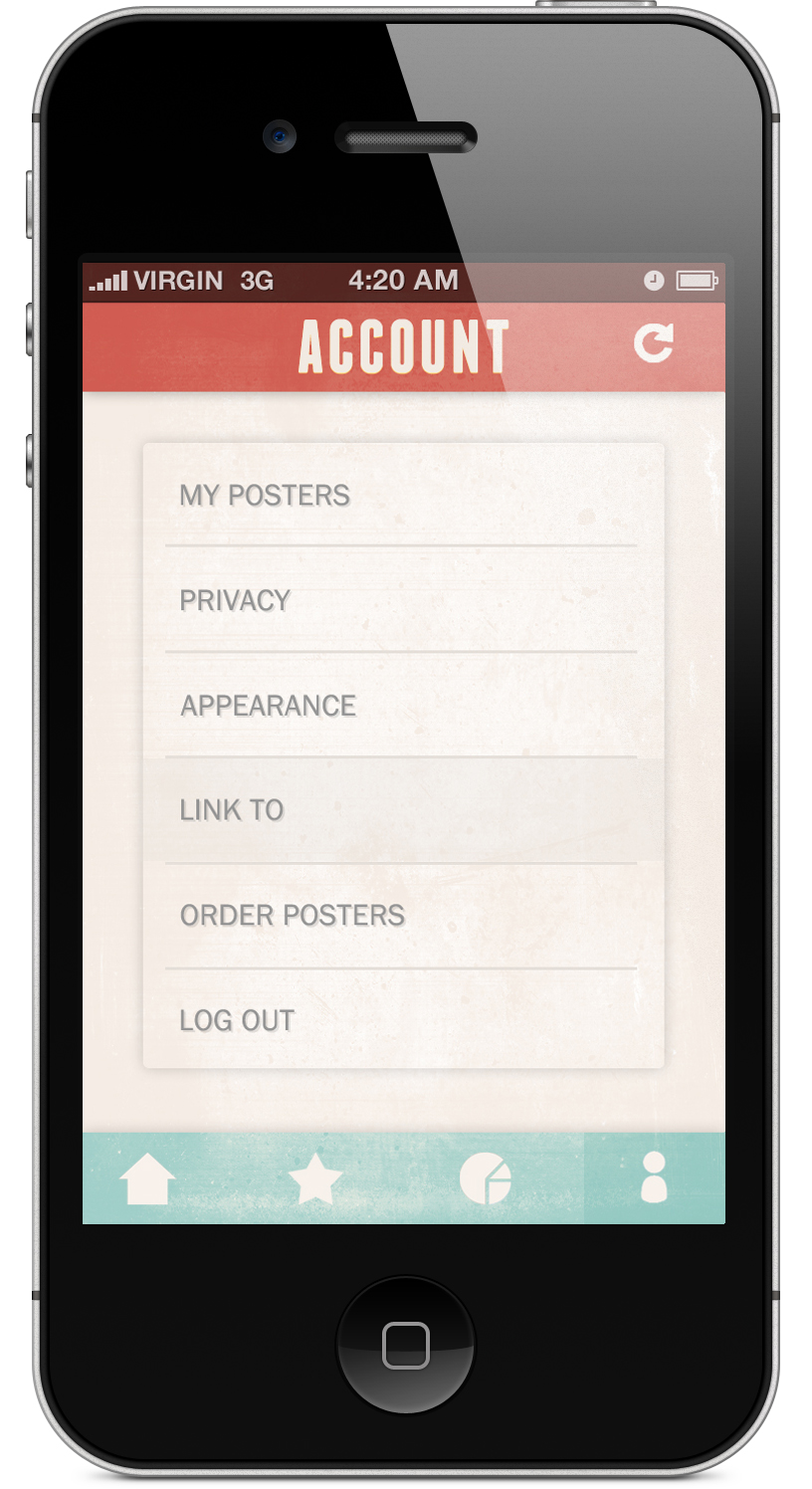
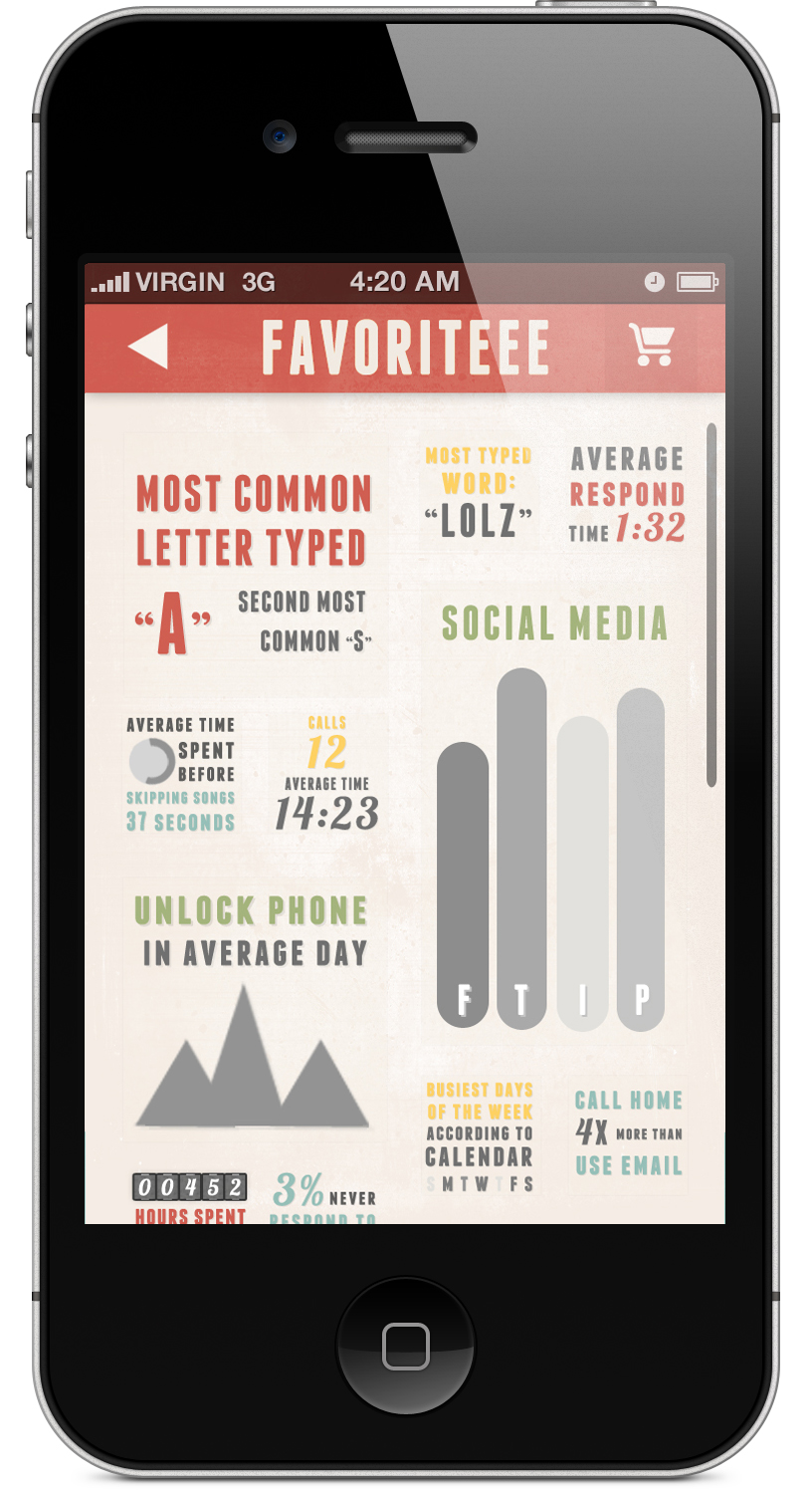
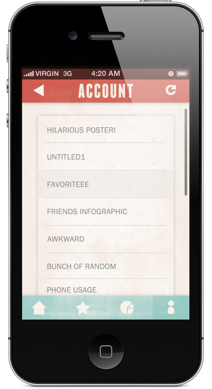
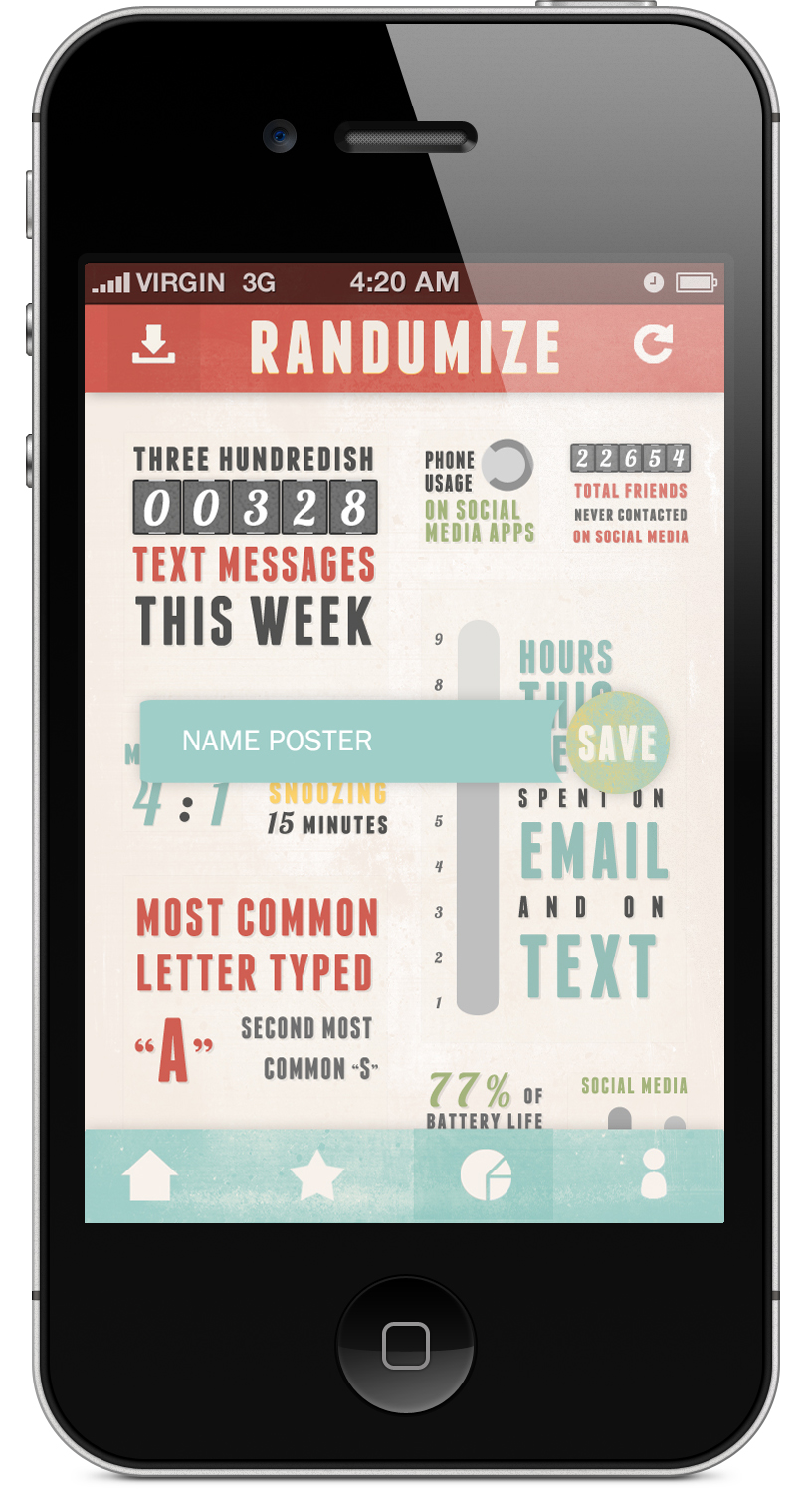
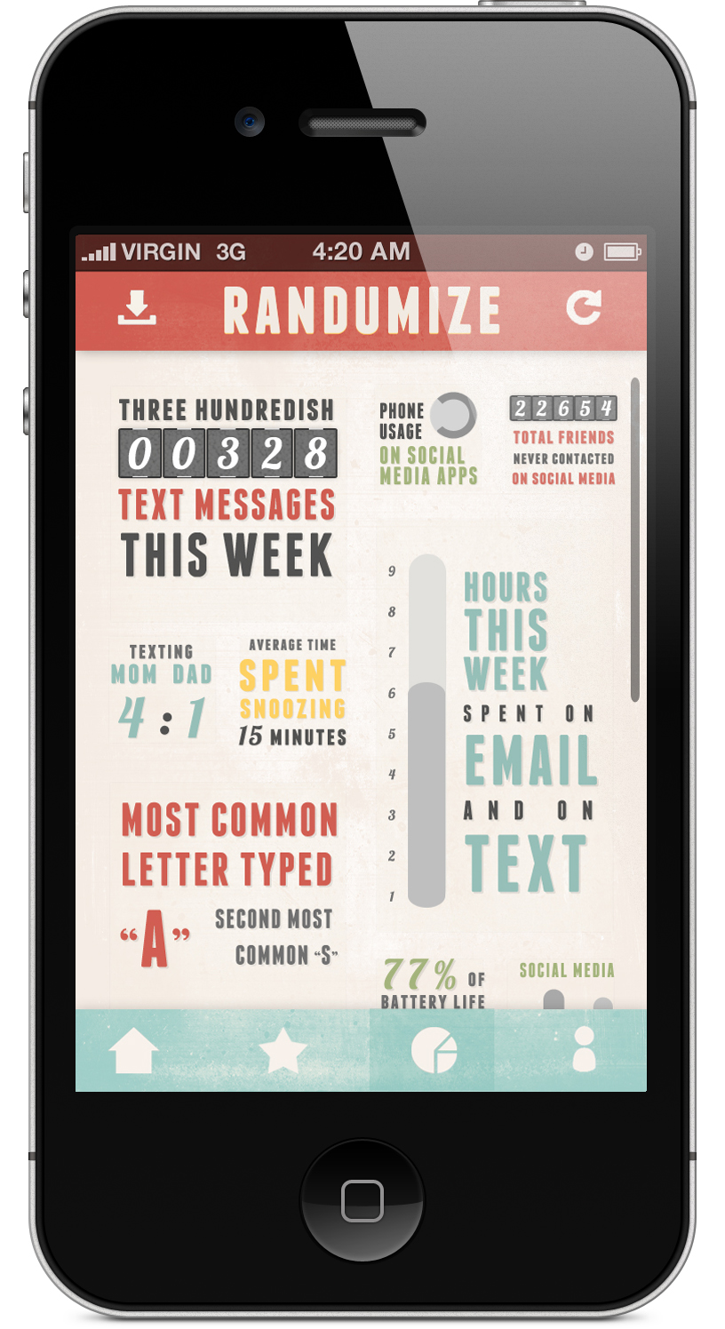
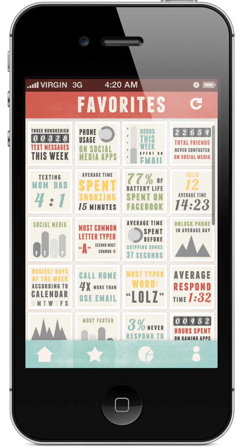
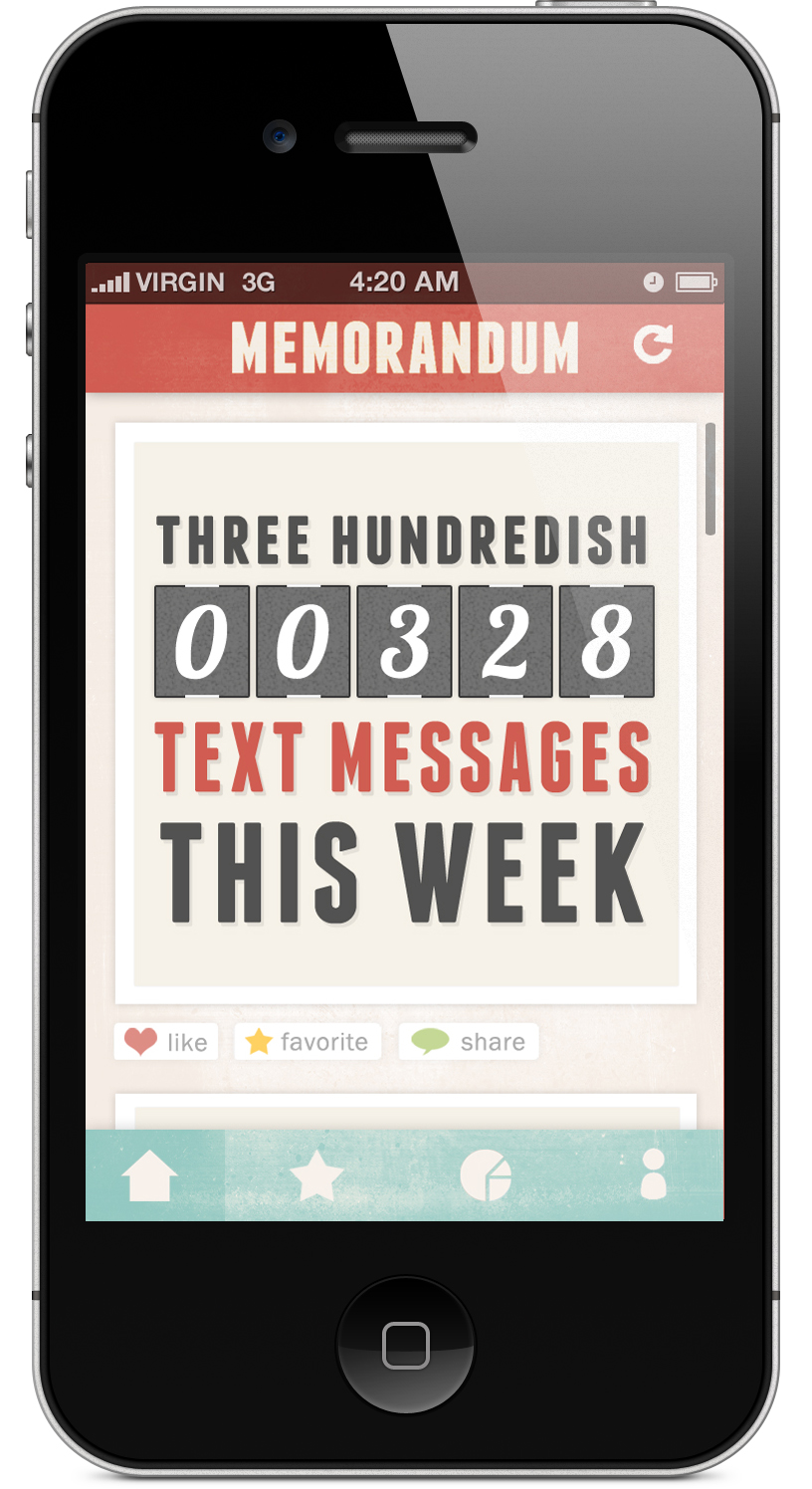
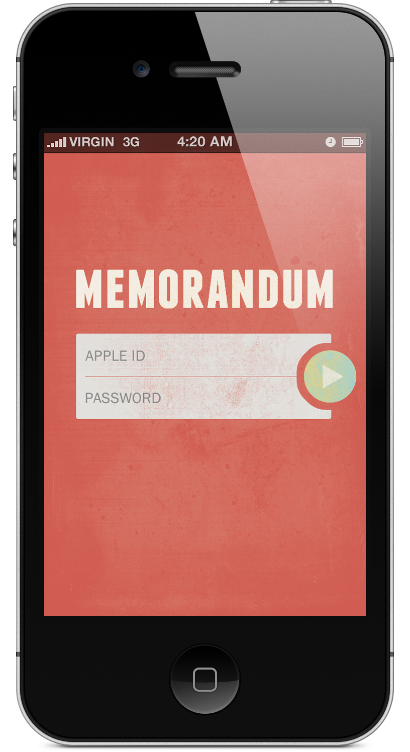
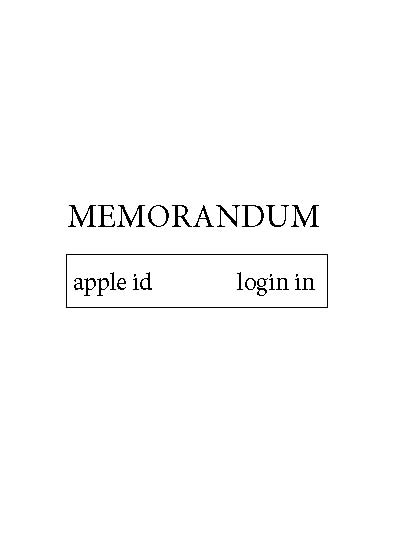
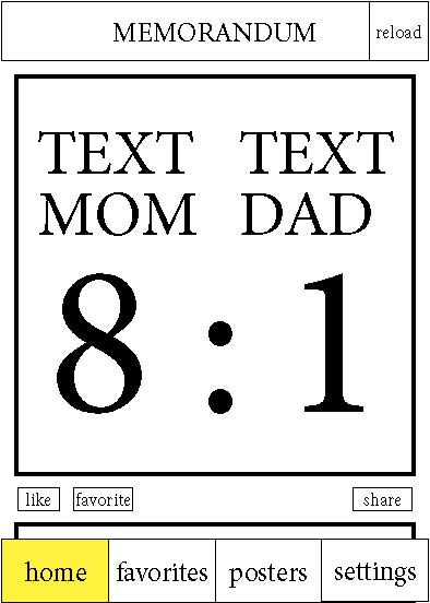
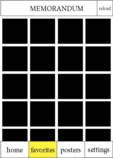
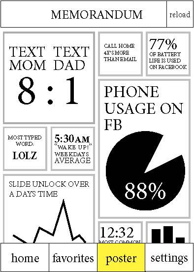
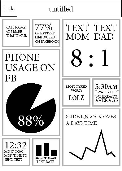
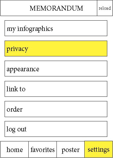
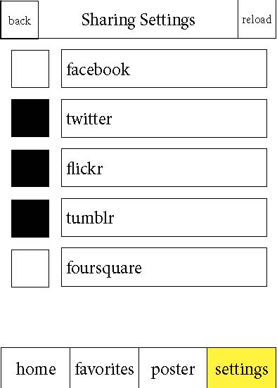
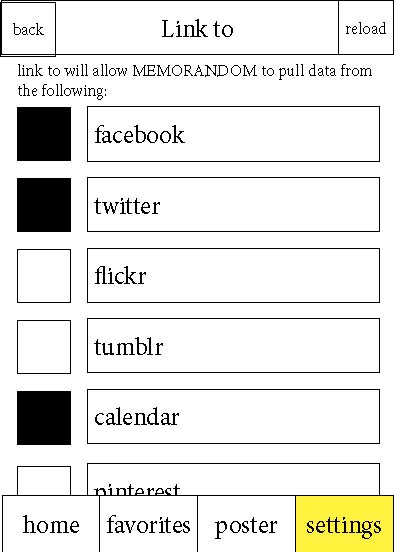
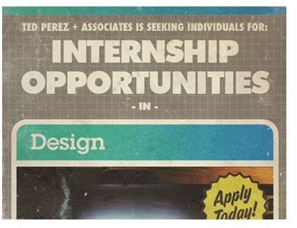
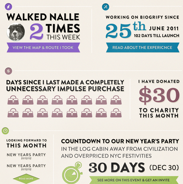
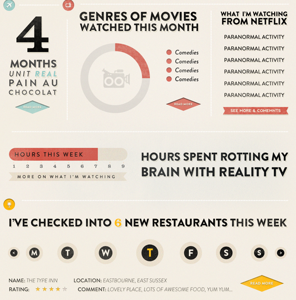
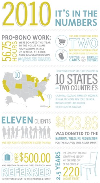
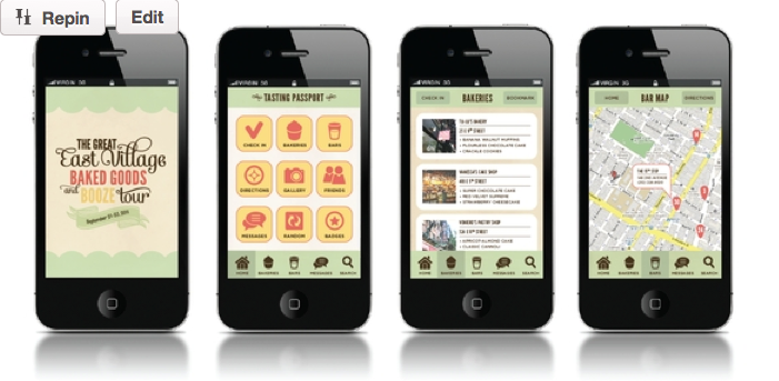
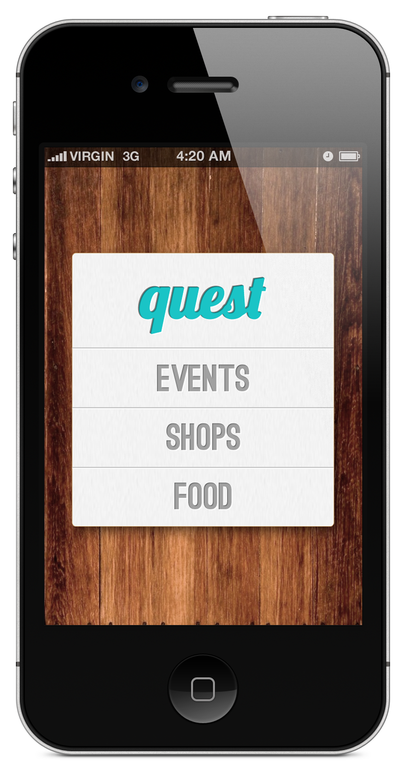
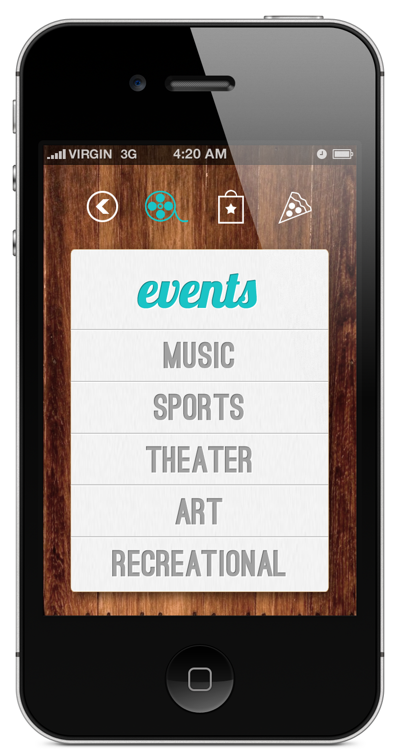
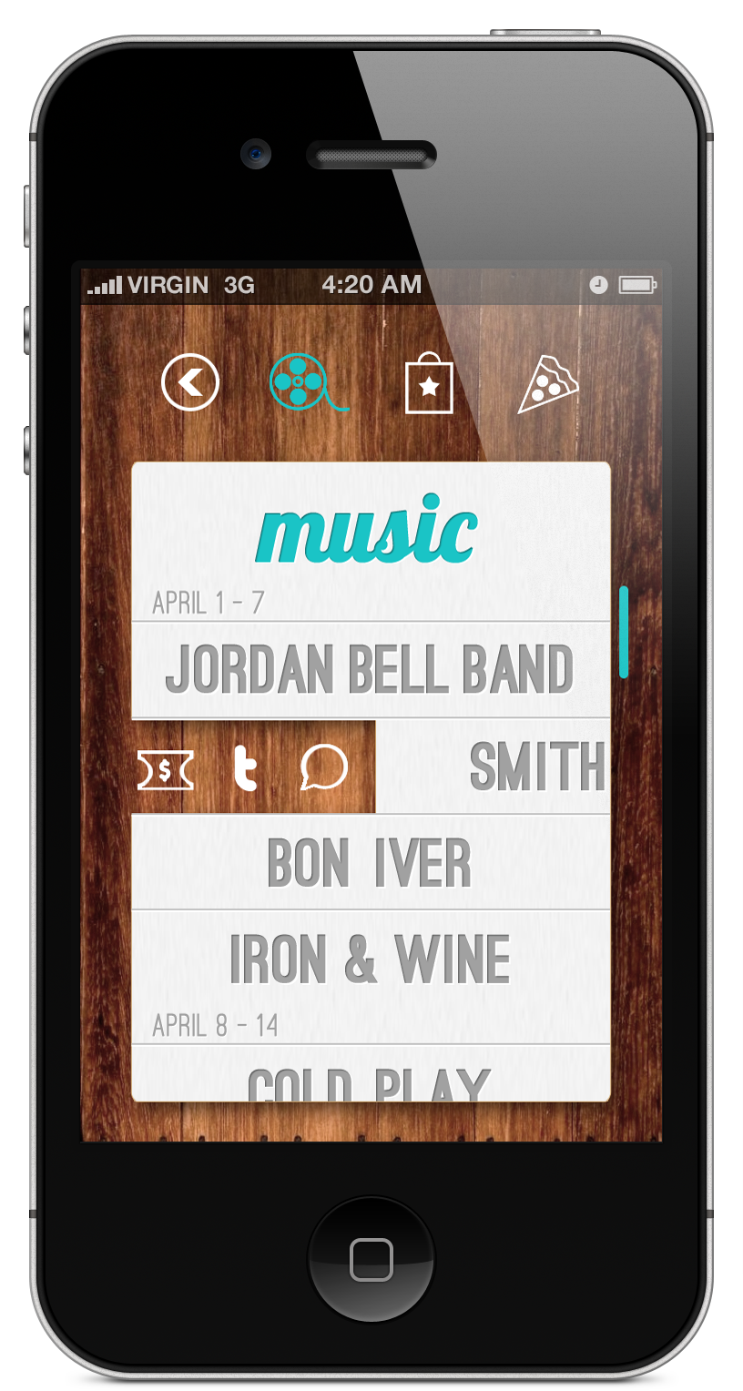
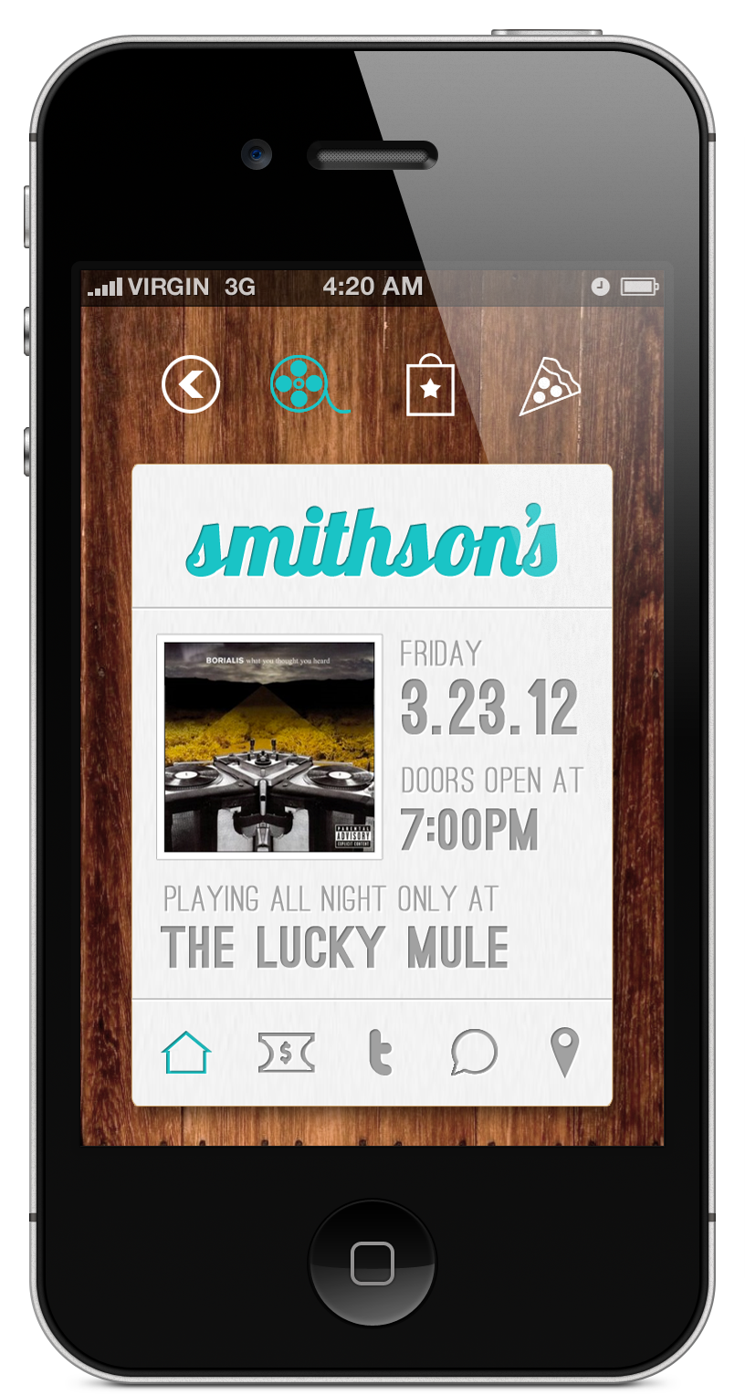
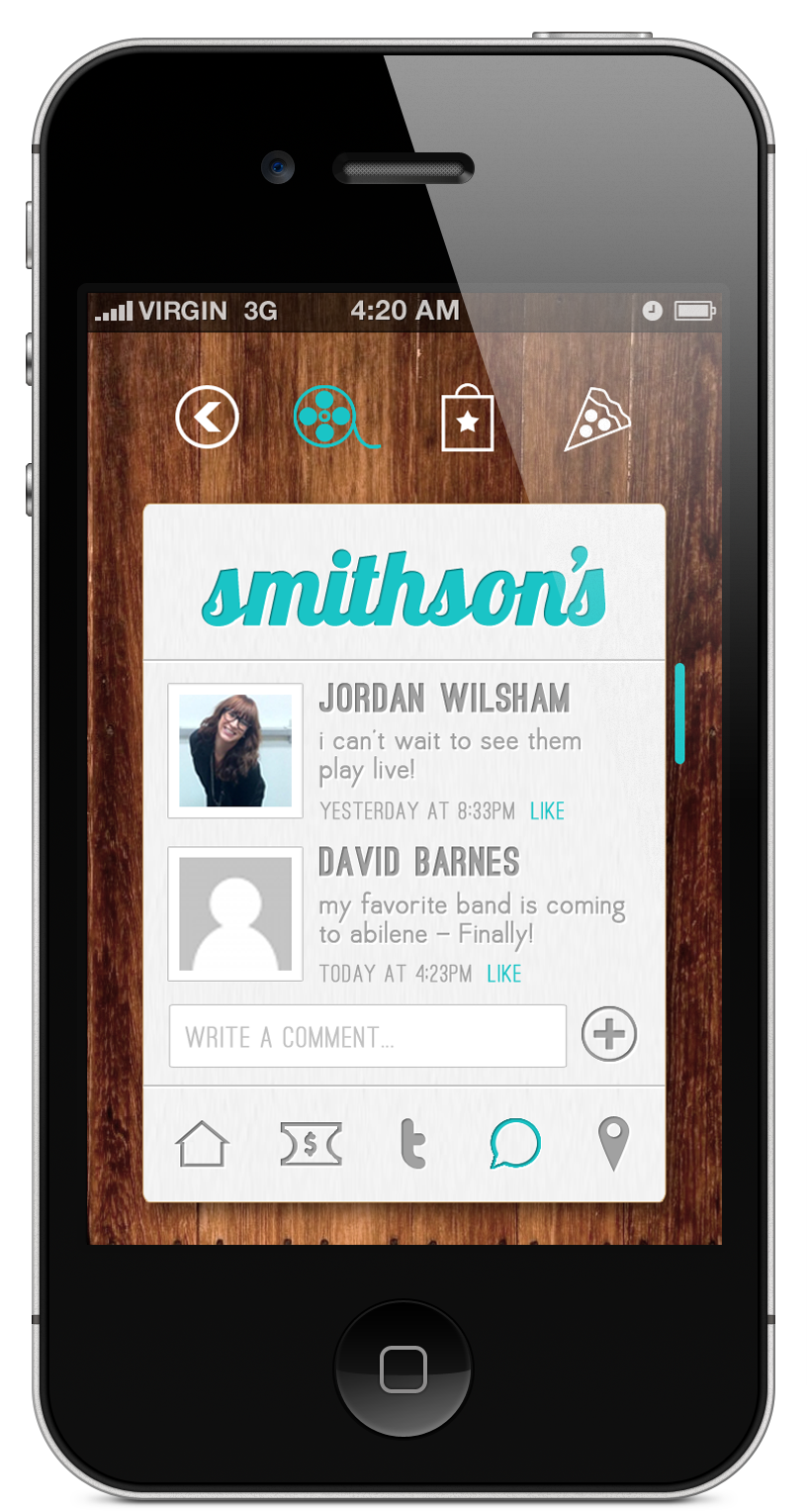
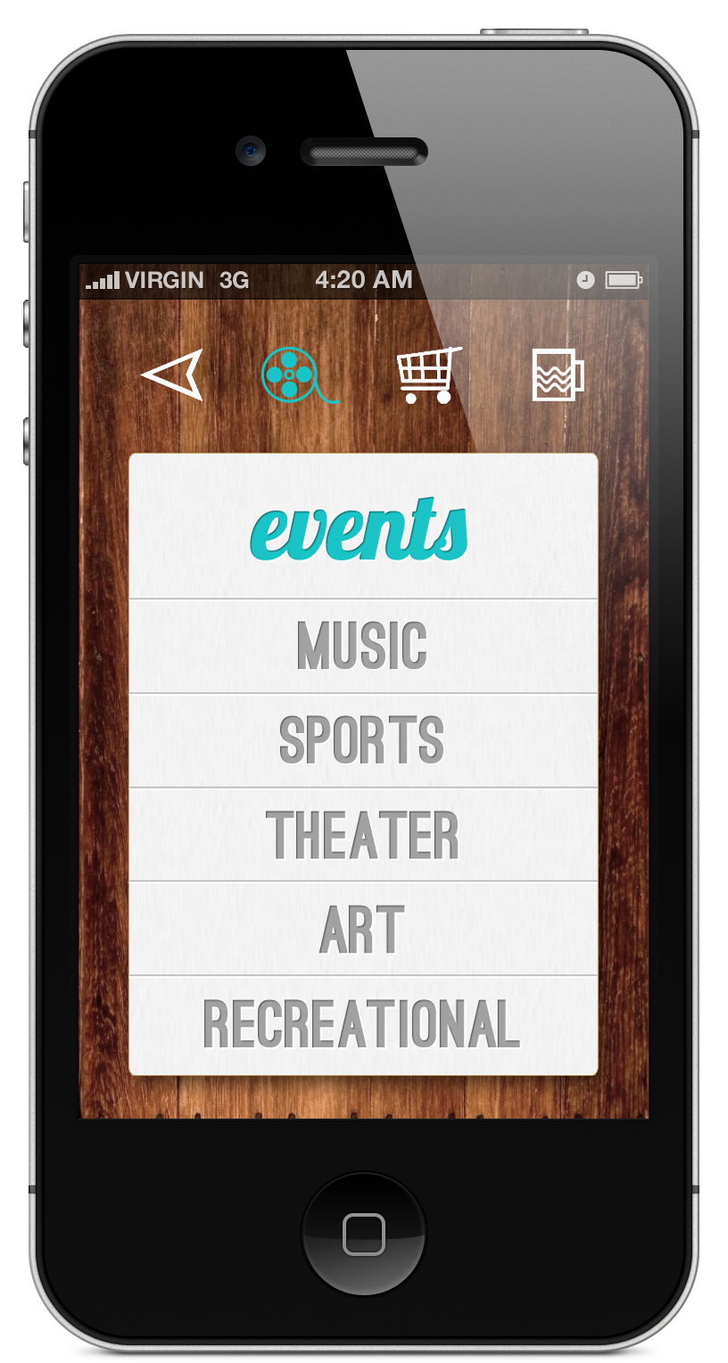
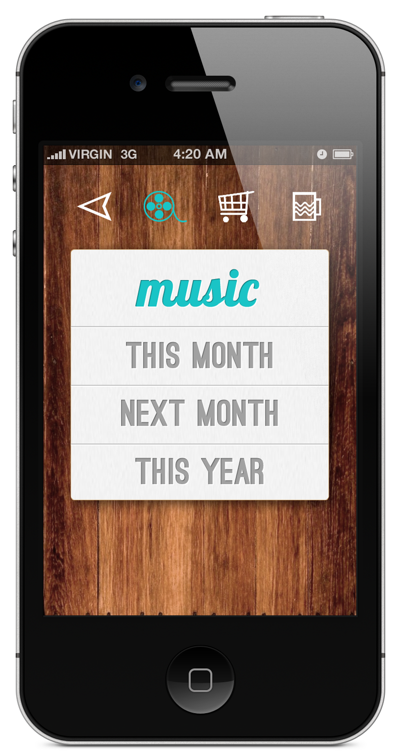
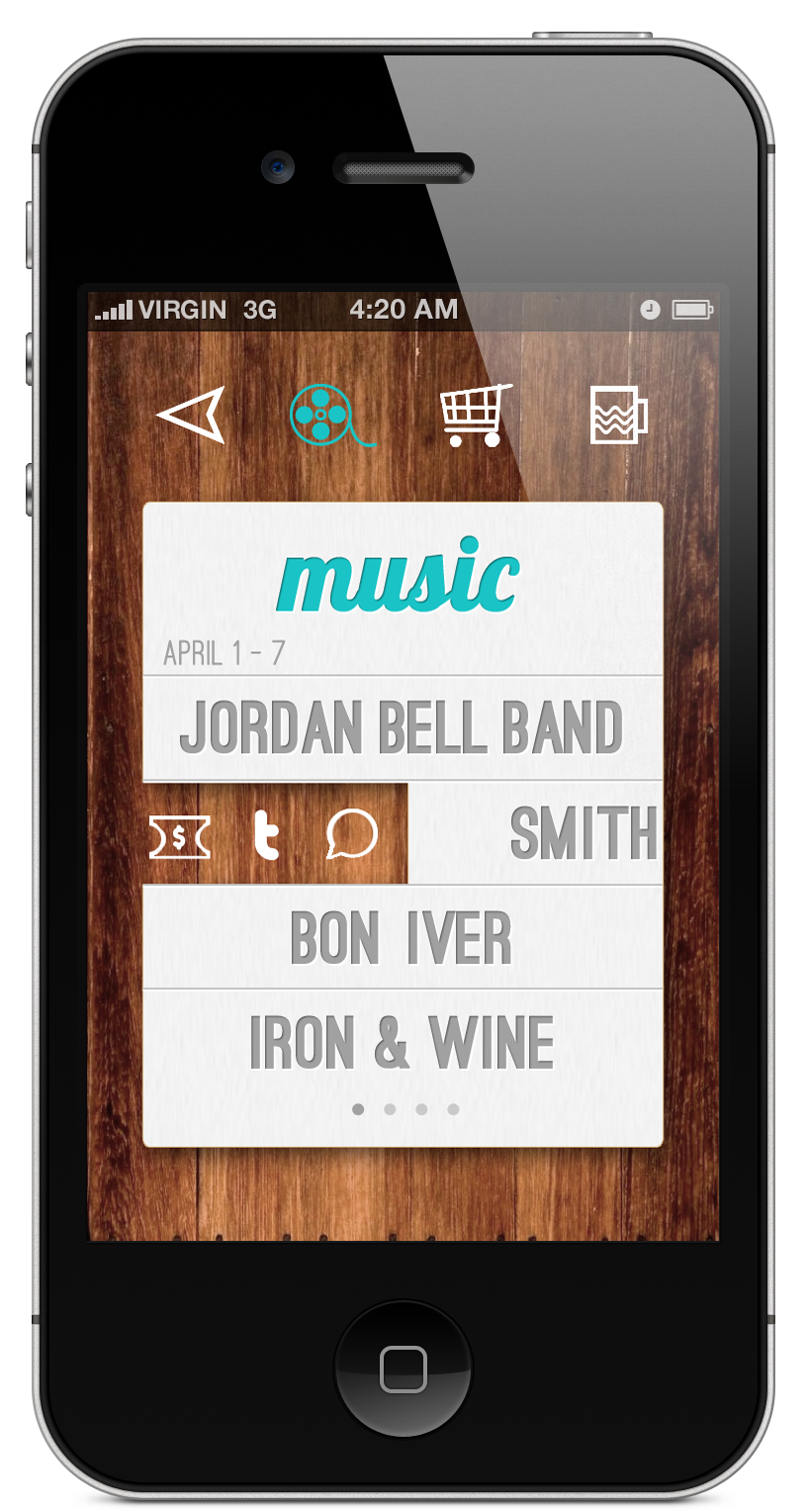
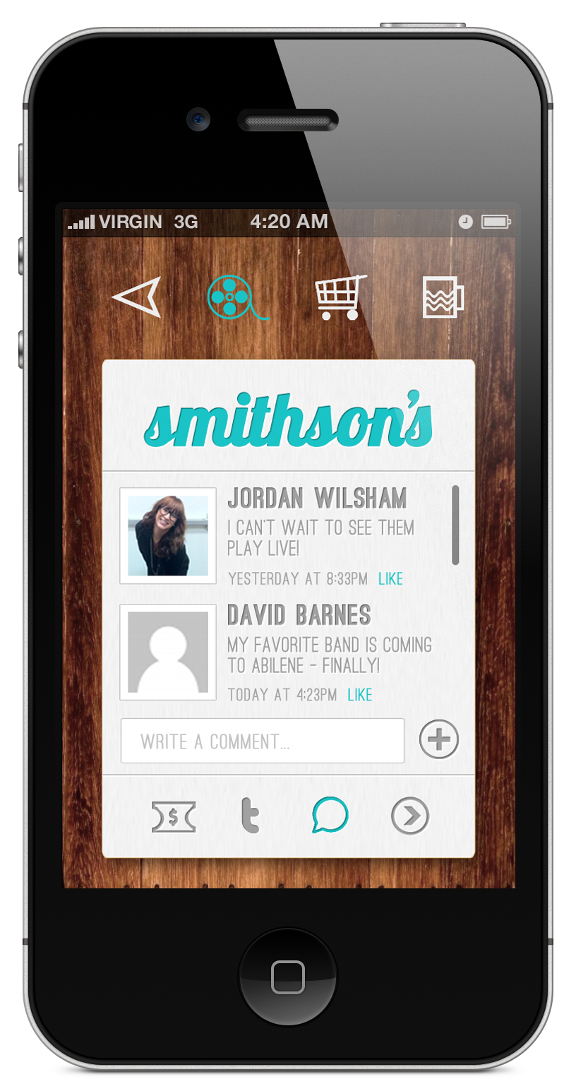
My project for the final was of course, an infographic mobile app. One thing that I really struggled with was not having to come up with what to do the information graphics over, but designing the actual infographics. Designing them was not an easy task because I had to figure out a way in which the interface would load a infographic onto a single “poster” so that it looked like an actual poster rather than a bunch of statistics on a page (that’s just no fun). I think overall, my designs for the infographics were successful because they all fit into the same dimensions so that whenever the infographic is created, it will use a template of the like.

I’ve noticed throughout the semester that my areas that used to be part of my weaknesses have slowly gotten better. This is especially noticeable in this assignment. I used to struggle heavily with negative space and overuse of motif; however, in this assignment, I think those two problems have been worked out. Thinking of the screen as real-estate really helped me in that aspect.

Even though mountains have been moved by how much I have improved over the semester, I still have things that need to be worked on (shocking, I know). While doing this project, I noticed that dealing with the overall cohesiveness is something that I need to work on. I struggled a lot with choosing a color palette and making the screens have the same feeling. I also had a hard time designing for a demographic for this app since the demographic is a lot larger. I didn’t want to make it too entirely playful; however, since this app does not have a function other than to make posters, I knew that in a way it needed to be.

I did not know what I was getting myself into whenever I signed up for the class (in fact, I honestly thought it would be something like digital illustration for the internet), but none the less, I really enjoyed interactive design. I want to take more interactive design classes, and look forward to doing so in the future.

Final: MEMORANDUM

0 Commentsby   |  05.08.12  |  Final Comps (P5)

Wireframing Pro.

0 Commentsby   |  05.07.12  |  Wireframes (P5)

Inspiration

0 Commentsby   |  04.30.12  |  Inspiration (P5)

Infographic App Names

0 Commentsby   |  04.26.12  |  App Names (P5)

  1. MEMORANDUM
  2. ABSTRACTSGRAPH
  3. SELF REPORT
  4. DOPE REPORT
  5. DATAGRAM

Tasks // Function

0 Commentsby   |  04.25.12  |  Content (P5), Task and/or Functionality List (P5)

Infographic App:

1. Look and see what the top ten most played songs are and the most common time played.

2. Add a new category to keep track of (Candy counter)

3. Look and see what the most common social media app you use

4. Look to see what you use the most on your phone

5. Share the infographic on a social media site

6. Edit a preexisting section on the infographic app (ie delete or change title)

7. Edit push notifications to modify to your needs

8. Enter in places visited that day and time visited, then view your route of that day on the map

9. View money spent that day, week, and month and average amount spent in a day

10. Edit theme/color scheme

  • Be able to edit which chart to use for the information entered
  • Be able to edit how much/which notifications to interact with
  • Be able to save infographics/have multiple infographics
  • Be able to have different infographics for different information

RANDOM:
I like the idea of it being completely random information, but with the option to “like” things and it adjust the information by what you like, like Pandora.

This Reflection Is Better Than A Mirror.

0 Commentsby   |  04.20.12  |  Reflection (P4)

This mobile app design has been my favorite project thus far in the class. Designing for the web is interesting, but it has nothing on designing a mobile app since there are so many more things to consider when designing for an app. One thing that I noticed that was crucial when designing for a mobile app is real estate and user interaction. I noticed these two things were crucial the hard way, and had trouble dealing with them at first. When I first started, I realized that I for the most part, over complicated things in the design, and how the user would interact with the app. Simple is definitely better and more convenient in this case. However, I saw significant improvement in how the user interacts with the app as the project progressed. One specific thing that I know progressed was the screen shot that had the short cuts where if you swipe your finger to the right, it would show the short cuts or if you swipe to the left, it would go to the next page which is a potential problem. Also the use of the back icon was a issue in the app because of the multiple pages in one section. However, by looking at the final product, you can see that these issues were resolved by simplifying. Instead having multiple ways you can scroll through pages, I reduced it down to one- the scroll bar.

I think the overall design for the app is APPealing, but I know that there is room for improvement. User interaction is the main thing that I noticed that I need to improve on. A successful design is great, but if the user doesn’t want to interact with it because of how the buttons work, then it won’t be a very successful app.

The Best Final You’ve Seen In Your Life, But Really.

0 Commentsby   |  04.20.12  |  Final Comps (P4)

quest: Event App

0 Commentsby   |  04.17.12  |  Final Comps (P4)

Progress: Real Rough Roughs.

0 Commentsby   |  04.16.12  |  Progress (P4)