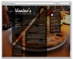
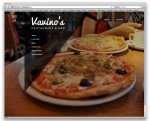
Archive for ‘Project 2’

Final Reflection

0 Commentsby   |  02.29.12  |  Reflection (P2)

I feel like I have come a long ways during this project. Especially since the beginning of January. But I still feel as if I have many obstacles to overcome. Specifically I think that technically speaking there are still many small techniques that designers use in photoshop that I read about and want to do but don’t fully understand how to do it. I think this is something I will learn over time and with continued practice.

Conceptually I think that I am nothing thinking big enough. I generally come up with a nice look or feel for my websites but I fail to see and think of every detail that will really give my website that umpf.  I get so focused in on one particular aspect of my projects and then I am caught neglecting other equally as important sections of my websites. I need to try to avoid doing this and just think of the big picture the entire time that way I can put intentional thought into ever facet of my design.

Some places that i have seen improvement in is particularly my eye for minute detail and alignment. I think this is attributed to my job and this class. I am no so detail oriented that i often fall into the problems listed in the paragraph above. But I still think that it is a great improvement in my design eye. Also i think that my sketching process has greatly improved in the confines of this class, I am beginning to think of all aspects of a website while im still in the sketching page which is a good thing I think.

Overall I think that I still need to improve my process work and try not to get focused in on small details that then end up consuming me!

As far as improvements from previous assignments I think that my design eye as far as detail and web information has focused and I am able to think more clearly about what needs to be done and what should be done and I can focus on layout design then rather than thinking of the small stuff.

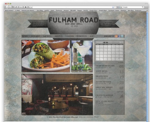
0 Commentsby   |  02.29.12  |  Reflection (P2)

With this project I found myself become even more comfortable with photoshop, I don’t believe I have ever used photoshop this much ever. I have still been struggling with some technical difficulties, especially when it comes to using quick commands, and dealing with how the grouping and layer system works in photoshop, which is a little bit different than illustrator. For the most part I have improved and find that with the use of groupings, it has become much easier to stay organize and to find elements i need to edit much quicker. On the concept side I feel that it is often difficult to really pinpoint a cohesive look and feel for a specific style of restaurant. I chose to go two different directions, an older more down to earth japanese restaurant, and a more upscale clean and modern restaurant. I chose the prior because i found it aligned with my own personal style much more, I found it difficult to maintain a clean and modern look, although completing the menu fragments later did help alot. I think doing the menu fragments was a very good learning experience for me because it helped me explore more typographic options. I found myself explore stuff that I know i might use in the future on other designs. I feel like throughout that part of the process and on to the final piece I have improved significantly on the use of heirarchy. Im beginning to learn to differentiate type using different values, which is much different than in print, more than size or weight value is becoming increasingly important in my interactive design work. One thing i really want to improve is creating more dynamic and interesting buttons, the subtle nuances of a button or a intended looking typeface, all those little details are difficult to iron out well. I also hope to get even more comfortable with photoshop so that I can move much faster and accomplish much more in my work. I would also like to incorporate a more strict adherence to the grid. I also want to learn how to better incorporate hand drawn elements into an interactive piece while keeping the entire piece cohesive.

Reflection Writing

0 Commentsby   |  02.29.12  |  Reflection (P2)

I think technical weaknesses I had was getting the website jpg to fit on the screen. Whenever I opened a 960 pixels document size in Photoshop and brought in the jpg it would scale down to a smaller size on screen. If I tried to scale it to the size it would pixelate and look blurry. I would get the 960 grid on the page but when I would put in the website jpg it wouldn’t work the way I wanted it to. Mainly, the website jpg wasn’t working for me with the right size.

I think conceptual mistakes where having the grids on screen as I made the website. On the homepage, I had the grids on there but with the other two sites I forgot to put the grids there. Therefore, I think some of the aligning is off.

I think throughout the process I saw improvement on hierarchy and making the site look more professional, rather than just shapes and text on a page to look like one. I think with the help of my wire frames, I could come up with a good layout and work on improving the page by improving visual elements and hierarchy to make it look better than my roughs.

I think I see a lot more improvement on this project than the last project we had. I think by coming up with a website design with a blank slate and going any direction we wanted really helped. I think last time since we had to make a website better, I had the mindset of just working with the same layout. On this project, I feel we had the freedom to choose what we wanted and coming up with a restaurant type, layout, design, and overall feel of the site helped improve the overall design of the site.I think inspiration helped a lot too to help improve with the design elements.

Overall, I think I need to learn on improving the website size which was a problem during this project. Also, I think as we keep working on designing websites then we will get better at designs…just like sketches, the more we make the better ideas come out.

Reflection

0 Commentsby   |  02.29.12  |  Reflection (P2)

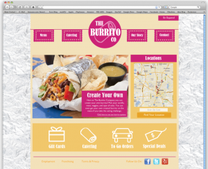
I think I did a better job designing past my wireframes this project. My final AIGA redesign was basically the wireframe I made with color added. I didn’t work much past it, all of my directions were very similar. This time I did a better job picking completely different directions.

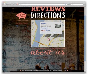
I had trouble making the website feel real. I think it is still missing some stuff, but the texture I used helped quite a bit.  I had to mess with a bunch of textures before I found one that worked well. I started with diagonal lines, which evolved into something weird as I continued to mess with them. My next try was to mimic the feel of the bricks in one of the photos. That worked well so I went with it.

I tried to do something similar on the large text on the home page, but I don’t think it worked well. I had a lot of trouble with the oversized words. They look weird without a treatment, but I can’t find a texture or color that works well. I’m still not very happy with how they look. Before I put this in my portfolio I will mess with the text and logo. I will also fix some of the details. I noticed that the drop shadows are different sizes throughout the site and I get off the grid by a couple of pixels every once in a while.

I need to do a better job following a process through the project. I sometimes work out a small detail before I’ve even sketched anything and end up building a website around that. This sometimes ends up alright for the one website I end up with, but if I want to build another direction I have to start from scratch. If I make myself build a process that works better I will be able to use the work I do throughout the early stages of the design to make each direction better.

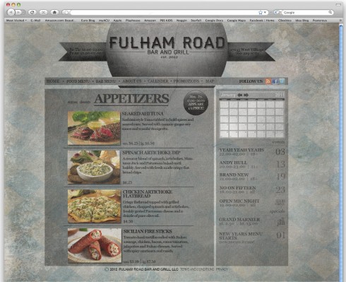
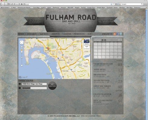
final comps

0 Commentsby   |  02.29.12  |  Final Comps (P2)


Final Designs

0 Commentsby   |  02.29.12  |  Final Comps (P2)


Zack G – Restaurant Reflection

0 Commentsby   |  02.29.12  |  Reflection (P2)

After completing this project, its actually kind of fun to look back on it, because it was so open ended, and I think each student had an opportunity to show their own personality. It probably won’t be very often that an entry level graphic designer will get to completely develop their own web site however they want it. Usually we will be coached to create something the client is looking for specifically, and because of this, there is not as much of the artist’s identity in the site (or project). One thing I definitely struggled with in the beginning was the use of a background picture, and foreground pictures, and how to successfully merge the two. Every time I’d use an image of food or something, it would just look cheesy. Another setback I faced was not developing my final idea earlier. I liked the direction I ended up on, but I just wish I could have arrived there much earlier, so I could have had more time to evolve the over all design, and spend more time working on negative spaces, and hierarchy issues, and even color issues. I kinda shot myself in the foot by waiting as long as I did, but overall I am not too ashamed of my final project. Butt again, I do think this was a fun project and I definitely enjoyed the freedom to explore your own theme, and choose your own target audience.

Brittany’s Finals

0 Commentsby   |  02.29.12  |  Final Comps (P2)


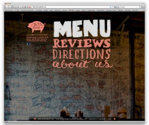
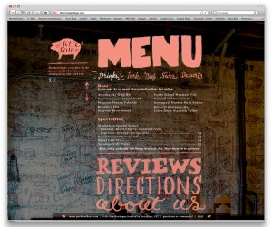
Final Comps

0 Commentsby   |  02.29.12  |  Final Comps (P2)


Composizione Finale

0 Commentsby   |  02.29.12  |  Final Comps (P2)