Archive for ‘Project 3’

P3 Reflection

0 Commentsby   |  03.23.12  |  Reflection (P3)

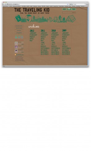
This project was not as daunting of a challenge for me as the last one, but I still suffered from several problems that hindered my final output.

In terms of progress, I believe I am getting much better at manipulating Photoshop and keeping things logically organized. This project required the greatest number of folders and layers so far, but I kept a pretty good handle on it throughout the process. I am also improving marginally in maintaining a consistent style or tone in my work, I think. From previous assignments I can see improvement during the process when developing different directions for elements. Even though they weren’t radically different, I think they were better than the directions from the last project.

Conceptually I am still having trouble breaking the traditional mold of how certain sites should look, and tend to stick to the confines of what encompasses a traditional blog or restaurant site. I still need to improve on the process, and finishing sketches before working on elements or rough compositions. I feel that if these things come first, I will be ultimately more happy with the end results.

Reflection

0 Commentsby   |  03.23.12  |  Reflection (P3)

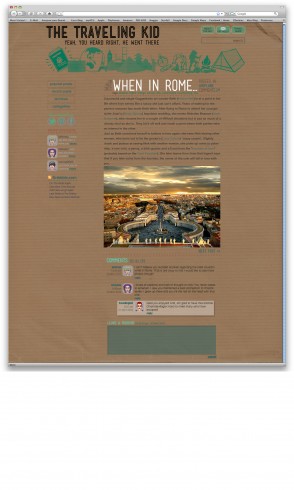
This last project was probably one of the smoothest so far. I don’t know if it is because it had less content or the whole interactive design is just becoming more natural (hopefully the latter). I should probably actually take time to sketch more for the next project as well. It probably would have gone a lot faster had I had something to look back refer to. I noticed I am still having issues with hierarchy and allowing content to be too vibrant or too dull. However, I am starting to pick up on using colour to show importance as well as weight and size.
The main issue I kept running into with this project was my complete and lack of knowledge regarding blogs. I had to keep referring to the project intro page to ensure I was using all the correct terms and all terms necessary. I also had to continuously search what terms meant and refer to inspiration and other blogs to get a feel of how one should look. I noticed the style is quite a bit different than others in the class so I don’t quite know if I hit it or not. I still think it looks pretty cool regardless.
As I mentioned before, this project seemed to go a lot smoother and faster than previous. I have continued to learn short cuts and advance my skills on photoshop. The program is becoming a lot more enjoyable.  I also actually completed a wireframe and all fragments this time which made the overall layout go a lot smoother and quicker. Surprising how much that actually helps!
I think I am getting better at placement and overall layout. I think my legibility and overall clarity has increased/improved. One major improvement is how much I actually enjoyed this project. I think a lot of it came from the originality and creating icons and other fun things.
I just need to continue working on my hierarchy and visual language. I think I still need to grasp that line between a loud background and an effective background. I should also learn how to actually sketch thoroughly and before the project is done.

Zack G Project 3 Reflection

0 Commentsby   |  03.23.12  |  Reflection (P3)

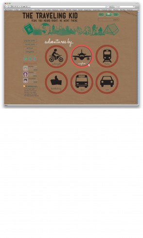
I think this project was one of the most difficult ones yet, mostly because it was so open ended. The name of the website, the target audience, the subject matter and the look were completely open ended, and that was very difficult for me to find a starting point for. As per usual I procrastinated way too long on this project as well, so I didn’t get any constructive feedback about my direction, which definitely hurts the learning process. I also noticed that I used the grid structure to format the site, and I used it for all my tool bars and headers and footers and such, but didn’t rely on it much at all when formatting the text. Another problem I face (which I put myself into) was my direction. I’ve seen soooo many boring blogs out there that just have information on the screen in a very boring way and they don’t hold my attention, so of course I decided to try something I haven’t seen as much of, and went with the bulletin board approach. My initial idea was to create an extremely user friendly site, in which the user could practically drag and drop whatever posts they wanted, wherever they wanted, almost like rearranging magnets on a fridge, or placing sticky notes in whatever order they wanted to. The other challenge I faced was executing this idea in an artistic, fresh looking manner. Like I said, I get so tired of all the blogs out there that look like a businessman with Microsoft Excel made them, so I wanted mine to have a kind of fresh, young looking feel to it. It was later that I actually decided to use my own art works and stories for the pages, mostly because I couldn’t think of a better client to create for, hence the name “Totally Randumb”. That is exhibit A of my lack of creativity. To wrap things up, I liked this project because it made me solve a lot of things for myself instead of just being told who to create for, but it was that same open-endedness and my lack of a creative idea that hindered me from creating something better.

Project 3 Reflection

0 Commentsby   |  03.23.12  |  Reflection (P3)

I really liked this project and had a lot of fun doing it, but there were some things i noticed along the way that I want to comment about! The first off being that I still have some slight spacing issues that i noticed when we were looking at the finals, these can be sen mostly on the story page. It isn’t anything hugely noticeable but I saw it and now that little technical mistake really bothers me.

Conceptually I rushed into one of my first ideas, which I still think turned out well and I really like it, but then as I was doing some of my sketches after the fact I came across two or three more ideas that would have been brilliant for a blog type website. So I would say that my big weakness conceptually was rushing forward without taking the proper time on my process. I really am pleased with my website and think that it is the best one that I have put out so far but it kills me to thinking about if it could have been better with some of my other ideas.

As far as over all improvement goes I have noticed me increased attention to detail and keenness to noticed subtlety, (which doesn’t mean the I necessarily accomplished it) I think that the subtle choice of colors and type really benefited me in this project. This can definitely be seen in my heading and body copy and alignment when compared to previous posts. I really like the way I handled the archive page and think that it is one of my strongest showings in a web design project thus far in the class. Overall I am very pleased with the site, but I know that it still can use some work and tweaks here and there, it’s by no means perfect.


I also could afford to improve on my process, like I stated before I don’t know how it would have turned out but I would like to think that if I would have done my process in the intended order that i could have come out with some awesome layouts and designs. Not doing the process in the logical order is kind of killing my potential projects.

Reflection

0 Commentsby   |  03.23.12  |  Reflection (P3)

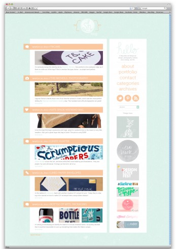
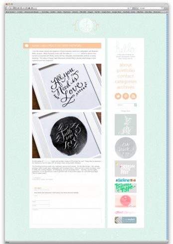
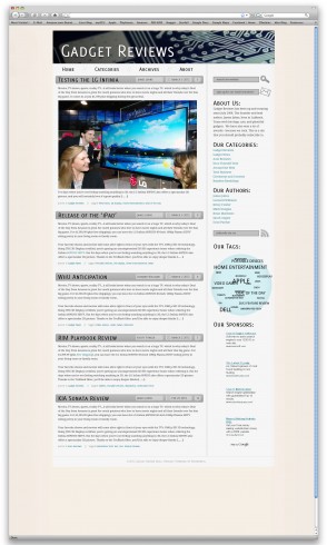
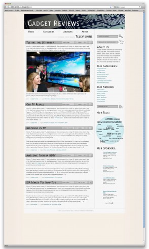
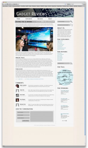
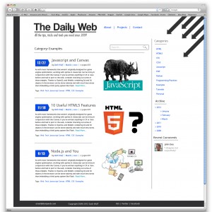
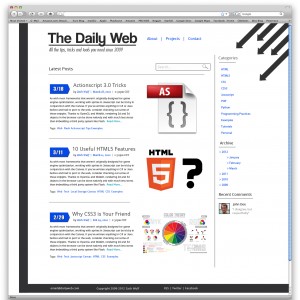
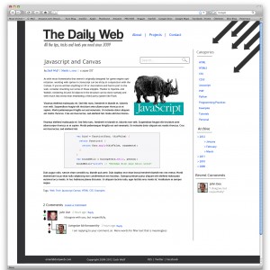
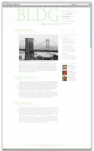
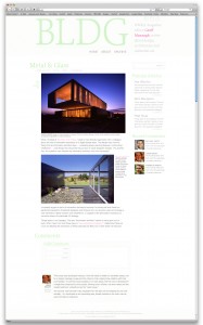
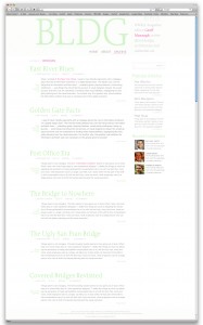
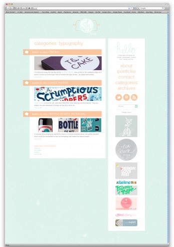
The blog was a challenge because the pages are all so similar, but different. They have to have the same feel and layout in order to make sense, but the levels of hierarchy on each page changed. This project had a lot of type arrangement and that was difficult sometimes to figure out the hierarchy and to make it the correct size and readable, although I think this time it was much easier to find a solution than on previous assignments. I think one area that coule be worked on more for me would be the hierarchy in the post title and date. The fonts I chose limited my choices, such as the thing I wanted to be higher did not have any bold or italic. Looking at it now I think the date could be even smaller than I made it so that the title would stand out more, and even maybe change the order. One page that I think is very readable and useable is the single post page with the comments at the bottom. I struggled to make the comments stand out from the submission boxes, and also so that it was not so heavy of a color that it brought your eye down to it immediately. I looked at a lot of other popular blogs and used a similar layout and I believe it reads well, with the exception of a little bit of spacing issue with the posters name and the date. I feel as if the home page is clear and it would be easy to see what interests me and to click on a post and go on to the post page. The clipped image is not too big but not too small, to where you can see a preview and it draws you in, which I think is the purpose of the blog. The archive page was difficult, and I think if I could do it differently I would make it slightly different from the other two pages, maybe with month and year and then it would continue onto posts from that month or year. This page was for categories (or tags) and I think it clearly tells you what has been placed in that category. I enjoyed this project and I would really like to make this blog real and connect it to my portfolio sometime in the future.

Final Blog

0 Commentsby   |  03.23.12  |  Final Comps (P3)


Project 3 Final Comps

0 Commentsby   |  03.23.12  |  Final Comps (P3)

Project 3 Finals

0 Commentsby   |  03.23.12  |  Announcements, Final Comps (P3)

Project 3 final

0 Commentsby   |  03.23.12  |  Final Comps (P3)


final

0 Commentsby   |  03.23.12  |  Final Comps (P3)